Interview with Cover Designer Anna Morrison

Anna Morrison is a freelance art director, designer and illustrator based in the UK. She spoke with us about her process and projects in an interview for Spine issue 6.
What was your path to becoming a book cover designer?
I studied Illustration at Camberwell College of Art after graduating I had to figure out a way to make some cash. I didn’t have the patience (or talent) to pursue a career as an illustrator; I remembered one of my tutors saying I might like working in publishing due to my love of reading so I contacted a few publishing art directors for a work placement and was delighted to have a bit of time at Penguin Books design dept. I loved being there and experiencing the process of designing book covers, I think that bit of work experience helped me to get a job as junior designer at Random House.
Can you explain your creative approach when taking on a new project?
That’s one of the things I love about designing book jackets, every job is different. It helps to read the book (obviously) and from there I tend to sketch a few ideas down; not necessarily anything visual I’ve remembered from the text, sometimes an idea just comes through the narrative, they don’t necessarily emerge whilst reading, they tend to come when I’m thinking about it afterwards. I often go back and look at my initial sketches and wonder what on earth I was thinking then try a few more concepts and start playing around on Photoshop until it all comes together or not…send it off and hope for the best! I feel the job of a book cover designer is to translate the text to pique people's interest to pick it up to read, it can be literal but I think a cover is more interesting if it's ambiguous. That’s a unique quality of the job; that there are (usually) no guidelines, it's just what feels right for the book.
Do you have a favorite project in particular? What about that experience made it unique?
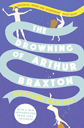
I really loved working on The Drowning of Arthur Braxton. It was a repackage of a book that came out a couple of years ago and had a kind of cult following. The author, Caroline Smailes, was just so lovely about the new cover. It's their labour of love, so to make an author happy is just the best! And I got to draw some naked people, that was a unique experience!
What aspect of book cover design do you find most compelling?
I love all the reading I have to do… and reading books I wouldn’t normally have picked up myself and also finding out weird facts/unless bits of knowledge especially when working on non-fiction books.
What is your design rationale for the cover of Laia Jufresia’s Umami?
I loved working on this book too. It had a completely different cover initially but the art director, James Jones, suggested we go down a more illustrated route. Umami is a story of the troubled lives of a small community in contemporary Mexico as they go through various stages of grief, it’s a dark novel but with humor too. I researched Mexican art, type and pattern (I find Pinterest is good for this) The character Ana surrounded by the plants she grows in the courtyard of where all the characters live, it's the place that connects all the people in the book and the garden she grows is a sign of hope and that felt pertinent to the book.
What is your favorite cover that you did not design?
Oh wow there are just too many to mention. I loved Jamie Keenan’s cover for The Metamorphosis by Franz Kafka, the way the type interacts with the image is just beautiful. I think The Crow Girl by Erik Axl Sund designed by Peter Mendelsund /Oliver Munday is great. It just looks so unsettling it gives an immediate reaction.


