Bekki Guyatt on Designing Insatiable

Bekki Guyatt is a Senior Designer at Little, Brown UK. Here she takes us through her process for designing the sexy new cover for Daisy Buchanan’s Insatiable.
When Insatiable came up in our briefing meeting, it sounded like a challenging and exciting book, so I jumped at the opportunity to design it. It’s very sexy and ambitious, and seemed like a fun and unique project to work on.
The book is about Violet, in her late 20s, in a dead end job, heart-broken, and broke, hungry for more. So, when Lottie offers Violet the chance to join her exciting start-up, she bites. Only it soon becomes clear that Lottie and her husband Simon are not only inviting Violet into their company, they are also inviting her into their lives. It’s a very sexy book about desire, lust, longing and the need to be loved.
We wanted to focus on the sexiness for the cover, but in a suggestive rather than explicit way, and to have a striking design that felt new and edgy. So the first thing I did was hours of image research, looking at all manner of things – the female form, food, hands, shadows, fashion, balloons… the list goes on! We also share things when we can within the department, and my colleague Charlotte sent me her image research for a book with similarly sexual themes. This was so helpful, as this was my first ‘big book’ project in lockdown, and I was struggling with adapting to the new way of working. To still have that support from afar was incredibly helpful and reassuring.
I then began combing these images with blocks of colour, framing devices, and different font styles – basically playing around to see what clicked. At this stage I had over 50 designs and picked the 20 most successful to discuss with the editor, Darcy, who I really enjoy working with, as she’s very visually minded.


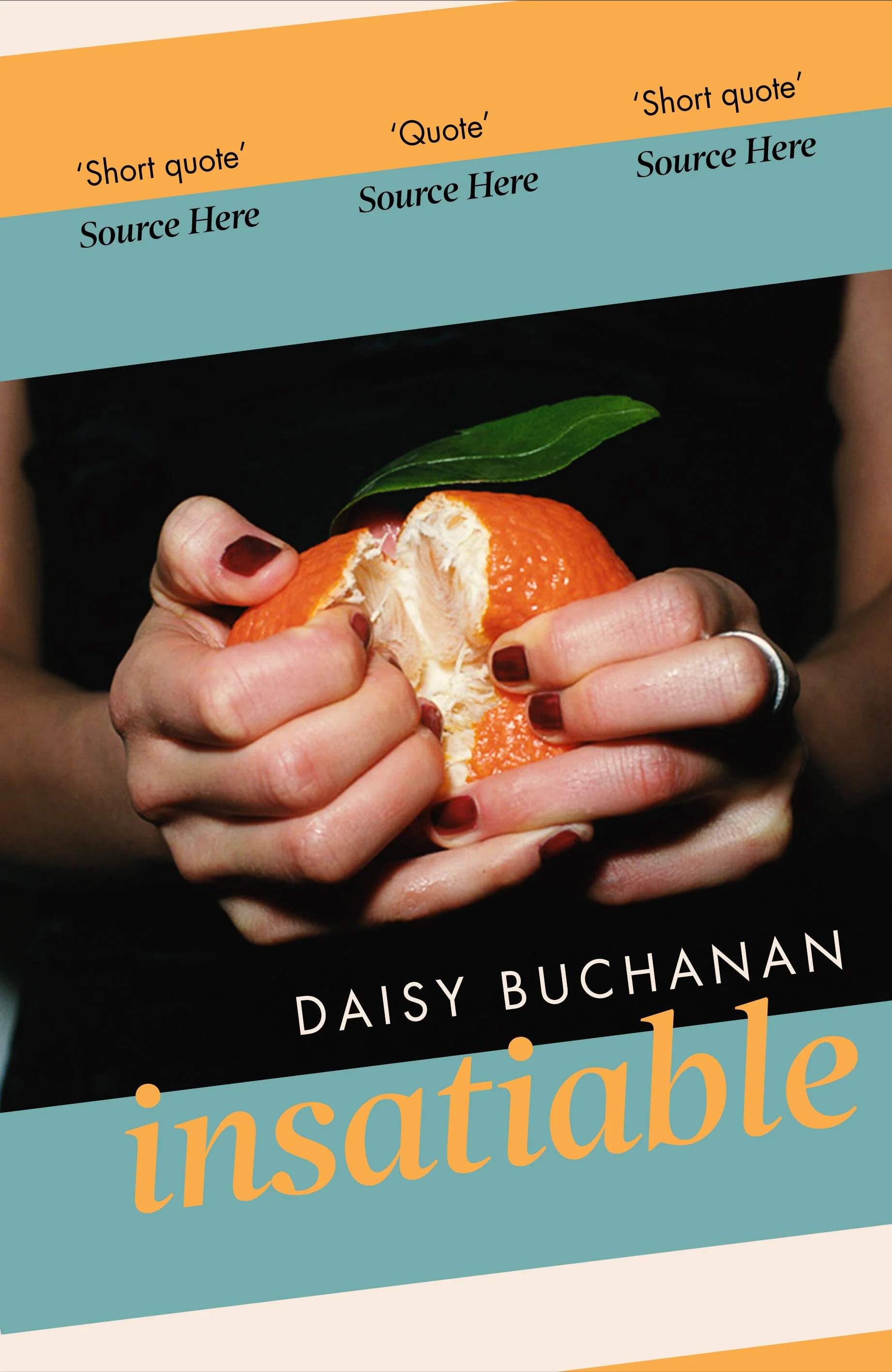
You’ll see that within these images is almost every element of the final cover. From this point on it was a case of working with Darcy to narrow down the best layouts and the best images, mixing up and reassessing multiple times, narrowing it down to three, with images of hands holding items in ways which felt quite sexual, and we had pretty much settled on a layout.

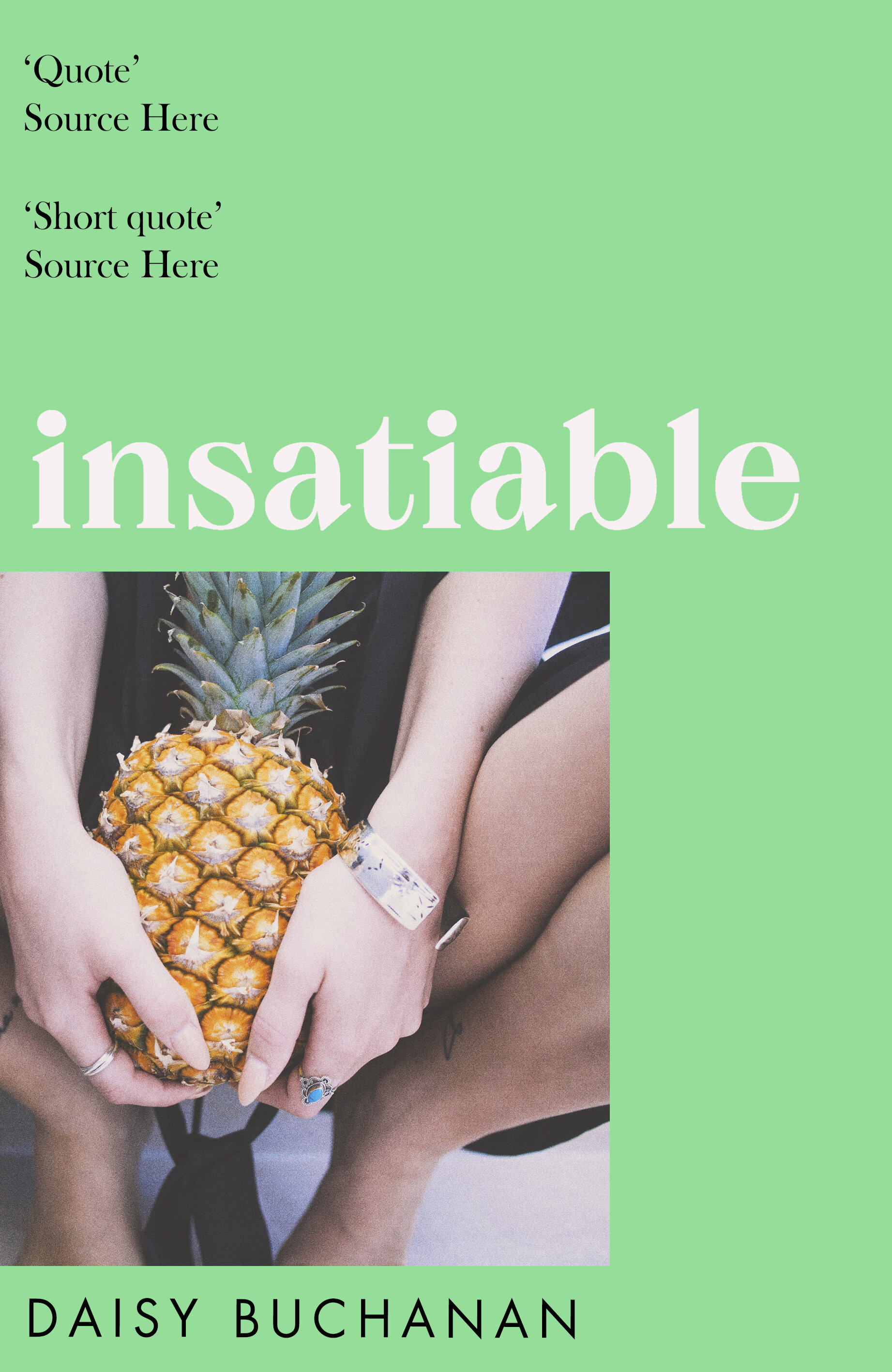

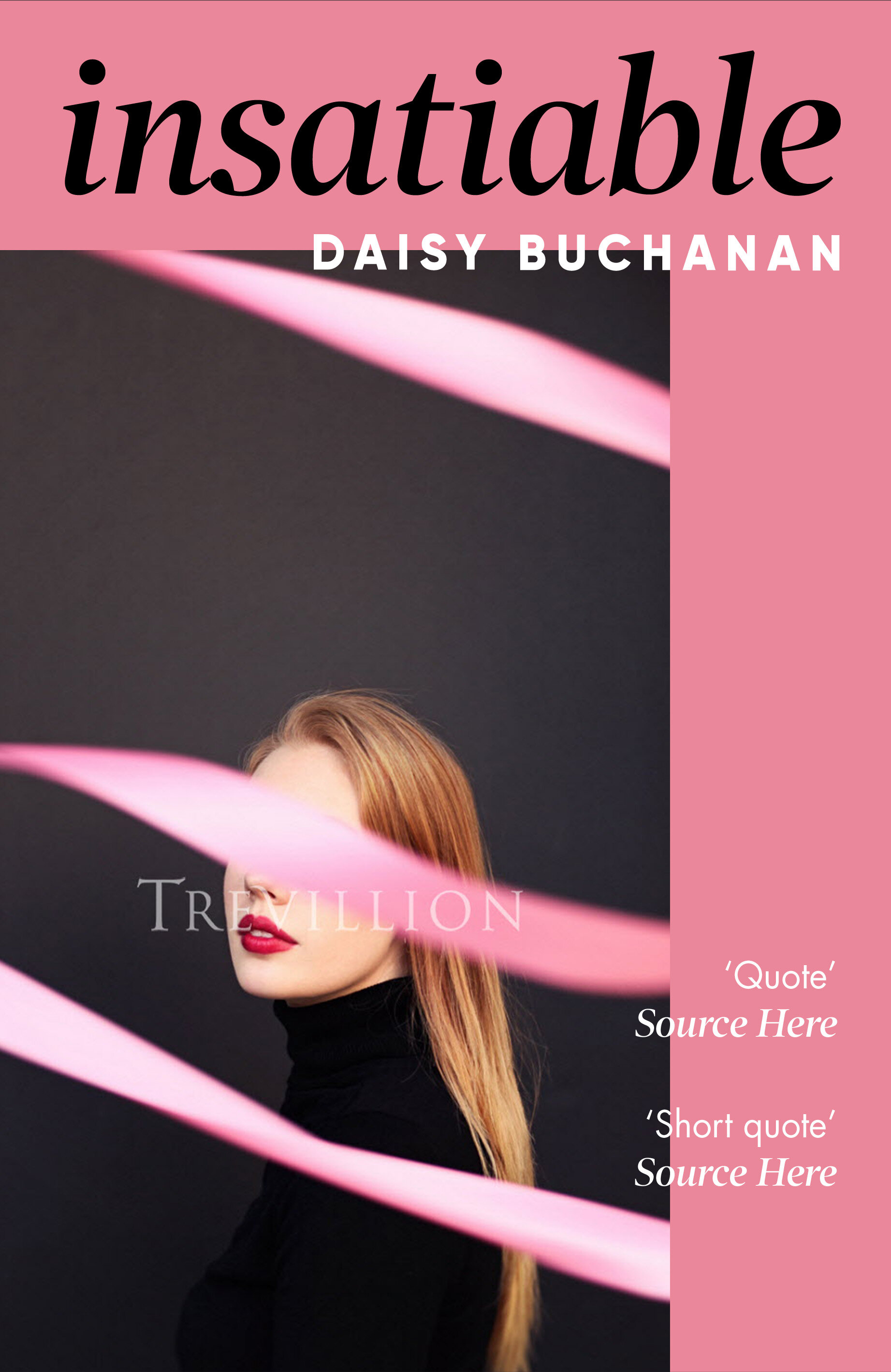
At this stage we worried we’d perhaps strayed too far from the fact that at it’s heart, this is a story about a woman finding herself, and what she really wants from life. So we thought let’s take another look at the female figure, and doing a little more picture research for some new ideas we had. I found some really beautiful shots, and some which I felt represented that sense of frustration and boredom.


When we went back to review the options next to the previous set, we decided to go for it with the orange image, and arranged for a bright orange Pantone to be used on the printed cover which worked so well! It’s so bright. I love when we can use Pantones, they just look so rich. And after sharing some early proofs, we ended up with loads of glorious quotes, so the final piece of the puzzle was working out the best placement for those, which we wrapped around the edge of the cover, following the flow of the image in the opposite corner.
Final cover
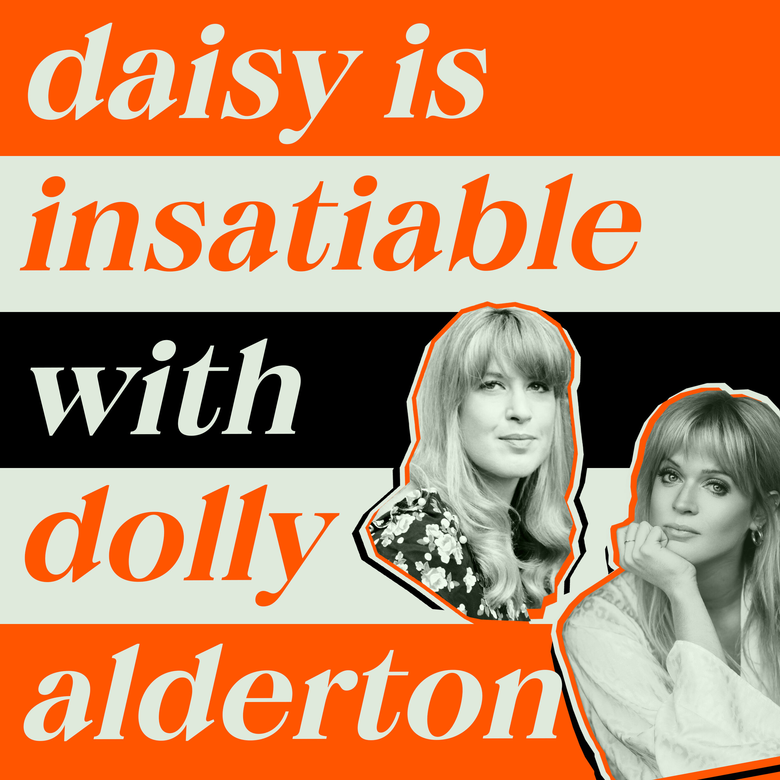
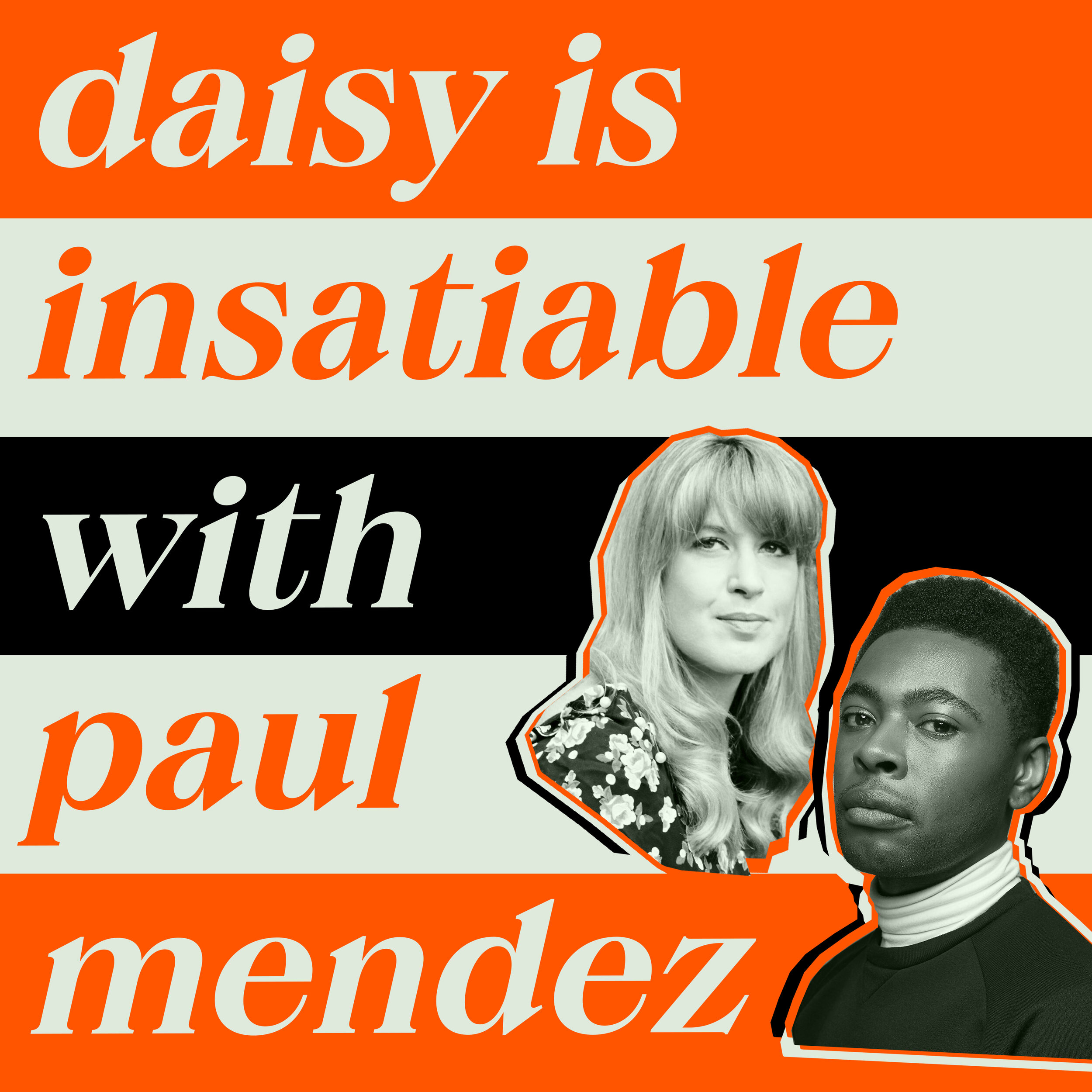
Since designing the cover, there’s been a real buzz around the book, which is very exciting, and lead to me getting involved with another fun design project – creating a podcast logo. Daisy is doing a series of episodes to coincide with the launch of the book, with amazing special guests, so I got to have some fun creating a design for the series, and individual episode images too.


Final design
Editor, artworker and lifelong bibliophile.