Behind the Scenes at Bonnier Zaffre

I'm sitting on a train on my way to London, and I'm ridiculously excited. Today I get to hang out at Bonnier Zaffre, the newest kid on the publishing playground. And this kid has had its Weetabix, already luring in big-time authors such as Lynda La Plante and Wilbur Smith.
Bonnier Zaffre, part of Bonnier Publishing UK, is the brainchild of CEO Mark Smith. A quick internet search reveals that zaffre is “a blue pigment obtained by roasting cobalt ore (and also) a cobalt blue colour.” Not the most obvious name for a publisher but Mark Smith chose it himself as he is a particular fan of the colour. Smith joined Bonnier in 2014 to start a fiction arm of Bonnier Publishing, itself part of global media group Bonnier AB, a Swedish conglomerate heavily involved in improving the Swedish education system by donating books to schools on a regular basis. The new publishing house has “the entrepreneurial spirit of a start-up, with the financial backing of a parent company with revenues of more than 6 billion euros.”
After slipping and sliding my way along Oxford Street (Uggs + wet pavement = broken bones waiting to happen) I find myself in front of a smart redbrick townhouse. I'm greeted by Art Director Nick Stearn, and shown into the main work space.
Despite being a cover designer myself, I have never actually set foot in a publishing house before and I'm curious to see if the décor matches up to my daydreams. It totally does.
A bright, modern, open space with build-in shelves filled with a rainbow of book covers, I'm staring around so much I must seem quite vacant and rude to anyone I meet within the first 10 minutes.
The design team
Everyone works together in the same room: editorial, sales, marketing and, my reason for visiting, design. The design department consists of three full-time designers, two freelancers and a production manager. They're clustered together at the far end of the room next to the kitchen, closest to the kettle. (Good work guys!)
From left to right: Anneka Sandher, Cherie Chapman, Nick Stearn, Alexandra Allden, Lewis Csizmazia
So let's meet the team. First up is Art Director Nick Stearn. Stearn has many years of experience in the design business, landing at Bonnier Publishing as a senior designer in 2015. He became art director for Bonnier Zaffre in early 2016. He is responsible for these beauties:
Senior designer Alexandra Allden joined Bonnier Zaffre in 2016, after Stearn decided he needed her on his team. “I wanted Alex so I got HR to encourage her, basically, until she came on board.” And no wonder, when you take a look at some of the covers she has produced in her first year.
Full-time designer Cherie Chapman joined the team towards the end of 2016. She treks in from Norfolk every day to design beautiful covers like these, with help from talented illustrators such as Kerby Rosanes (Nevernight) and Alexandra Gunn (Just Jack).
Jamie Taylor is in charge of all things production. He's the one who has to tell the team that the proposed gold-leaf embossed, diamond encrusted cover is not quite financially viable. Keeping track of the spending whilst also delivering a beautiful product is perhaps not as glamorous as book design, but it is absolutely vital for keeping a business afloat.
Taylor controls the “Dream Book,” which I handle with reverence. This catalogue contains all the finishes known to man (probably): leather, foil, spot gloss, anything your designer heart could desire arranged in a rainbow of colours.
Freelancer Lewis Csizmazia works in-house three days a week. He's currently revamping the entire Wilbur Smith backlist (for which Bonnier Zaffre owns world rights), which currently consists of 34 titles - no mean feat. I asked him to talk me through the process: “We kind of wanted to move his branding on from what has been done by Pan Macmillan,” he says “but still kind of keep it contemporary, so that it feels more branded than just type-set basically.”
Csizmazia started sketching ideas back in August, looking at various ways of making it work before bringing everything into Illustrator for tweaking. He says it's the branding that takes the most time but once that's approved, it's pretty plain sailing. He has eschewed the more typical horizontal orientation and gone for an aerial perspective, a subtle but effective alteration that is all kinds of awesome.
Anneka Sandher divides her week between Zaffre and the children's department of HarperCollins. She went freelance three years ago, looking to broaden her already impressive skillset. Before moving into publishing one of her first jobs was designing greetings cards for Hallmark. “It's pretty much the same kind of job really, dealing with finishes and prints etc.”
I asked Sandher what happens if you want to step away from the computer and get arty. “You can just do things at your desk. Alex was doing something the other day in the kitchen with bits of paper, she was trying something out. You can do things really low-fi, just photograph something on your phone and then take it into Photoshop. Sometimes a cover looks more impressive than what has actually gone in, background-wise.... When you're on a budget you don't necessarily get the opportunity to have a big photoshoot.”
Creative freedom certainly seems to be the norm here. “We want to work with everyone... There are no rules to how to design stuff here,” says Stearn. “We want to be different from everyone else so we encourage everyone we commission to come up with their own ideas.... It keeps the list looking fresh.”
This was definitely the case with Bonnier Zaffre's first adult title, Maestra, by L. S Hilton, published in 2016. The Sunday Mirror called it “deliciously decadent,” the Sunday Times called it “fantastic,” and it has certainly done its job in putting Bonnier Zaffre on the map. “Maestra did really well for us, it kind of launched us into publishing and the fiction world and it took it by storm,” says Stearn. So far around 1 million copies have been sold globally.
Superstar designer Jon Gray and design agency Blacksheep came up with initial cover concept. “They weren't collaborating but both had reached a similar conclusion and elements of both were moved forward as one solution.... When we sold the rights globally to different territories (30 in total) they all took our cover, except for the US who decided they wanted to do their own. They eventually came back to us for the paperback and bought our cover. On the back of that we've grown and we're acquiring more brand authors, recently Lynda La Plante.”
In late 2016 La Plante parted ways with long-time publisher Simon & Schuster. As reported in The Bookseller, they will continue to publish her extensive backlist while Zaffre takes on her new work. Zaffre have already had great success with book three in the Tennison series, Good Friday, propelling La Plante higher up the Sunday Times chart than ever before.
A lot of that may have something to do with the new-look covers. The vast majority of the previous designs feature the ubiquitous silhouette-of-a-shadowy-figure-looking-all-sinister. Which is fine. You know you are looking at a crime book. Zaffre, however, are breaking out of that tried and tested mould.
Nick and Alex agree that crime covers are evolving, becoming more considered, modern and clean. “We've tried to throw the silhouette in the canal, with a brick,” Stearn laughs. La Plante's covers have been given a new concept. Photography still plays a part, but with a twist. Hot, saturated colours distort the image, rendering it abstract but still recognisable. In the case of Good Friday, the photograph is of the metal spiral stairs in Covent Garden which feature in the novel.
I asked Stearn if he thought there was an element of schadenfreude between the different publishing houses. “There is to a certain extent... If you invest in an author, from another publisher, you want them to do a lot better than their previous house, so we can say we know what we're doing.”
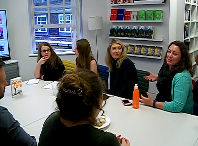
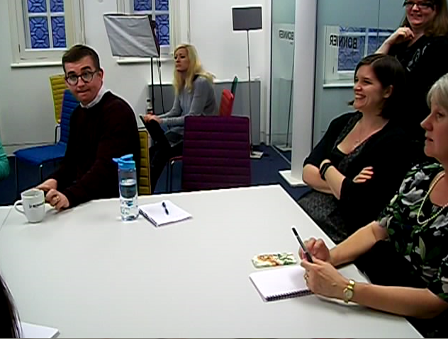
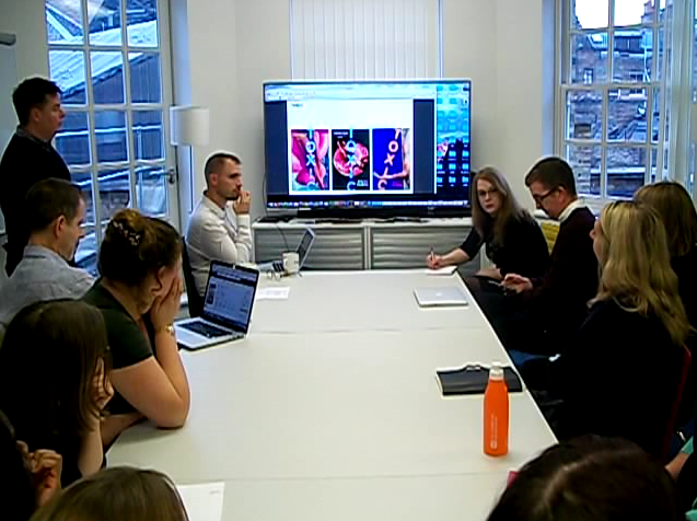
After I finish grilling the staff it's time for the weekly cover meeting, where design and sales get together to look over the work in progress and share opinions. Once everyone is gathered in the brightly lit conference room, covers-in-progress are flashed up on a wide screen TV.
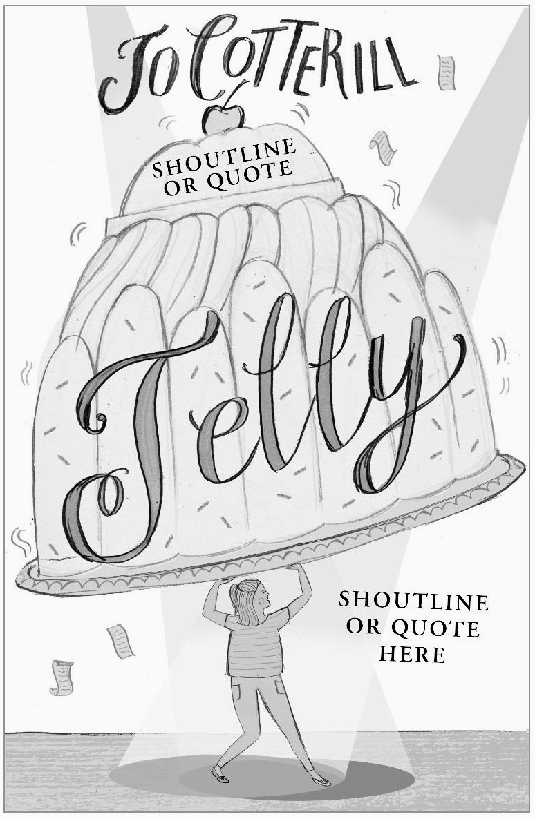
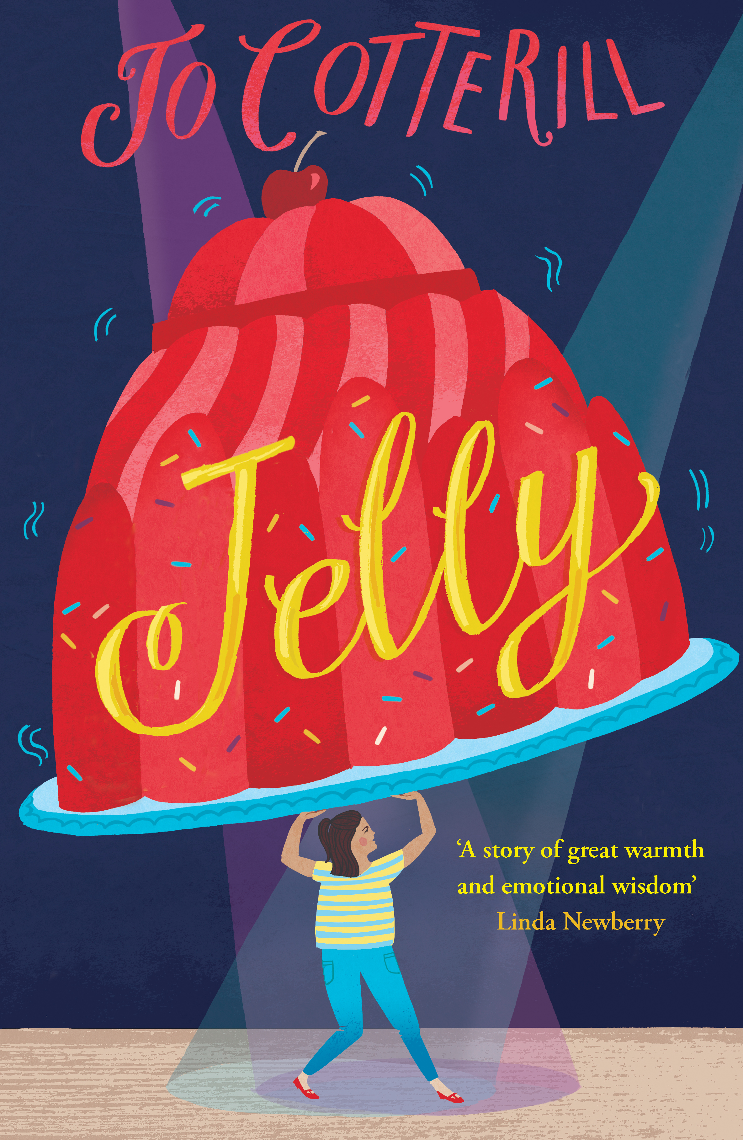
Jelly by Jo Cotterill (due out May 2018) deals with issues of body image from the female perspective. Freelancer Anneka is working on the cover. A previous version raised concerns that the girl looked too old fashioned in her dress and so has now been given a more modern look of jeans and a t-shirt. The head of UK Sales points out that the authors name looks a bit cramped at the top and it's agreed that the title be scaled down slightly to give it more weight.
The next cover, for Toxic by Nicci Cloke, has six potentials covers at this stage, and divides the room. Everyone agrees that the vertical type placement is inventive but is this good or bad? The covers featuring tanned, toned body parts were deemed to be too “sexy” for a YA book, too Jackie Collins? Some present are concerned that the proposed covers too different from Cloke's previous covers. Most gave No. 2, the eventual winner, the thumbs up due to it being the most unsettling. Is the girl unconscious or simply enjoying the water? The darkness of the water not only makes the font pop but also adds to the sinister sensation. But is it too dark, some wondered? The head of International Sales is concerned about how well it would be received in Australia, so a metaphorical pin is put in it until feedback can be acquired.
Toxic being discussed in the cover meeting
Final Cover, Design: Sinem Eras
Something I notice right away during these discussions is how every single person in the room has a voice, no matter their role. Every opinion is valued and taken seriously. But it is by no means a formal meeting, more of a freeform conversation between friends, with lots of laughs, as they agree on what works and what doesn't.
Another thing I notice is how difficult it is for me to keep my mouth shut. As a designer and contributor to Spine, judging books by their covers is what I do, so it's really hard not to blurt out an opinion. I manage it though, reminding myself that today I am a journalist and journalists must simply observe with a detached eye.
After a short intermission it's time for the adult titles.
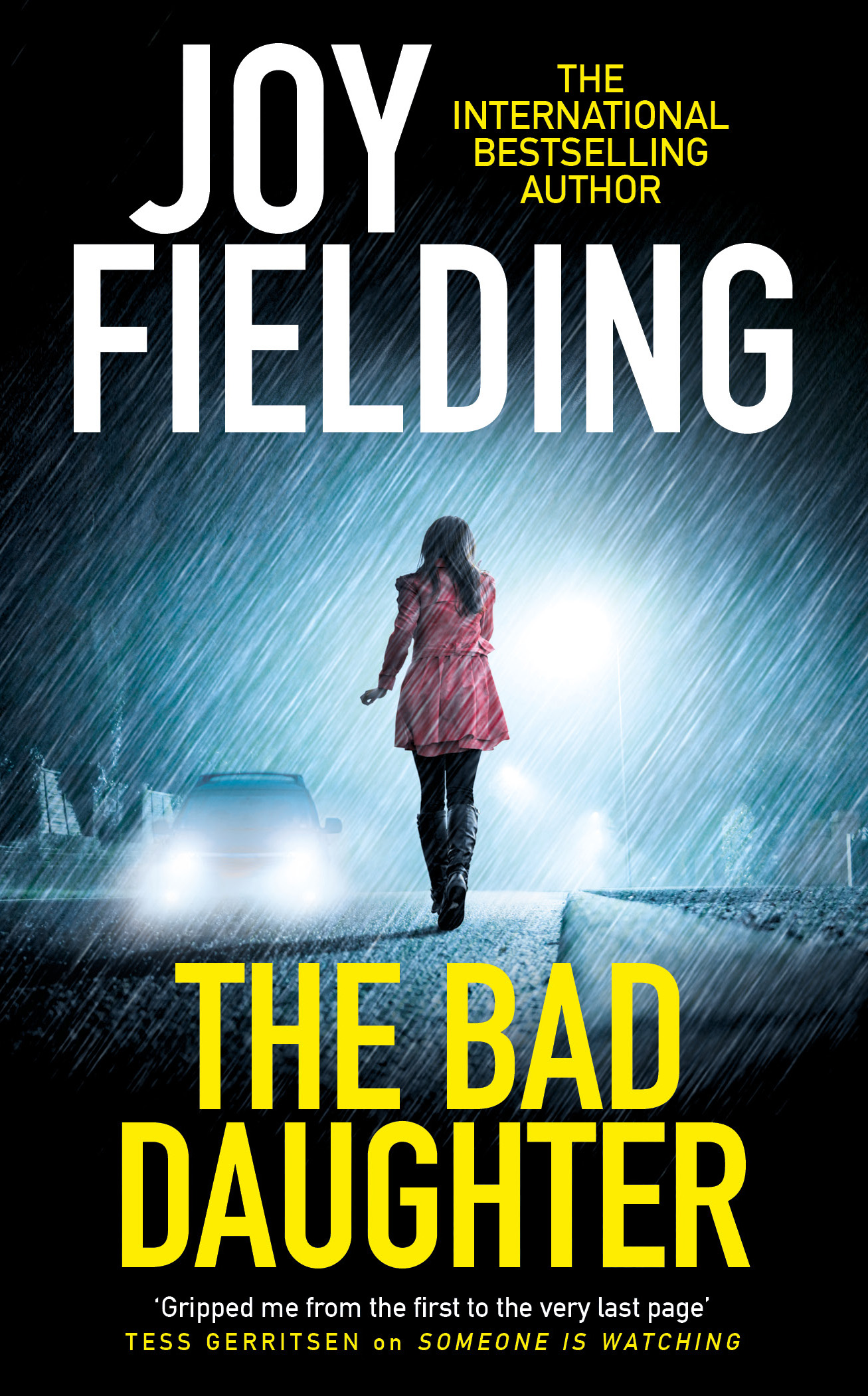
Drafts for The Bad Daughter, a thriller by Joy Fielding, are flashed up on screen. Thoughts are voiced before a pick 'n' mix approach ensues. Let's take the colours from No. 1, the type from No. 6, and add them to the layout from No. 2 All together these elements become the UK B format paperback. The export edition remains in keeping with previous branding.
Next up is Mr Peacock's Possessions by Lydia Syson, due out in hardback May 2018. Part Swiss Family Robinson, part Heart Of Darkness, this is another one that divides opinion.
Mr. Peacock
There are four fairly different approaches, each with it's own mood and connotations. No. 2 immediately jumps out at people, but is finally dismissed as being too “masculine” and “retro-looking.” No. 4, featuring a bird of paradise, seems to be the Marmite of the bunch: Some people love it, others are not so keen. Those in favour call it edgy. Those not in favour call it too busy. Stearn points out that “the jungle IS busy, there's a lot going on.” Is it too much for a literary hardback?
Everyone agrees that the imagery of No. 3 is beautiful but not right for the story. As the discussion ends it seems that everyone is leaning towards No. 1, but with a white background, as best representing the time period of the story. I was surprised to learn later on that No. 4 had been chosen to be developed further. But this is how Zaffre operates; things are always evolving, changing, growing. They are always striving for originality.
Back at their desks after the meeting, I ask Nick and Alex for their thoughts on future trends within design. Nick says he'll be glad to see the back of type-through-flowers which has been a “thing” recently. “In terms of colour (the trend) has gone from flouro-yellow to flouro-orange.”
Alex chips in. “When we saw the top 10 Sunday Times in the summer – all the covers were blue, all of them, it was interesting.”
“Ours was the only yellow one, that was for Exile (by James Swallow), set amongst all the blue. Great for us!” replies Stearn.
How do they think these colour trends start?
“The sales team will sometimes pick up on it and go 'this has sold this many copies, can we have something like this please?'” And it goes from there, says Stearn.
I've thoroughly enjoyed my outing to Bonnier Zaffre. It's obvious that they're a close knit team who get on well together and this is what makes them great. I'll leave it to the lovely Nick Stearn to sum up:
“The good things about us is we're small, we're 40 people, we're drawn from all of the other major houses... we're all here so we know the industry and being small means we're quite agile. We can react quickly to new trends. We're all quite a new team here and we've already doubled in size and we've gone up ten-fold in terms of turnover and profit. It's exciting.”
Join us in celebrating the enormous talent that goes into making books. Consider a small donation to our Patreon fund. Your support helps us provide you with an in-depth look at some of the book publishing industry's most creative people.
www.patreon.com/spinemagazine
Editor, artworker and lifelong bibliophile.


