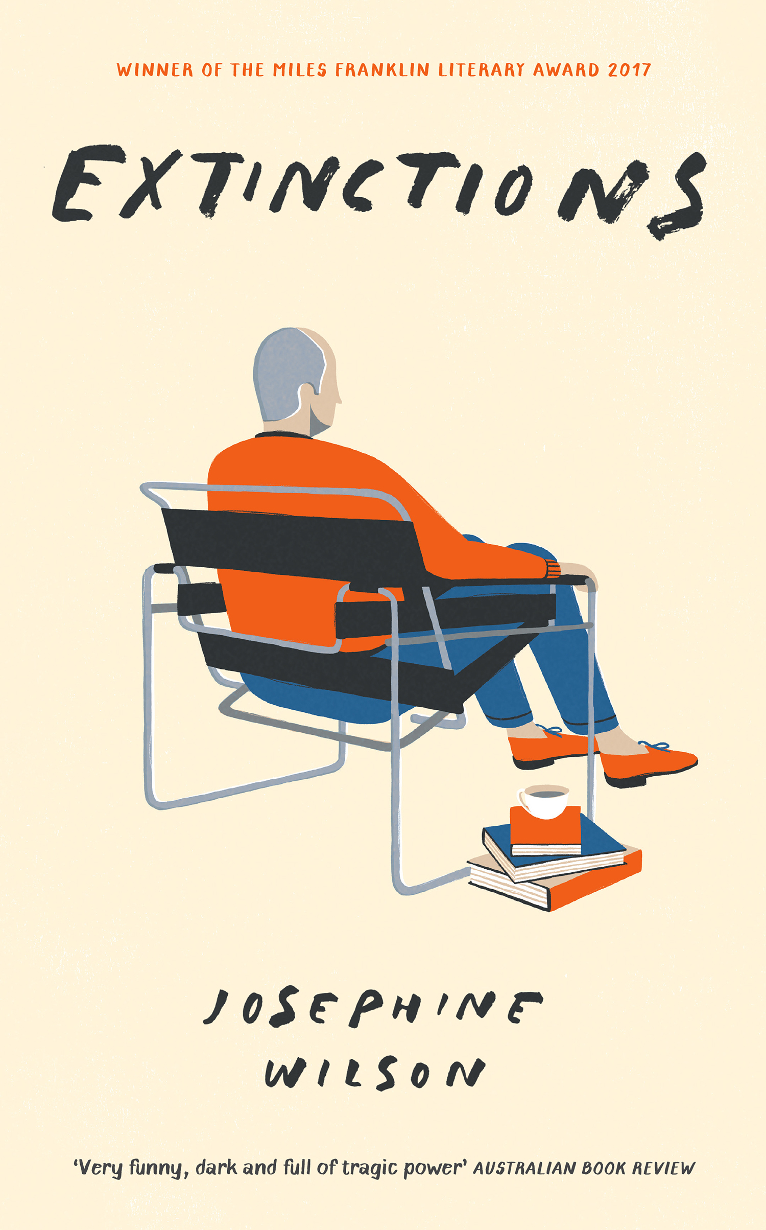
David Doran Keeps it Minimal for the Cover of Extinctions

David Doran is an award winning illustrator based in Falmouth, UK. From his studio by the water, he works with international brands, magazines, festivals and publishers creating illustrations of all shapes and sizes. His debut book Alphabet Cities is available now in a bookshop near you. Here he takes us through his process for creating the jacket for the hardcover edition of Josephine Wilson’s Extinctions.
In October 2017, I was approached by Steve Panton, designer with Profile Books (now working at Little, Brown Book Group) to work on designing the cover for Extinctions, by Josephine Wilson. The story follows Frederick Lothian, a retired engineer who has quarantined himself from life by moving to a retirement village in the suburbs of an Australian city. The book explores the theme of extinction in all it’s forms - natural, racial, national and personal.
Throughout his life, Frederick Lothian placed a great deal of emphasis on the objects he’s collected and, now that he’s nearing the end of it, has amassed quite a collection. The more I sat with the story, I felt how there was a lack of human connection and communication throughout, and that the furniture and objects instead held so much importance. I explored the idea that these objects could build a portrait of the character and, in the cases of sketches #4 and #8, could potentially be stripped back to the bare structure of the objects, almost seeing them through an engineers eyes with simple ink drawings of the silhouettes.
We decided on #1, focusing on Frederick in his beloved Marcel Breuer B3 chair, with a small pile of books by his side. I liked that this cover was set against a simple background - taking the object and character out of context, and stripping the image back to it’s simplicity and function…a design sentiment shared by the Engineer.
Visually, I was enjoying how these coloured backgrounds in the mock-ups were feeling. Though it felt like we needed to, again, strip the image back even further and have the character sitting against a simple off white background. The colours were seeming a little too jolly for the story; we needed to find a balance between simplicity and not looking too sad and lonely!
For the final rendering of the lettering, although the initial scribbles in my sketches were merely placeholder titles, Steve was enjoying how these developed and I think the loose brush strokes add a human element to the cover. For a story that’s all about human connections & relationships, or the lack thereof, this felt necessary for the cover to communicate.
Final Cover
Editor, artworker and lifelong bibliophile.
