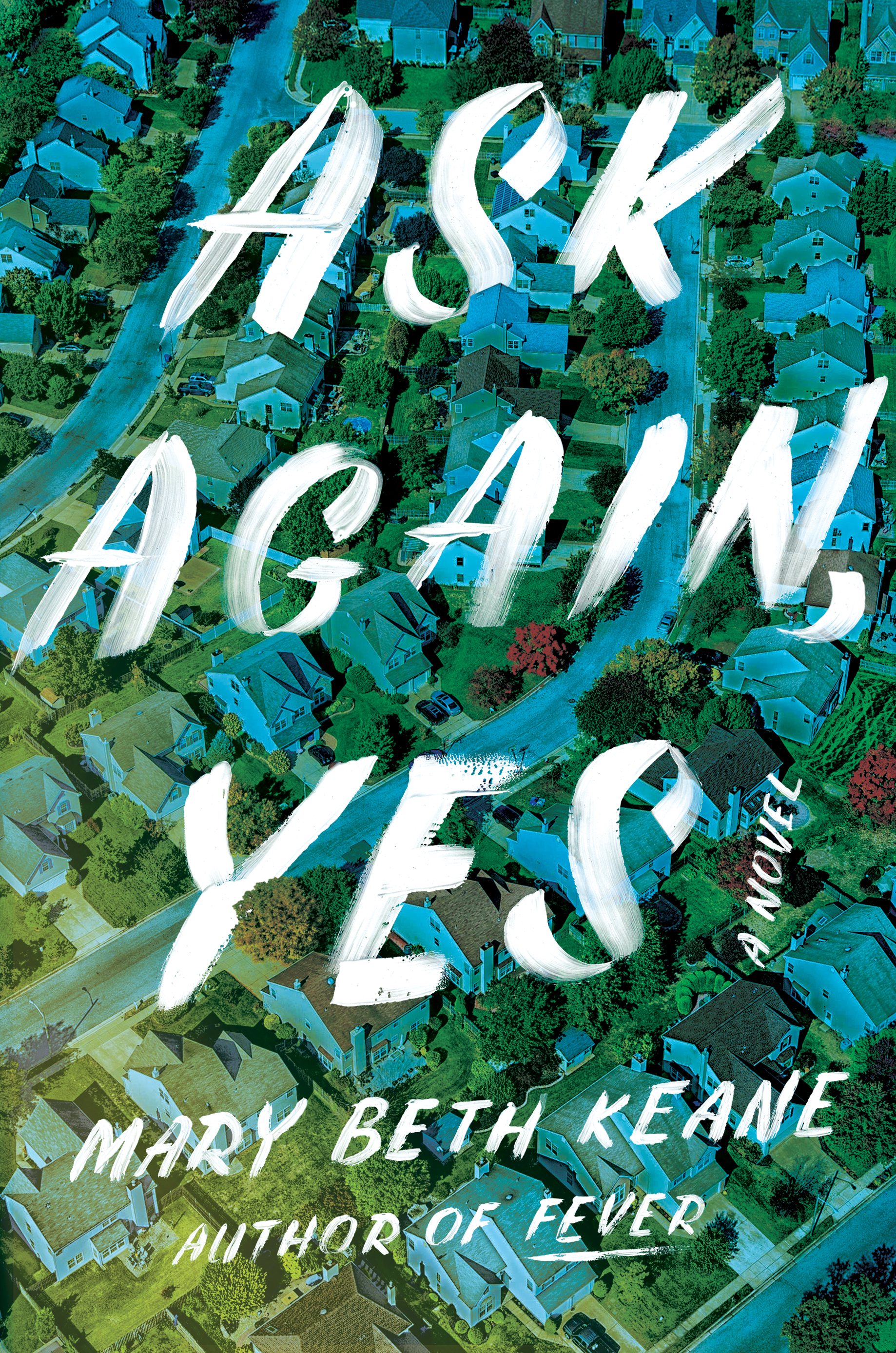
David Litman Designs an Epic Cover for Ask Again, Yes
David Litman is a graphic designer and Assistant Art Director at Simon & Schuster in New York City. Here he outlines his process for creating the vibrant cover for Mary Beth Keane’s Ask Again, Yes.
A lot of designers talk about the trouble of working on a cover for a book that they really like. For me, it’s usually that I’m trying too hard to represent all the complexities of the novel rather than focusing on a simple idea and executing it in an attractive way. This book had me going down a lot of wrong paths in trying to do it justice.
The story is an epic about two families who move to a town outside New York City. Without giving anything away, there is a tragedy and the characters spend the rest of the novel and many years reconciling this event. Thematically there’s a lot to unpack - issues of mental illness, the American suburban ideal, family, love, secrets, forgiveness… A lot.
I started with some abstract images of houses. This has already been done quite a bit, and a lot better than what I was coming up with. Something felt small about them too. Again, this was a big book.


At one point I became fixated on the title, and it’s connection to Ulysses: “…and then I asked him with my eyes to ask again yes and then he asked me would I yes…” That’s when I had to stop and ask (again,yes) why the hell I was reading Joyce when I should be designing something.
Okay; simple concept: suburbs, secrets, something not quite right… Fine.
I started experimenting with photographs of suburban landscapes that felt big and epic like the book is. The idea was to take these images and add a twist to them to show something being off, or damaged. The technical term for this is the “fuck-it-up” method.


I had amassed a huge collection of suburban photography and was again feeling a bit stuck. When this happens I usually start focusing on typography rather than imagery to carry the message.
The hand lettering is based on a very common style of lettering that you see in delis and storefronts and car washes; very quaint, very American. There are entire workshops and YouTube videos on how to do this lettering perfectly, but luckily it didn’t want to be perfect; it wanted to feel human and fallible. I used a brush loaded with gobs of white block printing ink to get a dimensional texture.


I tried this treatment with dozens of my collected images and this one worked. Something about the kinetic gesture of the lettering with the sweeping columns of roads and houses played nicely. The lettering managed to effect the background image in the way that I had wanted with my fuck-it-up comps.
When I saw it I knew that it was a book about people, not concepts, which I think was my real problem when I started out. For a book focused on tragedy, the title was hopeful and the energy of this design seemed to capture this.
I wish it was more of an “Ah-hah moment,” but this was one of those cases of stumbling in the dark and finding a light switch. Sometimes my designs come to me all at once, fully formed, and it’s just a matter of getting them down on the page. Other times it’s a process of working through a lot of bad ideas, putting in the time and waiting for the right thing to show up in front of me.
Final cover
Editor, artworker and lifelong bibliophile.