David Litman on Designing Sensation Machines

David Litman is a graphic designer and assistant art director at Simon & Schuster in New York City. Here he takes us behind the scenes of his design for Adam Wilson’s Sensation Machines.
Literary speculative fiction is a genre that I love and one that I can also find to be a challenge. It’s very easy to lean too far into the fantastic elements of the piece which can make the package look too much like commercial sci-fi. This book is about marriage, capitalism, and a very human drama with the sci-fi elements being a farcical backdrop.
The novel takes place in a post-Trump dystopian near-future, and everything you can imagine that goes with that. There are augmented reality helmets that some people wear which project a personally tailored version of reality. The character describes his augmented Brooklyn neighborhood as a kind of amusement park version of itself; everyday street life mingled with fantastical objects, space-ships and aesthetics inspired by various fictional worlds. I was very drawn to this imagery.
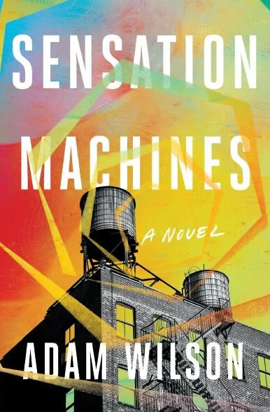
The art director, for SOHO press, Janine Agro, suggested ways of portraying this augmented reality while still feeling literary and not too sci-fi. Perhaps an image of Brooklyn that is affected or has a suggestion of being altered rather than literally interpreting a scene from the book. The other direction was depicting the AR helmet itself in an artful way.
The artwork feeling hand-crafted and a little messy seemed like a good way of pulling it out of a genre pigeon-hole. I experimented with a few collages of Brooklyn photographs paired with crazy painterly colors and prismatic shapes.
Another comp showed the shape of the visor with the augmented city contained within.
I also tried torn paper with surreal, hyper-color Brooklyn juxtaposed with it’s black-and-white “reality.”
The AR device is described as looking sort of like a motorcycle helmet, which was tricky to represent because the package didn’t want to feel like a book about motorcycles or, again, look too down-market sci-fi. I was afraid it would look like a storm-trooper helmet or something if it was too representational. The solution here was to draw a sketch of a helmet, the lines a bit naive, with an altered image of Brooklyn within. This made it feel less literal, more metaphorical. Though I think it still looks like a motorcycle helmet.
I liked the idea of depicting a contained micro-verse. An image that felt both like a world you could enter and an object that you could hold. The final cover is a collage of Brooklyn buildings and unexpected objects like glaciers and a space shuttle. The palette nods to Instagram and social media giving it a tech-y feel. The image has a haunting, dystopian vibe while still appearing bright and colorful. Something about the mechanical aspects and organic shape played off the title nicely.
Final cover
Editor, artworker and lifelong bibliophile.

