David Mann & A Black Fox Running
David Mann is an Art Director for Bloomsbury Publishing. As well as designing covers for the likes of Margaret Atwood and William Boyd, he has created this stunning cover for Brian Carter. Here he walks us through his process for creating A Black Fox Running.
This was a wonderful title to work on. One of our authors, Melissa Harrison, absolutely loved this book – first published in 1981. She describes it as a lost classic, and the book that made her a writer, and brought it to Alexa von Hirschberg, her editor's attention who completely agreed. It really is a classic and we have published it as such for a whole new generation to enjoy.
In the same way that Watership Down and Charlotte’s Web managed to make the characters of the animals completely wholly believable, in Black Fox, we have Wulfgar, the dark-furred fox of Dartmoor and his nemesis, Scoble the trapper in the pitiless winter of 1947.
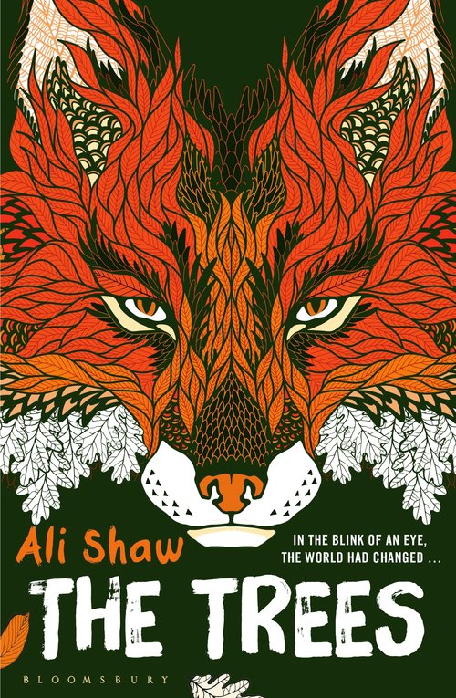
This cover was quite challenging in an unexpected way, as I had recently designed two other titles that both featured foxes on their covers! So, I did want to design a cover very different to both Ali Shaw’s The Trees, and The Many Selves of Katherine North by Emma Green.

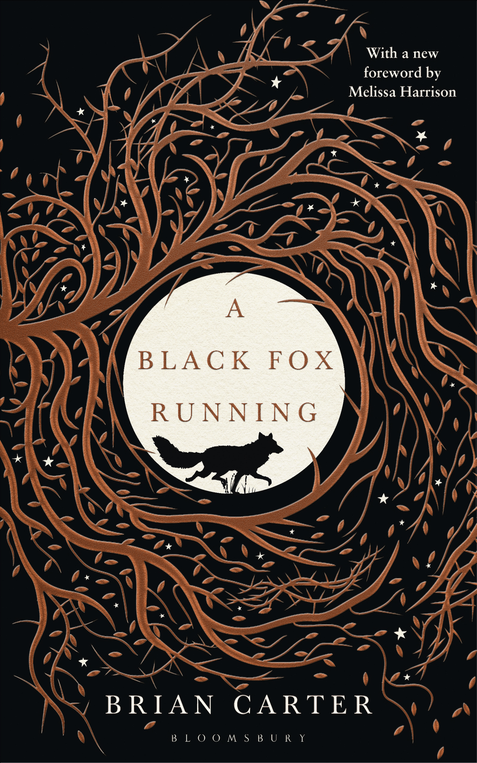
Premonitions, dreams and the mystical world are prevalent, and images of the moon and stars so I had this in mind from the very start. It also doesn’t shy away from painful themes either, so I didn’t want to produce an overly bucolic feel to the package. Asking a designer to design a cover with a fox is a bit of a gift, so I tried many options. I usually design up to a dozen concepts playing with the hierarchy of title, author and image – so when I present at my weekly cover meeting, the Editors and Sales and Marketing teams can feedback on which is closest to the package they feel will attract our potential reader most successfully.


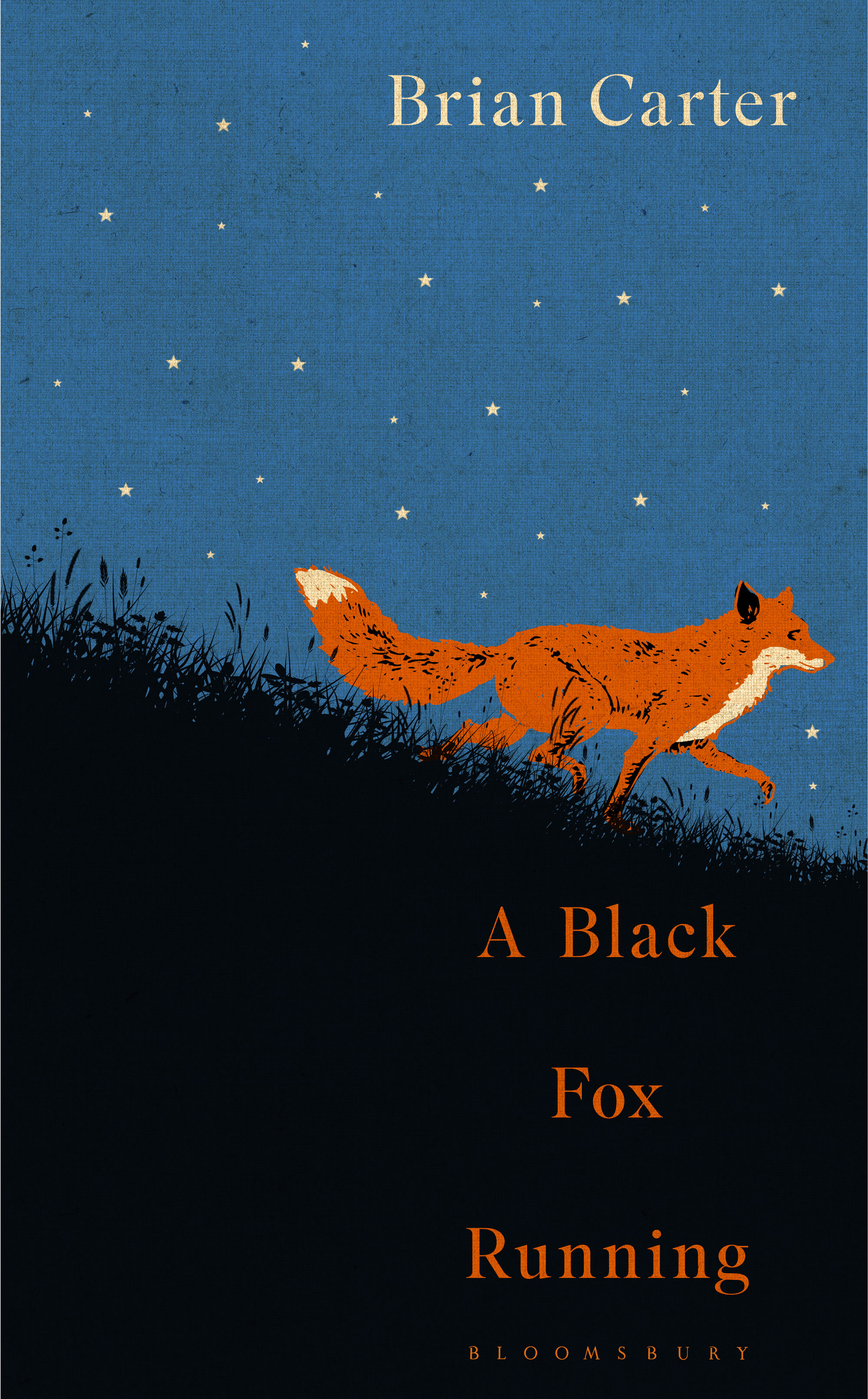


As a designer in publishing, we’re very used to absorbing lots of different feedback, and working out how best to address all the information gleaned in those discussions. As often happens (fortunately!) we did have a shortlist in the first round with the team liking the simplicity of a design of a moon with the fox scurrying by, and another more complex image of the fox running through a forest, so I developed both. I was rather biased to the simpler ‘moon’ concept, but soon realized this didn’t present the ‘whole picture’ of this complex novel. It needed a bit of danger, a feeling of claustrophobia.


And so I surrounded the moon with a maze of leafy branches, and felt we were nearly there so Alexa sent the cover to Melissa, who is such a wholly creative person. She has an encyclopedic knowledge of all things natural – even down to helping me position the fox’s legs properly to approximate the correct running gait. But the real spark of genius from their discussion was to add thorns to increase the drama of his entrapment. (Kicks self for not thinking of that…)


Brian’s family loved the cover! I did feel a huge sense of responsibility to do Brian’s work justice, so that came as a great relief.
Final cover
Then, I worked closely with our brilliant production controller Francesca Sturiale. With every title, we discuss what is possible to really bring out the best in the design of each book. Fran has fantastic attention to detail, and every job is scrutinised to ensure we get every detail at it’s very best. We really wanted to make this one glimmer, and finally decided on copper foil, which on the black base ranges from being dark and sinister to brightly gleaming.
I have Wulfgar seated on the back – I thought he deserved a well-earned rest!

Join us in celebrating the enormous talent that goes into making books. Consider a small donation to our Patreon fund. Your support helps us provide you with an in-depth look at some of the book publishing industry's most creative people.
www.patreon.com/spinemagazine
Editor, artworker and lifelong bibliophile.