David Mann on creating the cover for The Seven Deaths of Evelyn Hardcastle

David Mann is an Art Director for Bloomsbury Publishing. As well as designing covers for the likes of Margaret Atwood and William Boyd, he has created this stunning cover for Stuart Turton. Here he walks us through his process for creating The Seven Deaths of Evelyn Hardcastle.
I’d never worked on a cover like The Seven Deaths of Evelyn Hardcastle before, simply because I can’t think of anything like it. It’s an incredible piece of writing by Stuart Turton that defies a single genre - Gosford Park meets Inception via Murder on the Orient Express anyone?! The eponymous Evelyn dies time after time at a country house ball, as party guest Aiden wakes up in the body of a different guest every day to solve the mystery of her murder.
Alison Hennessey, the editor of Raven Books has an encyclopedic knowledge of every possible genre of crime and I’ve already been treated to briefs on the brilliant Gothic mystery of Laura Purcell’s The Silent Companions and Delphine de Vigan’s contemporary thriller Based on a True Story. How to brief this mindbender?!
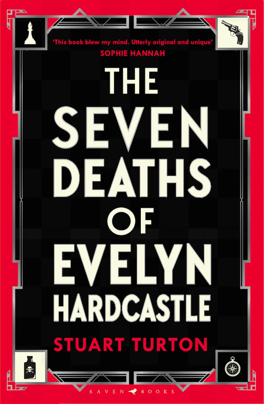
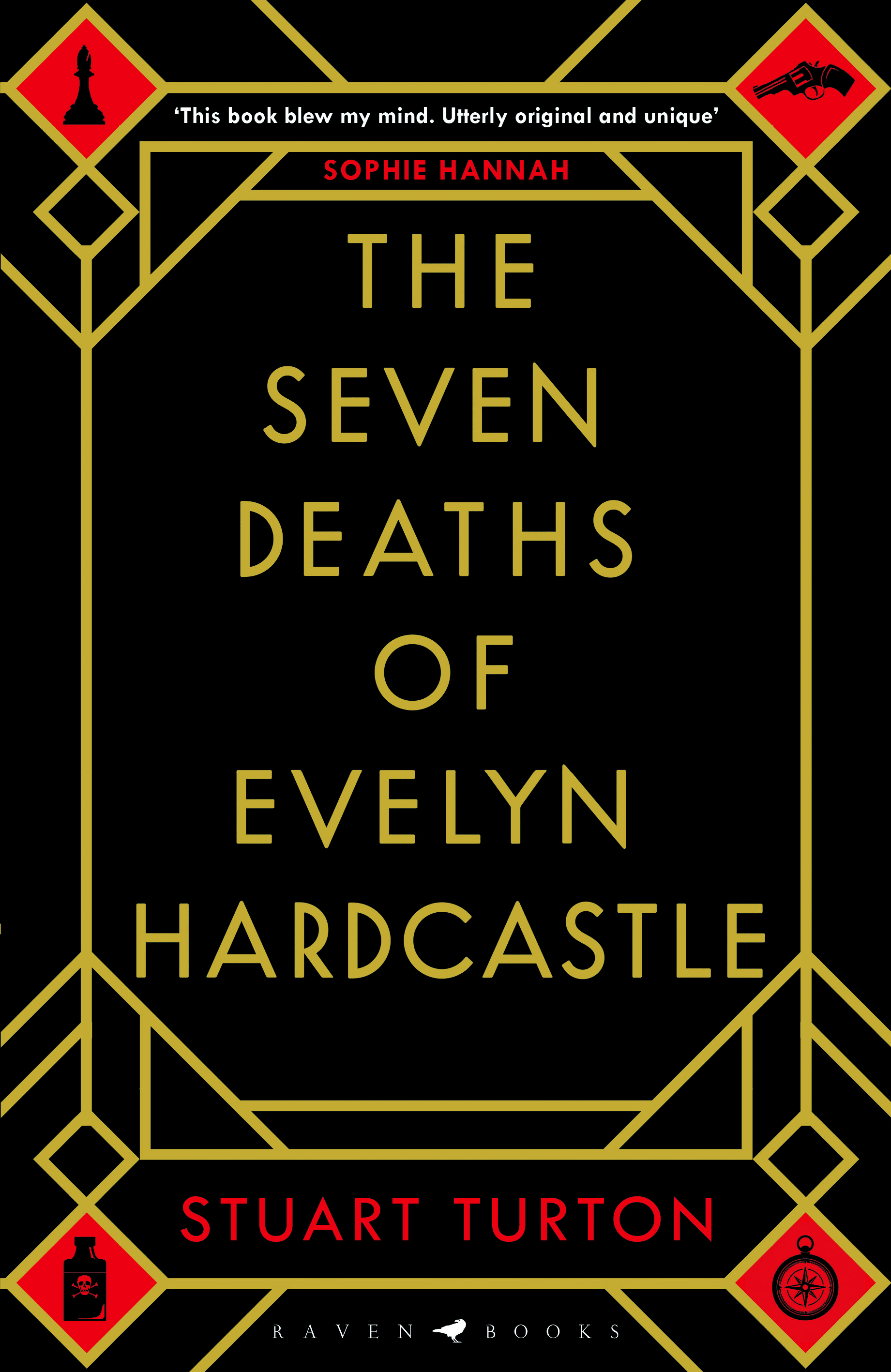
It is a great, long title - so we soon decided to focus on a largely typographic cover, with hints to the plot with pivotal icons that you’ll discover a long the way. As a reader, I love referring back to a jacket and taking in elements that gradually make sense as the plot reaveals itself. As I read Seven Deaths I made notes as I went along - a chess piece, a compass, a revolver... also the checked floor, red carpet and ornate mirrors in the entrance hall of the great house. Early on the colour palette of black, red and gold to various degrees came into focus - all signifying a period/crime/decadent tone to the cover.
I wanted to get a feel of a floor plan onto the cover and experimented with that as I tried options incorporating icons that I hoped brought to mind the classic Cluedo and murder mystery icongraphy. Eventually we settled on an Art Deco inspired framework that felt sharp, layered and fractured to convey the complexity and period of the story. Along the way I also tried checked designs that originated from chessboards and the checked floor of the entrance hall.
Quite often I find designs get stronger with the less is more approach and we whittled away and reduced elements to make the cover more direct, and hopefully more classic. The focus was to be the title, which is so compelling that it really did just need framing to make it center stage.
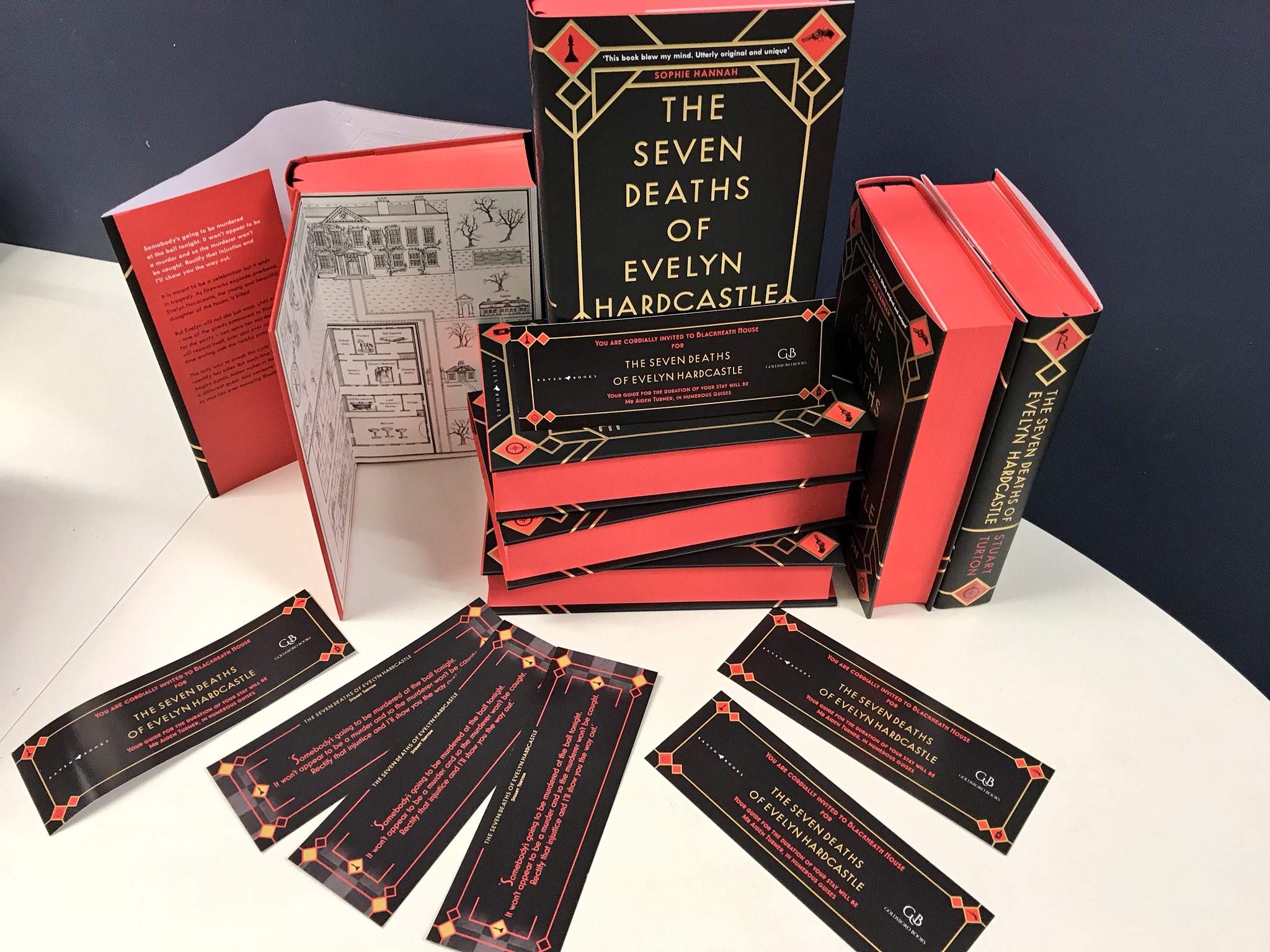
Alison also commissioned Emily Faccini to illustrate beautiful floorplans for the endpapers, which give a detailed layout of the house and gardens that really brought the whole package together.
Once again we relied on Fran Sturiale to make her usual impeccable job of production who pulled out all the stops with embossed gold foil, and spot gloss on details. We’ve also produced a signed, limited edition for Goldsboro books with red sprayed edges and a ribbon that looks divinely decadent!
Join us in celebrating the enormous talent that goes into making books. Consider a small donation to our Patreon fund. Your support helps us provide you with an in-depth look at some of the book publishing industry's most creative people.
www.patreon.com/spinemagazine
Editor, artworker and lifelong bibliophile.


