The Covers of Devangana Dash: a Delightful Blend of Graphic Design and Deeply Human Illustration

New Delhi-based visual artist and designer Devangana Dash knows daring color and deviant lines. Just look at her covers for works like Goodbye Freddie Mercury, Auroville, and Heart: A History, and you will find that oft-coveted balance between crisp, modern design and the gorgeous singularity of the human hand. Dash works as an in-house book designer for Penguin Random House India, where a constant influx of creative projects requires her to design, illustrate, and correspond with clients daily.
Even though design is Dash’s line of work, she still finds time to illustrate, create, and stay in touch with the passion that eventually became her career. “My role as a book designer is primarily designing book covers—from decoding the cover brief, conceptualising, to making the book ready for production. In addition to art directing and designing covers, I also work on illustrated art books (picture books, coffee-table books, adult colouring books), and often design the inside layouts.” Dash said. “Apart from my full-time job, I have a particular interest in storytelling, and love illustrating and writing for children’s picture books.” In fact, Dash has already written and illustrated her first children’s picture book The Jungle Radio: Birdsongs of India, which will be published by Puffin in April of this year.
Although Dash has worked for an array of clients and designed covers for all types of books, her favorite projects are literary fiction and children’s literature, as they allow for the most interplay between the text itself and the cover that encases it. “I like that you can stretch your imagination canvas beyond limits [when working with] fiction. In the enthusiastic pursuit of discovering scenes and motifs for the cover I also end up reading most of the fiction books I work on (always a plus for your annual reading-list!)” Dash said. “[I] also discovered that I enjoy working on re-jacket editions of books-previously published with different covers. It’s like wrapping a known book in a new skin, a book which has already been identified on a bookshelf—a daunting yet satisfying task.”


When Dash isn’t engrossed in cover design, she revels in illustration. And she’s damn good at it. “Two of Dash’s cover designs have been recognized by the Oxford Bookstore Book Cover Prize: The House That Spoke, authored by Zuni Chopra (shortlisted in the top 6 book covers in Jan 2018) and Masters on Masters authored by Amjad Ali Khan (long-listed in the top 12 in Dec 2018). My illustration process is a blend of traditional and digital and usually involves conceptualising, drawing and painting by hand and do the finishing on computer,” Dash said. “I prefer working in mixed media—with the the base in gouache or watercolors, add details with crayons or pencils, and then further enhance it on the computer,” Dash said. “So far I have illustrated some of the covers myself, and created inside illustrations for a children’s book Ayesha and the Firefish (Puffin Books, 2015). Interestingly, the cover for the book also made an appearance at Times Square in June 2016.” Some of Dash’s previous clients include Child Rights and You, World Wide Fund for Nature (WWF) India, Katha, Wildlife Trust of India, Centre of Environment Education, among other non-governmental organizations based in India.
As far as Dash’s creative style goes, the artist considers herself a student of the natural world and the five senses. “I believe my visual style to be blend of bold colours, layers, and organic textures,” Dash said. “For inspiration, I rely on nature and wildlife (especially birds and sea turtles), picture books by my favourite artists and authors, different genres of music and world radio, and a cup of tea.” Just consider the covers below (and our artist’s commentaries on those covers): we cannot help but detect the colors, layers, flavors, and even sounds of Dash’s designs. Lines and colors dance, producing a sort of synesthesia where we, too, can see sound and taste color.
Goodbye Freddie Mercury (Hamish Hamilton, 2018)
GFM was one of the most exciting projects I worked on with Penguin. When the book came to me, it was one of the much anticipated literary-fiction titles of the year by a debut novelist. Since its inception, me and my literary editor were on the same page about this cover needing to scream one thing, i.e. rock ‘n’ roll. After reading the first few chapters of the manuscript, I knew the book had to be packaged like a cult novel: the story had everything it needs to be a cult film, like music, drugs, love triangles, mysteries and murky politics. The writing was fresh, pacy, and robust against a setting of the raw, desi Lahore and the cover needed to do justice to this mixed-bag of flavours.
Coming to the cover concept, the GFM universe revolves around the two young protagonists whose paths cross dramatically—Nida, a student and a daughter of a conservative household, and the famous and privileged Bugsy—a radio jockey in the nation’s only English radio channel. These two youngsters are also the prime narrators of the story with every chapter carrying their alternating voices, which gave me the idea to have their upside-down portrait on the cover. The cover illustration therefore has a bold and confident Nida and Bugsy, against an edgy psychedelic background suggesting the lifestyle of the youth characters in the story. Though the story had a contemporary setting with millennial characters, its setting was the historic city of Lahore, which the writing beautifully illustrated with a blend of nostalgia. To bring out these roots in the old city, the composition has motifs on the border, inspired by the famous vivid and decorative truck art of Pakistan.
After composing a cover concept, the next step was to get an artist on board who can finely execute the cover illustration, in a style similar to the vintage rock ‘n’ roll posters. I was fortunate to collaborate with the exceptionally talented artist Samya Arif from Karachi, Pakistan. Samya’s visual style and her enthusiasm and was a perfect match for this cover artwork. She executed the brief beautifully with her fine sense of composition and colour, and the entire process of collaboration with her was extremely enjoyable and fruitful.
For the final colour palette, we chose to go ahead with an electric blue, fuchsia pink and a bright yellow scheme. The author was particular about using a distinct yellow that we associate typically with Freddie Mercury—you see him wearing a iconic, bright yellow military style jacket in a concert during his Europe tour, which further made its appearance in music videos and posters. It was one of the best design decisions we made, since it is the yellow which makes the book stand out on the shelves. These brilliant, pop colours came out beautifully on a uncoated finish paper in the final printing of the cover jacket. We further packaged it in a bright yellow binding fabric, and lush fuchsia pink endpapers.

Heart: A History (Viking, 2018)
In the summer of 2018, I was asked to design the Indian cover edition of Heart, a book that was to be simultaneously published in the US and UK with two different covers. Heart is a beautifully written memoir by cardiologist and author Sandeep Jauhar that tells a story of our most vital organ, and of the doctors who gambled with their careers and patients who risked their lives to understand it. I found the writing serious and informing in its overall tone, with bits that were personal and self-reflective. A challenge here was to not make the cover look clinical in any way, but to still achieve the gravitas of the genre it was placed in. I visualised the cover to be a clean, poignant, and minimal artwork.
The final cover has line art of the vital organ: the basic structure of the heart with its intricacies. I had already seen both the covers of the international editions, which had painted illustrations of the heart, I thought it will be wise to retain the personality of the book and have another illustration for the third edition. I believe we humans load the image of a heart with so many feelings and interpretations, we give it the personality we want, according to how we feel about the world around us. Hence it was difficult to come up with one image of the heart that summarises all of its complexities and mysteries. I wanted the cover to not over-write any of the notions of this enigmatic organ and have an uncomplicated, simple artwork. To communicate the prime function that our heart serves i.e., pumping blood, I kept an illustration of a red and a blue heart, symbolic of the oxygenated and de-oxygenated blood respectively. The two hearts intersect and overlay, to suggest that it is thriving as one beating heart. The title was done in a formal, classic type, with a soft healthy pink for background of the cover jacket. If one rolls out the entire cover spread, it is partitioned into three colours—soft pink, and its two coloured flaps: blood red, and a royal blue. For the final packaging I gave a soft pink case for the binding fabric, and solid red endpapers.
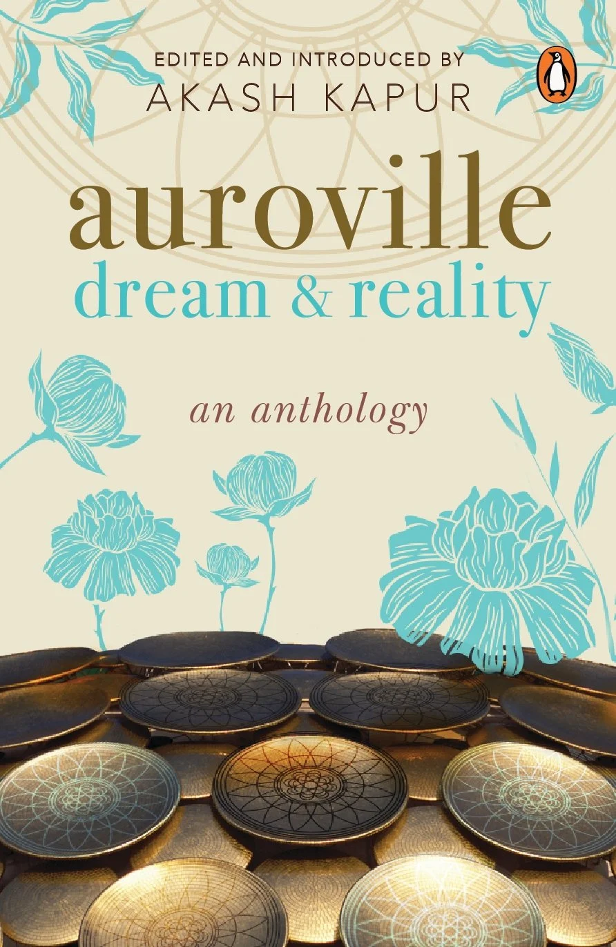
Auroville: Dream and Reality (Penguin Books, 2018)
This cover design was for an anthology of writings on Auroville—a spiritual township based in Pondicherry, India. The town is a brilliant example of communal living, since it was built brick by brick and sustained by its people. The writings in the book situated Auroville as a constantly evolving place, built on dreams, hopes, ideals, and hard work of the community. Bringing out the vast complexity of the layered meaning of this place, on a limited canvas of the cover was a real challenge. I had the fortune of visiting the township myself a couple of years back, and had a vivid memory of the place and it’s energies. While designing the cover, for inspiration I went back to my journal for the motifs, memories and the stock of photos that I documented during my travel.
On the cover artwork, you see a part of the ‘Matri Mandir’ (Sanskrit for ‘Temple of the Mother’), an iconic structure, situated in the centre of Auroville. It is also called the soul of the city, and it made perfect sense to have the central structure on the cover. The structure is a dome, made of intricate golden discs that reflect sunlight, that give it a radiant, metallic shine. I wanted the cover to be spiritual, graceful and wise in its mood and colours—white and gold, with elements that show growth and richness of life. To also complement the title ‘Dream and Reality’, I wanted a slightly fantastical twist, with the dancing blue flowers on the golden half dome that represents the rich, abundant land. An important section in the book is dedicated to ‘work’ and the active daily life in Auroville, after a brief reading of which I picked up some motifs and scribbled tools of labour on the back cover of the book. The idea was to bring out the spirit of ‘making’ the settlement by the people, as a tribute to the amount of labour gone into building this town, and structures and systems that shape the economy and social organisation of Auroville even today. For the post production, the title was done in bronze colored foil, to complement the metallic golden disks, and the artwork was printed an uncoated paper.
You can check out more of Devangana Dash’s work at her website: devanganadash.com.
Mary Ryan Karnes is a freelance writer and a Master's candidate in fiction at the University of Southern Mississippi.