Eleanor Crow teams up with Illustrator Yehrin Tong for Infused

Eleanor Crow is a book cover designer, illustrator and deadline observer. She likes to draw everything from armadillos to zucchini. Yehrin Tong is a London based illustrator whose work is a detailed and hypnotic exploration into mathematical and abstract pattern. Here, Eleanor talks about their creation of the cover for Henrietta Lovell’s Infused.
Henrietta Lovell is best known as the Rare Tea Lady. She is on a mission to revolutionise the way we drink tea by replacing industrially produced teabags with an appreciation for the best quality leaves. Her quest sees her travel to the Shire Highlands of Malawi, across the foothills of the Himalayas, and to hidden gardens in the Wuyi Shan in China to source the world’s most extraordinary tea. Infused takes us on a remarkable journey, introducing us to the people who grow and craft the precious leaves as well as the celebrated chefs who serve them. And always guiding us is Lovell herself, who tells the story of how her love affair with tea has shaped her life through times of both great joy and adversity. The result is a delicious infusion of travel writing, memoir, recipes and glorious photography, all written with Lovell’s unique charm and wit.
Designer Luke Bird started on the project when in-house at Faber. He proposed a pattern based cover with a label, and suggested the illustrator Yehrin Tong. The rough visual has an existing illustration by Yehrin just as a placeholder.
Luke subsequently went freelance, and was unable to proceed with the project at that time, so it was given to me to take on.
I briefed Yehrin for some illustration ideas, to feature teapots, tea leaves, landscapes and other items featured in the book.
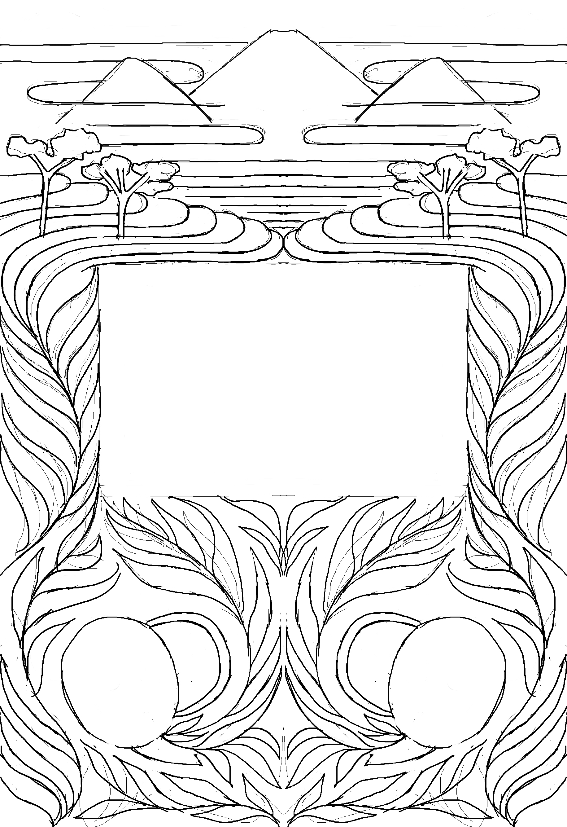
Yehrin is wonderfully inventive, and came up with a number of polished sketches, cleverly devising complex patterns that incorporated small teapots and a swirling pattern of steam and leaves.
Some versions were densely detailed with a complex and fluid repeat, others were looser, incorporating a stylised and symmetrical landscape incorporating a number of motifs.
I soon found that the label concept, although it had looked good on the first proposal, obscured too much of the pattern. The rectangular shape didn’t sit happily over the sinuous forms of Yehrin’s illustrations created for this book. It felt as though the label was pushing the relevant parts of the illustration out to the edges, making them hard to read.
We decided to focus on a single large teapot, which then became the label shape containing the type, created in negative by the steam/tealeaves pattern emanating from the teapot. It seemed more evocative of the behaviour of steam, as well as suggesting the rich and abundant growth of the tea leaves.
The dark green background was matched to a sample sent to us by the author, and suggests the strong, dark green colour of tea leaves. The gold foil blocking adds a lustre to the overall design.
As Yehrin sent through work in progress sketches, I also found that the original Bodoni italic used for the title type no longer made sense within the teapot shape. The sloping forms and the marked contrast between the thick and thin strokes had looked elegant on the original label shape, but we needed something stronger and simpler to work in a more decoratively shaped label.
We used Core Circus from S-Core as the display face, paired with P22 Johnston Underground for the body copy on the jacket flaps. Even without its extra 3D layer effects, Core is a wonderfully simple typeface with a charming rounded quality that seemed to echo the teapot shape.
Final cover
The endpapers are a dark green, the binding spine lettering is blocked in gold on white boards, and there’s just a flash of red on the head and tail bands.
Yehrin’s strength is to match a clever concept with exquisite pattern-making – she turns every book jacket she works on into a thing of beauty.
Editor, artworker and lifelong bibliophile.


