Ellie Game on Designing A Little London Scandal
Ellie Game is a London-based designer of books at 4th Estate and William Collins. Here she talks us through her process for designing the vibrant cover of A Little London Scandal.
Part whodunit, part portrayal of 1960s London, A Little London Scandal tells the story of Nik Christou, a rent boy in London who has his life turned upside down by an accusation of murder. His friend and confidante Anna Treadway believes he is innocent and is determined to find him an alibi. The book explores themes of establishment, corruption, sex and secrecy, and when the brief came to us I knew it was one I wanted to work on.
The editor was keen for us to look at a photographic treatment, something fresh and bold with a strong sense of period. Her brief included lots of brilliant images from the 1960s, and the author had pulled together a great Pinterest board too. In this instance I didn’t get to read the manuscript, but all of these visual references really gave me a feel for the setting and tone of the novel and provided a jumping off point for me to do my own picture research.
I was looking for an image that would strike that perfect balance of reflecting the spirit and tone of the book while also depicting the right combination of the period, place and person – easier said than done!
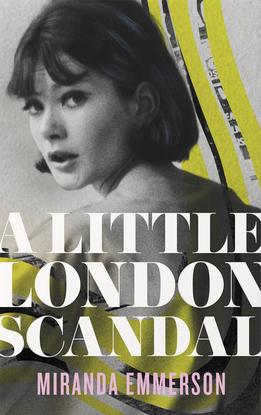
Luckily I did find lots of great imagery, and in the first visuals I put together I had fun collaging some of them together - my thinking being that I could communicate more of the story with multiple layers and textures.


I liked these on their own, but when I started combining them with type I felt like there was too much going on. I realised that the cover needed to be much simpler to have the impact we were looking for.
So I went back to the original images and began looking at using them in their entirety, but playing around with adding colour and bitmap textures to give them a bit more punch. I looked at a few different type options at this point too, some more contemporary ones to contrast against the retro images and some 1960s inspired ones too.


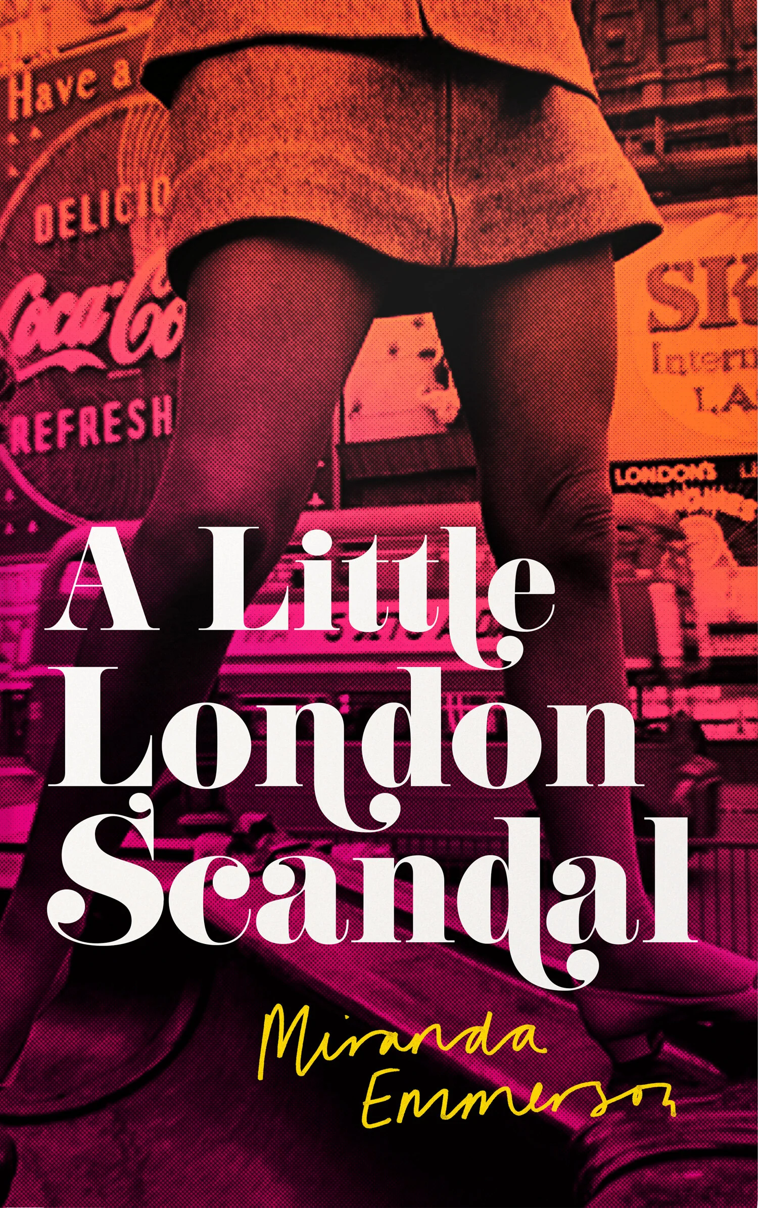
The cover we ended up going with actually uses an image that had been on the original brief, and I had been working with it early on in the process (sometimes the answer is staring you in the face!). In terms of reflecting the content of the book it was perfect as it sets the right tone, but as it doesn’t show a face it has a bit of ambiguity about it. I treated it to give it a bit more texture, added a colour overlay, and, when combined with the 60’s influenced typeface and hand-drawn type on the author name it just seemed to capture the spirit of the novel perfectly!
Final cover
Editor, artworker and lifelong bibliophile.