Emma Ewbank, Creating A Thousand Paper Birds

Emma Ewbank is a senior designer for Bloomsbury. Her portfolio features many notable works including the design for Tor Udall's A Thousand Paper Birds. Here Ewbank describes for Spine what when into creating this remarkable cover.
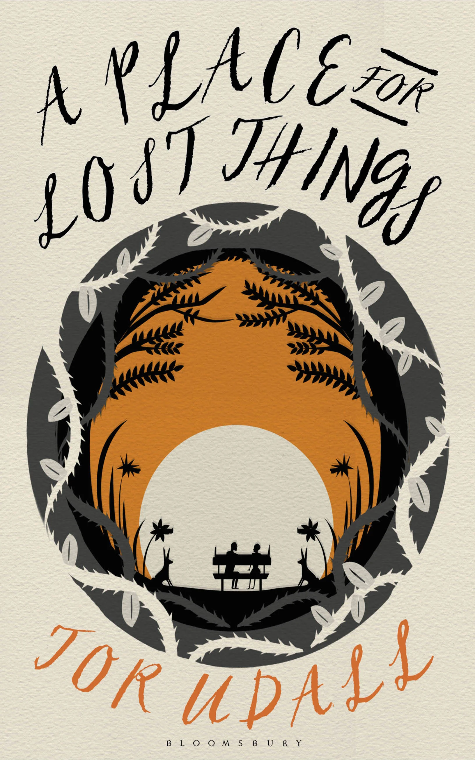
When I first got the brief for A Thousand Paper Birds (originally called A Place For Lost Things) I knew instantly it was going to be a really exciting cover to work on. Tor Udall, the author, weaves a beautiful and sad story of love and loss, interlinking five characters set over four seasons set in Kew gardens. The plot is intimately bound to the nature of Kew gardens, and it was important that we were able to show that on the cover. One of the characters in the book, Chloe, is an origami artist and that automatically opened the doors into exploring origami for the cover as well as making paper a key theme.
Using these elements of origami, paper and nature, I started to design up some of the visuals featured here. From the get go, finding some way of using a paper cut was in my head, as I knew it would add interest and depth to the cover. My process for illustrating is sketching out the elements and then going over them with the pen tool in illustrator, which gives them a ‘not perfect', playful finish to them. I then piece everything together in Photoshop.
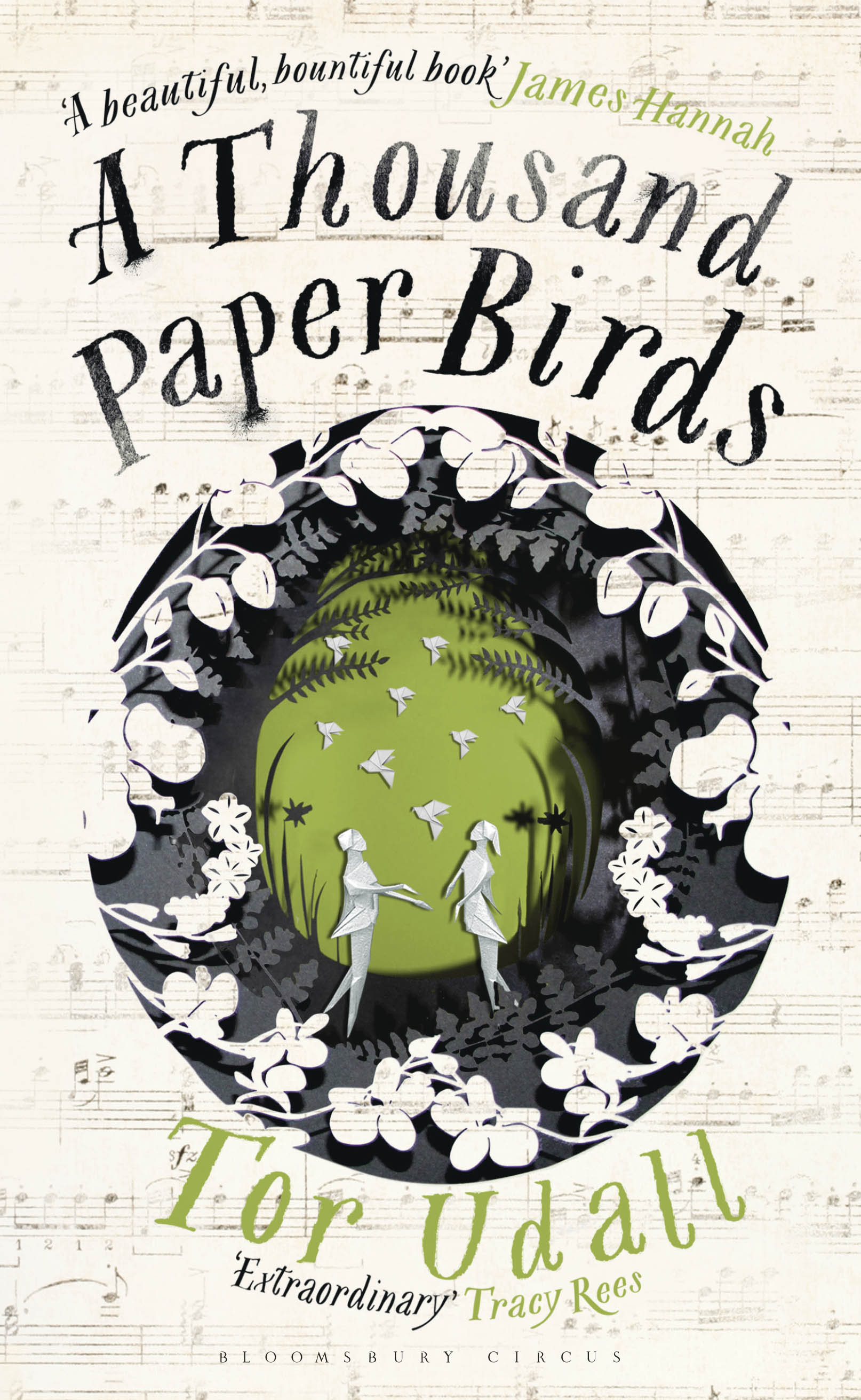
As you can see, the orange circle cover was the one most liked in the cover meeting, which was then developed. From this visual I had more contact with the author and between myself, the author and the editor, the cover we see today started to take shape. The title of the book changed to A Thousand Paper Birds, which meant that it was important that origami was brought back into the cover.
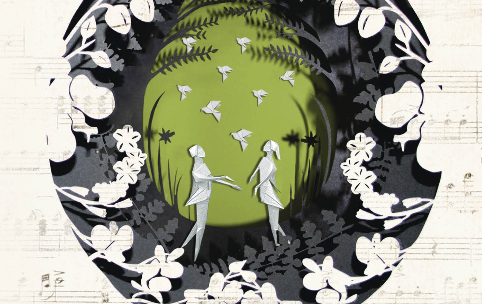
The first layer of the cover, which looked more like thorns from a wood, changed to orchids, which feature prominently in the book, and origami people and birds were used as the central focus. I would love to say that I made the origami myself, and I did have a go, but it is a lot harder than it looks! So for this part of the cover, these were Photoshopped in. The three different layers of this cover were then sent off to a laser cutter, which can cut the finest detail. When they came back from the laser cutters, I then assembled the three layers on top of each other and then photographed them, and then brought them back into Photoshop - which I am so glad I did, as it really adds to the depth of the cover with all it’s natural shadows, which you just can’t recreate in Photoshop. The final touch was layering sheet music over the first layer of the orchids. This is a hint to the character Jonah who is a music teacher.
Although this cover involved quite a bit more effort than some, due to the physical making of it, it was a joy to work on. I would say the best part of this job is hearing that the author loves their cover. At the launch of this book recently, the author told us all in her speech that this book was twenty years in the making. Drafting, re-drafting, adding and subtracting as well as enduring the rejections from publishers that all go hand in hand with being a debut author. I am delighted that Tor is really happy with the cover we ended up with, and am so glad we went that little bit further with it and pushed it into the shape it has become. If the cover helps a book along the way with the success it deserves, I can be very happy with that.
Join us in celebrating the enormous talent that goes into book cover design. Consider a small donation to our Patreon fund. Your support helps us provide you with an in-depth look at some of the book publishing industry's most creative people.
.
www.patreon.com/spinemagazine
Editor, artworker and lifelong bibliophile.


