Lucy Kim on Designing the Cover for Fly Me

Lucy Kim is an Art Director for Little, Brown & Co. in New York City. Among her designs is the amazing cover art for Daniel Riley's Fly Me. Here Lucy details the creative rationale behind the work.
This was one of the first projects I was given when I started working at Little, Brown last year. The editor presented the title at a meeting and it sounded like a really fun project – a story about an airline stewardess in the early 70's, still on the cusp of the glamour days of air travel. Just the thought of doing the visual research for this alone was enough to make anyone want to work on this. I mean, take a look at what planes looked like back then!


The Furniture. The Uniforms. And on top of it all, the ART!!!


The author, Daniel Riley, even lent me a book of his on airline identity design history, filled with amazing examples from the time period. The cover practically designed itself! Well, not exactly.
One of the things I love best about my job is the actual reading involved. I was an English Lit major in college and started learning about design while working as administrative support for an art department after I graduated. And I fell in love with book cover design because I found that not only do you get to read the books, but you have an opportunity to 'translate' the book, visually, and help it find its right audience. And the idea of being able to contribute in such a big way to helping a reader find a book they might enjoy, maybe even love, makes me so grateful to be able to do what I do.
But ANYWAY, I read the manuscript and came away with two things: 1) the main character of Suzy is one of the coolest protagonists I've ever encountered in a book, and 2) the early 70's setting of the fictional town of Sela del Mar is described so vividly that it's pretty much the other main character in the story. There was actually a third thing as well – it's a really good read and the ending blew me away!
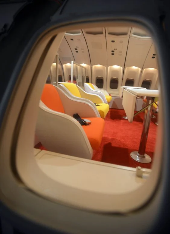
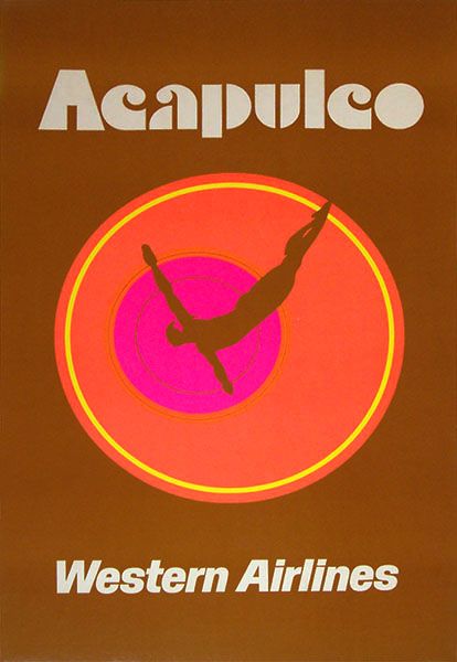
So based on my initial research I had an idea early on to do a beach scene of California in a flat style mimicking those vintage travel posters to Hawaii or Mexico. But after reading the manuscript and being utterly engrossed by the author's narrative I started worrying that a scene of the setting could never really capture the way the author brought it to life. And it wasn't actually meaningful to anyone unfamiliar with the book because at the end of the day it was just a picture of a beach with a boardwalk and an ocean – even with the retro styling and type it didn't speak enough about the book. I also tried some designs based on vintage airline logos incorporating images of California beaches. There was one design based on airline windows that got kicked around for a bit, but with the help of some sales feedback the whole group agreed that none of them were getting to the heart of the story, which was the character of Suzy herself.
So I then began searching for an image of a young woman on a beach from the early 70's – I really wanted a vintage photograph because the place/period is, like I said, so well-described that I wanted to be as faithful to the book as possible. Now we all know these pictures exist, we've all seen old family photos of folks frolicking on the beach with weird swim caps, etc. But finding one of just the right woman, of a quality good enough for reproduction on a book jacket, as well as being legally available for us to use? That's another story. If I had a year to research, maybe, but time is money and I wasn't finding enough of the right images of women in time. I expanded the search to any women who fit the right scene/physical description and decided I would find a way to incorporate the time period once I found the right figure.
Not restricting the search to the 70's helped enormously and I found a few images that had just the right woman/expression/etc. This is when the visual history research also came in very handy, and I played a lot with color and texture to emulate some designs of the late 60's/early 70's. I liked this woman in the striped shirt best because she had the kind of stance and body language that seemed perfect for Suzy. I ended up 'Warhol-ating' her to get the design to look retro but still get some good colors on there. The editorial gang was good with it, sales/marketing got on board, and lastly the author and agent were content.
And there you have it. There were some bumps along the way but this book jacket was a real pleasure to work on because it's such a great read and there was so much visual inspiration throughout the process. It's one of those books that make me appreciate working in publishing.
Join us in celebrating the enormous talent that goes into book cover design. Consider a small donation to our Patreon fund. Your support helps us provide you with an in-depth look at some of the book publishing industry's most creative people.
.
www.patreon.com/spinemagazine
Editor, artworker and lifelong bibliophile.