Let's Talk Endpapers

I’ve always said that the most effective book designs involve some level of surprise. This might be something hidden within the image on the cover, some quirky juxtaposition of imagery, or to do with the production techniques. One of my favourite ways that designers provide surprise is through creative endpapers, where the viewer opens the book and finds something entirely unexpected and delightful inside the front page.
Technically speaking, endpapers are the pieces of paper glued into the inside cover of a hardback book. They are separate to the main text block and glued into place in the spine. A similar effect can also be created in paperback books, by printing on the inside of the cover. This effect looks especially luxurious when paired with French flaps.
Endpapers are literally a blank canvas. They aren’t thrust into the limelight like the cover and spine, and therefore can push the boundaries more. They don’t have to follow any particular conventions or be eye-catching in the same way. Beautiful endpapers are a reward for the customer who has gone that step further than simply picking up the book, who has been enticed into the pages of the book itself. They may not sell the book by themselves (although I have been known to buy many a book on the basis of the endpapers alone), but they may just be the factor that pushes the customer to the till. As with all aspects of book design, well presented endpapers demonstrate to the customer, either consciously or subconsciously, that the publisher believed that this book was worth putting extra effort into, and therefore worth reading.
The Butcher’s Hook
From a less consumerist perspective, endpapers are an opportunity to experiment and to play around with peritext that might not be relevant or eye-catching enough for the cover, but is in some way important to the text itself. This space is the perfect place to put a map for instance, or some sort of illustration of the setting. It might reflect something that’s going on visually on the cover. This was done beautifully with the hardback edition of Janet Ellis’ The Butcher’s Hook, where the endpapers are a negative image of the toile pattern on the front. In non-fiction it can be a good place to put images that perhaps couldn’t be printed in colour in the main text, or to have diagrams that don’t have an obvious home within the context of the book itself.
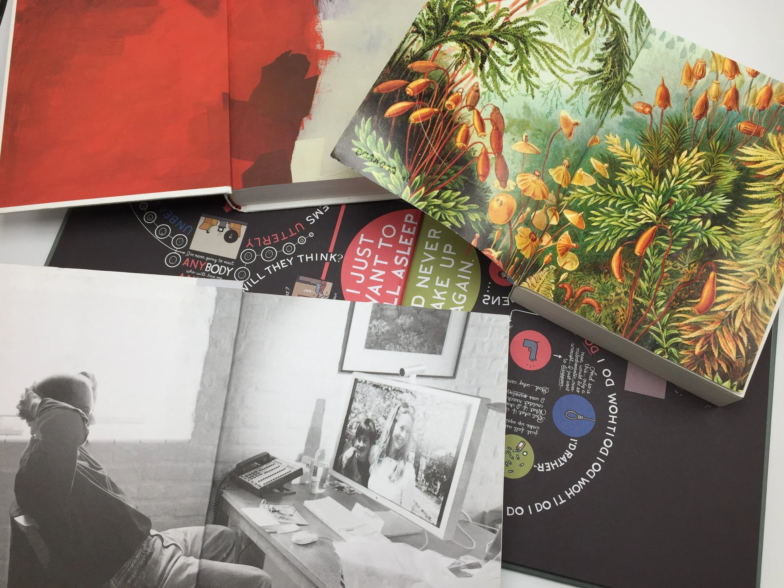
The Vorrh
My favourite kinds of endpapers are the ones where the cover of the book itself is quite plain, but the endpapers are very bright or lavishly illustrated. The UK edition of The Vorrh by Brian Catling is a great example of this. The cover is black and white, quite bold and graphic. The endpapers are an illustration by Ernst Haeckel, which is highly detailed and colourful, creating a wonderful contrast. Opening the book is like falling down a rabbit hole into a Wonderland-like scene, which sets up the tone for the book, which is a strange mix of science-fiction and surrealism.
This wouldn’t be an article about endpapers without mentioning Persephone Books, a small independent publisher based in London. Persephone reprint forgotten classics by women from the early 20th Century, and have a uniform aesthetic for their books. They all have grey covers with a small white plate displaying the title and name of the author. Delightfully, when one opens a Persephone book one finds, printed on the back of their paperback covers, a vintage fabric print from the era of the book. In this way these books can be both sleek and elegant on the outside, and full of personality on the inside, before you even read a word of the book. It also makes them highly collectable, as they look so stylish lined up with their matching grey spines. The Persephone shop in Holborn is a delight to visit, as they merchandise their books wonderfully with books open and endpapers on display. Each book also has a bookmark which matches the endpapers.
You might be wondering, in the world of ebooks and when so much book purchasing is done online, why are endpapers relevant? Surely they’re obsolete. Well this is where the bookseller in me comes out and makes some argument about bricks and mortar stores and how online shopping will never replace them. But it’s true. In the context of this article, endpapers are one of the things that makes the experience of book shopping worthwhile. They provide that element of surprise that you simply cannot find when browsing through thumbnails online. They are one of the things that publishers have been putting more effort into in recent years, precisely for this reason: endpapers and good design help to sell books. They are what make it worth our time and money to go into bookshops and browse. It isn’t just the author’s words that you are buying, it’s an object, and hopefully one that you will love and treasure for years to come.
Book Designer and BookTuber.