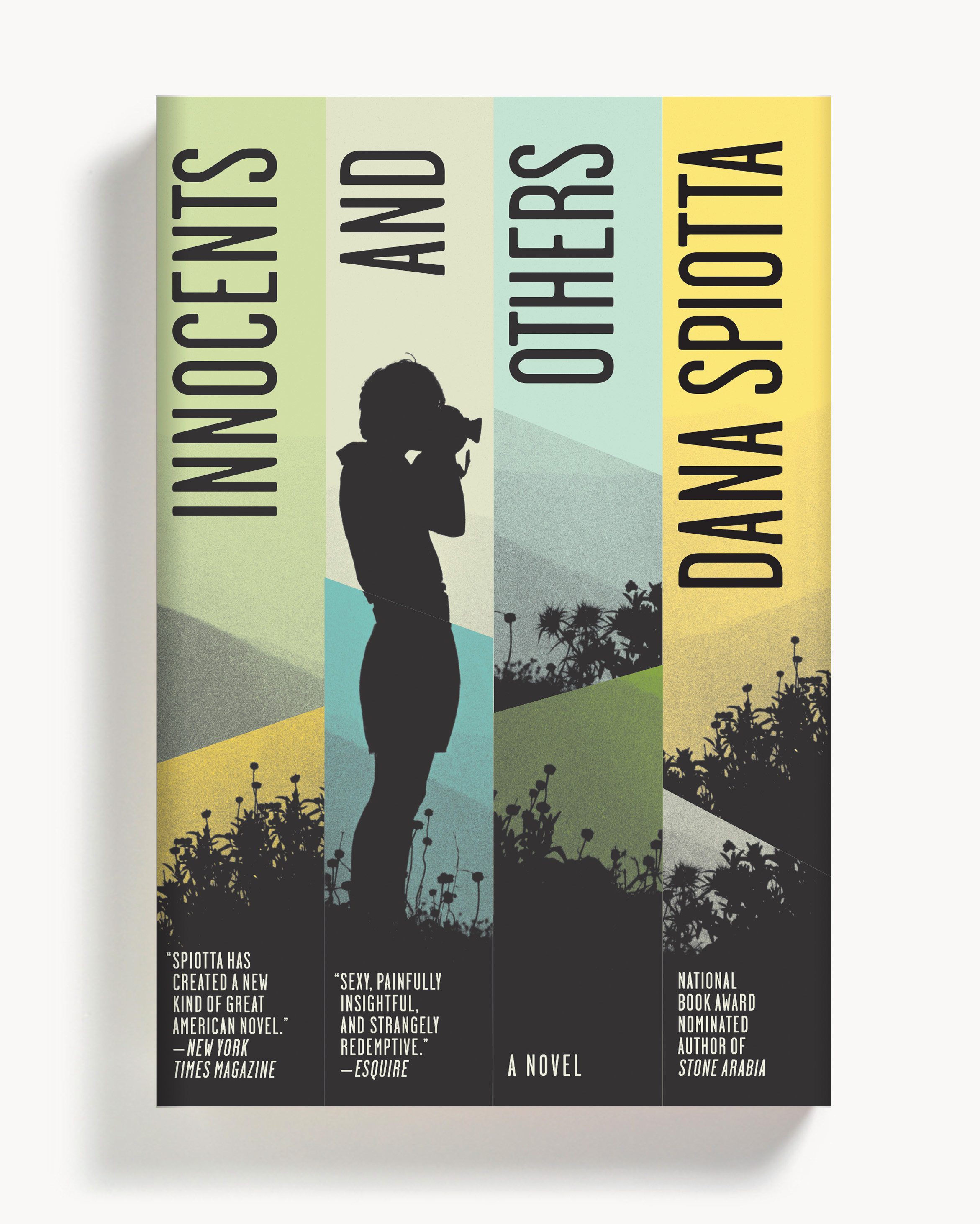
Strick&Williams, Innocents and Others

Strick&Williams is a Brooklyn based design firm whose work includes the creation of the book cover for Dana Spiotta's Innocents and Others. Here they detail their process for developing the piece.
Innocents and Others, by Dana Spiotta, is a coming of age novel set in the 1980s about two female filmmakers, tangled together through friendship and work. The book re-examines questions that have been on the table since John Berger’s “Ways of Seeing”; how do women see themselves, how do they see themselves as others watch them, and how does the fact of being seen impact female identity. Woven into the narrative is the story of a woman who does not want to be seen, but wants to be heard. She navigates her relationships with men exclusively through telephone conversations, creating a world in which watching is irrelevant because intimacy is achieved through listening. This surprising twist on the theme of being seen provides a worthy exploration into what happens when women’s appearances are not their primary social currency. The book is a very fresh take on how female identity is formed, and the role that friendship plays in that process.
Jaya Micelli, the art director at Scribner that approached Strick&Williams with this project, asked for a design that would reflect the edgy quality of the writing. Our design research led us to consider ways in which the concept of objectification has been visually rendered throughout the years. Art historians describe Manet’s “Olympia” as the first painting to demonstrate female acknowledgment of objectification, and since then many, many images have surfaced that convey the same idea and push past it. For the design of this cover we considered images that included mirrors, reflections, and lenses. We considered fractured, deconstructed renderings of women. We considered the dazzling quality of light that defines California streets and cinema.
The image that we finally chose shows a young woman standing on a hilltop with her camera. Her short shorts speak volumes about the inherent sensuality of the character she represents. Here is a young woman poised at the apex of her creative prowess. To create the Russian doll effect of seeing and being seen, we sliced up the image of the girl and her camera, so that it looks edited. The pointed, asymmetrical collage forms are reminiscent of the 1980s, as is the particular shade of orange used because it reminded us of Kodak. Finally, we turned the type on its side to force the visual emphasis onto the beautiful girl in her fractured landscape; a perennial subject for cultural examination.
Editor, artworker and lifelong bibliophile.
