Eric Wilder, Learning to Interpret Cover Design
Eric Wilder, book cover designer and publisher of Spine Magazine, recently designed the dynamic-yet-pristine cover for Learning to Interpret: Working from English Into American Sign Language for RIT Press. The cover, which features traditional letters as well as ASL ‘glyphs,’ encourages anyone who picks up the book to begin the work of interpretation right away, which was exactly Wilder’s intention. “Learning to Interpret is academic in nature and deals with interpreting in American Sign Language. My goal was to come up with a very clean yet engaging cover for the subject matter. And by engaging I mean, I wanted readers on some level to have to interpret the cover for themselves,” Wilder said.
Wilder designed Learning to Interpret while he was on a two-week excursion through Europe, and the whimsy of his travels manifested in all the designs Wilder sent the publisher. “The publisher wanted the job completed semi-immediately. I had just cleared my schedule of everything else, and notified my other clients that I’d be gone. So I actually had a good day or two to sketch out some ideas before taking off. I continued to work on it between sightseeing and dining, while my wife and two children recovered from jet-lag. Even though I was working out-of-pocket, it was the most ‘available’ I had been in a while,” Wilder said. “Just being in a different environment was influential on my process for this one. The bulk of my work is more novels than anything else, so the change of mindset and scenery was helpful.“
The options Wilder sent the publisher have the same goal (encouraging readers to interpret) but different visual elements.

Option 1
“At the time that the brief came in for this, Adobe had recently released a previously unpublished Bauhaus typeface that I fell absolutely in love with, Joschmi. I just really like the way that the type is structured to the point where it almost becomes more object than letter. When you read it you have to work at it a little bit, interpreting forms as letters subtly at a conscious level. To push the engagement further I broke the words ‘Learning’ and ‘Interpret’ in the title, and defined each word by assigning them separate colors.”

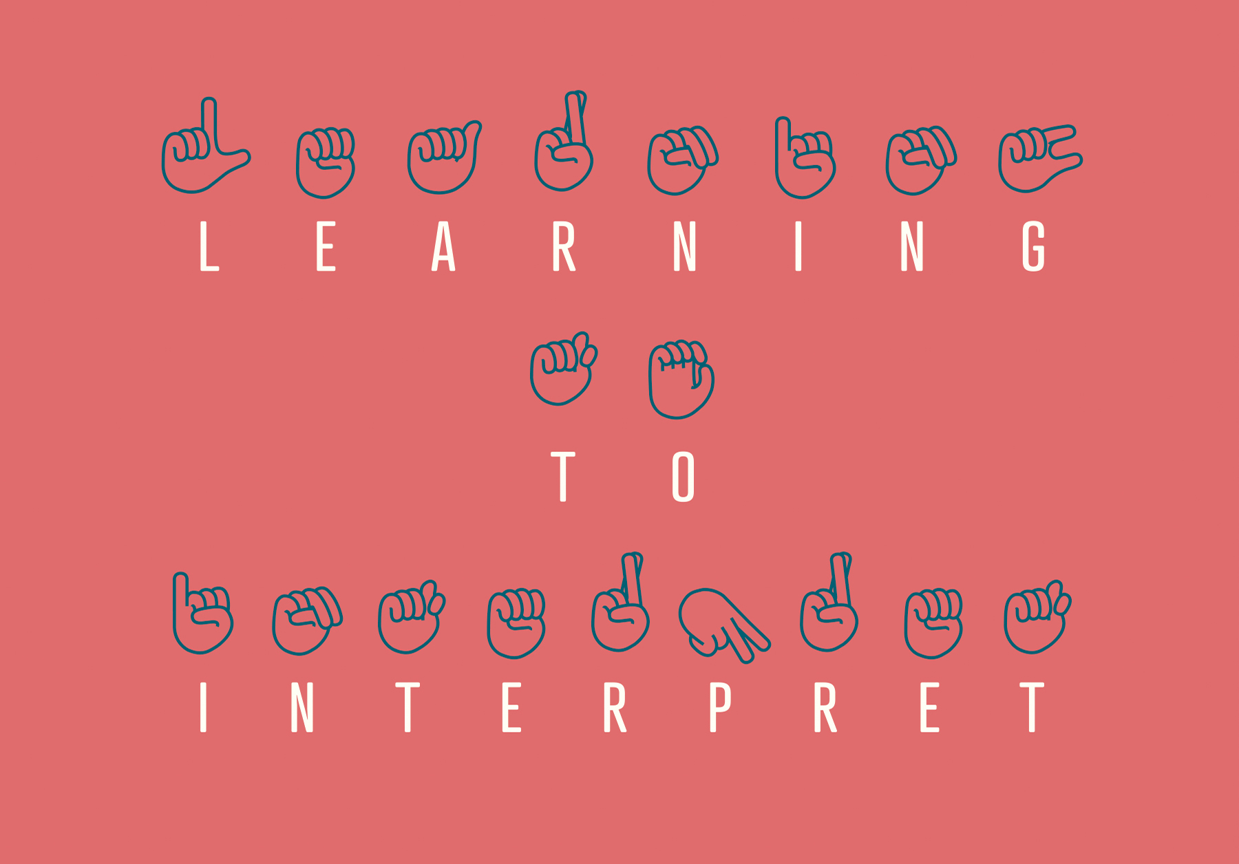
Option 2
“For this option, the title of the book is broken down into individual letters and then each letter matched with their corresponding ASL hand sign. The kerning was brought way out to slow down the read, and force the reader to pay some attention to the hand signs, and visually interpret each letter into sign language. The typeface, Atrament, serves the intent of this design.”
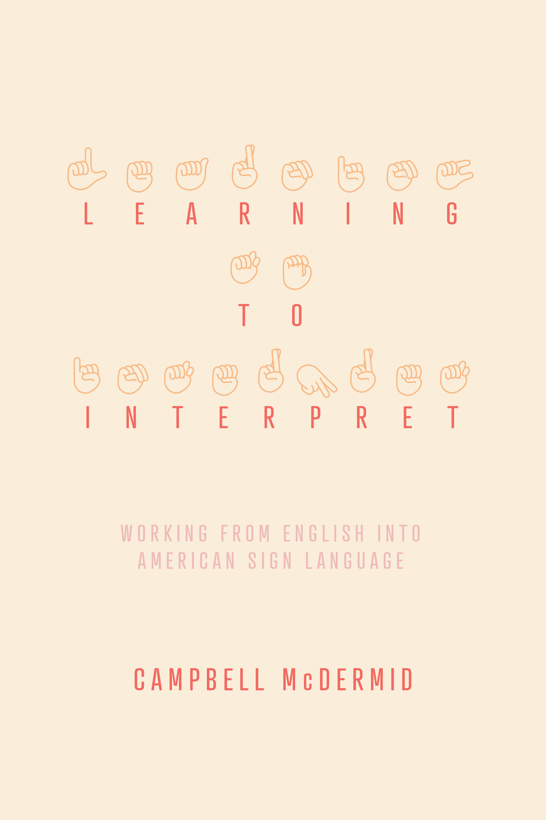
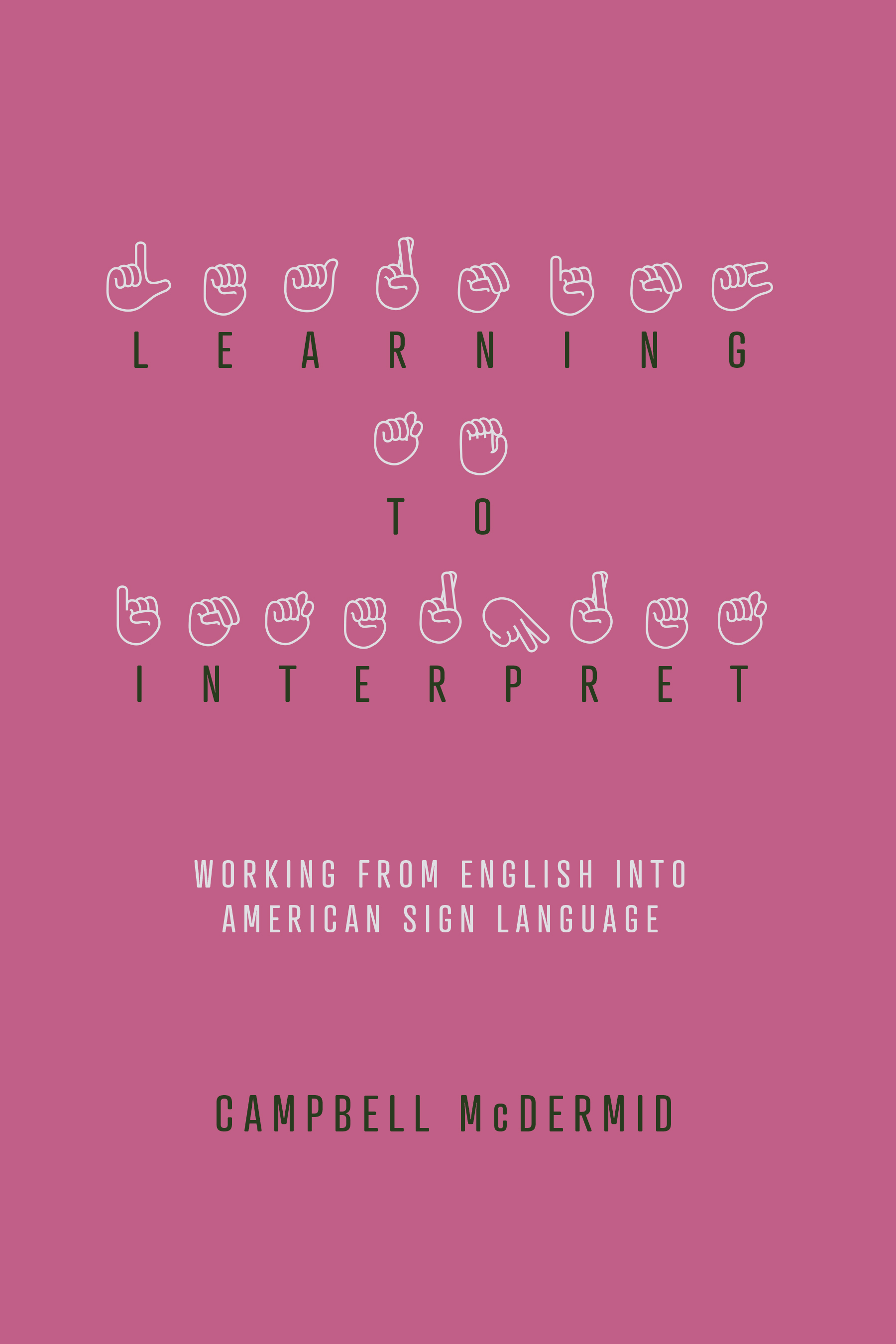
“The publisher reviewed the concepts and decided that Option 2 was the best way to go. From there I had to provide other color options. What I had first given them was good, but didn’t pop and, looking back I’d have to agree. Some good client feedback. So, I came up with a range of stronger color schemes to catch the eye.”
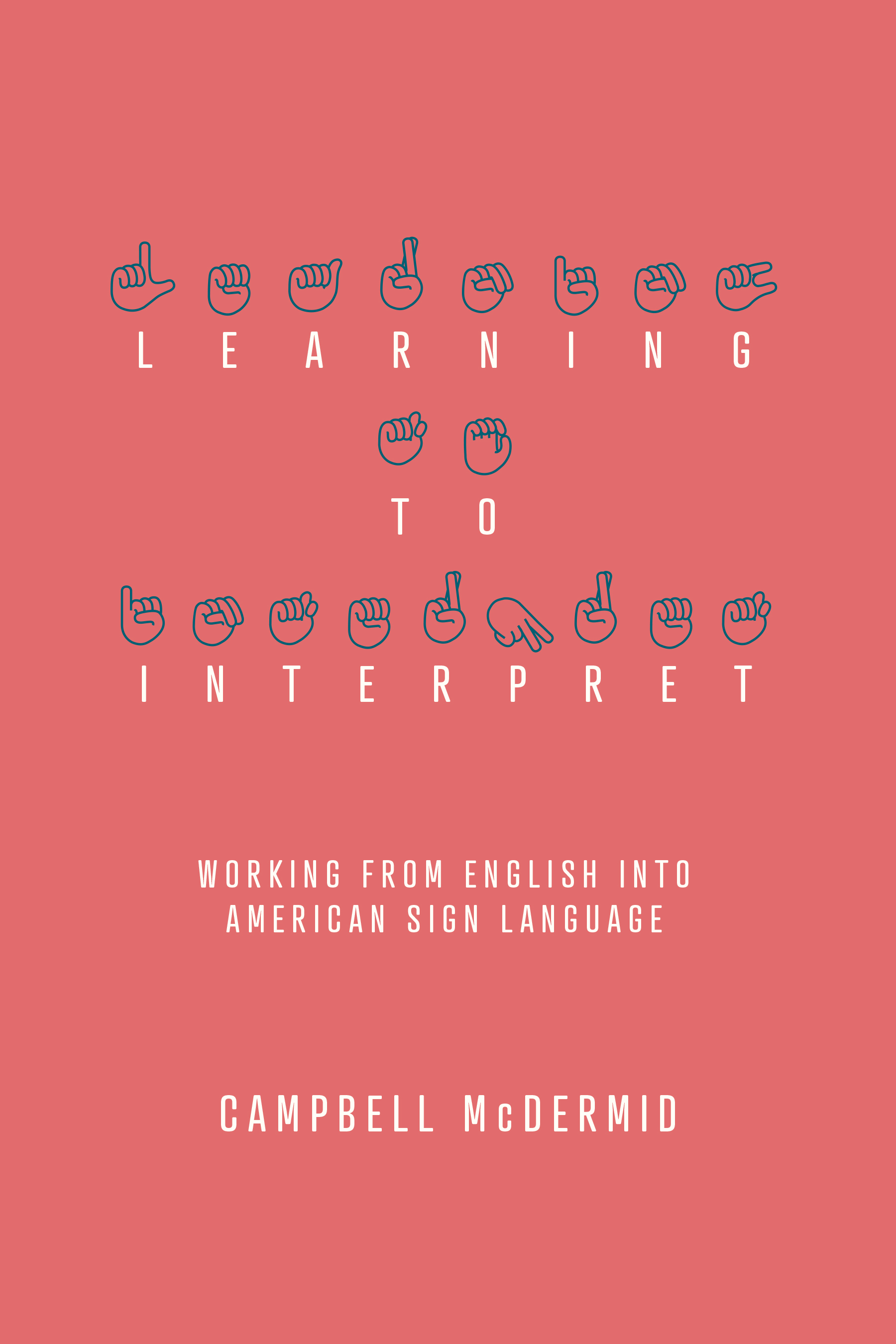
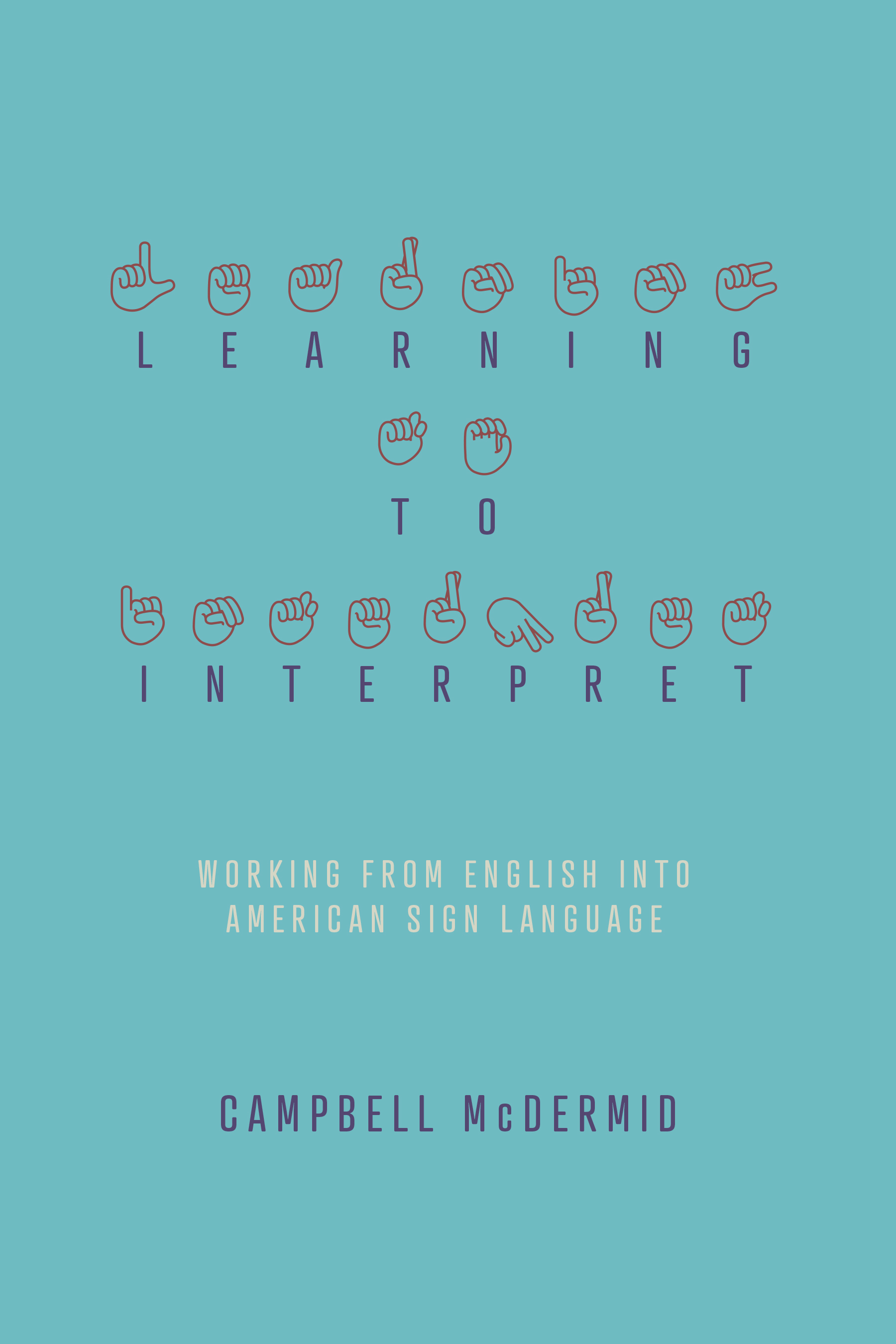
“They went with the red, white and blue option [1], which I admit, takes its cues from the word ‘American’ in the phrase ‘American Sign Language.’”
Final Design
“Overall I was very pleased with the way this booked turned out, with each element, though clean and simple, serving a significant purpose in the overall design,” Wilder said. And after two weeks visiting London, Paris, Luxembourg, and Germany, Wilder turned an academic text into a visual trip.
Mary Ryan Karnes is a freelance writer and a Master's candidate in fiction at the University of Southern Mississippi.