Glenn O'Neill Gets His Hands Dirty For The Possible World

Glenn O'Neill is the Deputy Art Director for Cornerstone, an imprint of Penguin Random House. Here he details his process for creating the uplifting cover for The Possible World.
The Possible World is a novel featuring three seemingly disconnected characters who each, in different ways, need saving. They are brought together to change one another for the better. Ben is a six-year-old boy who witnesses a horrific crime that claims the life of his mother; Lucy is the doctor who tends to Ben in the aftermath; and lastly Clare, an elderly lady, who harbours a long lifetime of secrets.
In considering a jacket approach it was suggested, in our monthly briefing meeting at Penguin, that we think of the possibility of a simple iconic image that radiated a sense of hope.
I researched a full colour photo of a bird taking flight, supplied by Getty Images, and simplified it to a silhouette; I then set this off against another motif, a photo of a little boy with arms outstretched, supplied by Colourbox.
In order to represent these images more lyrically I chose to further integrate using colour textures.
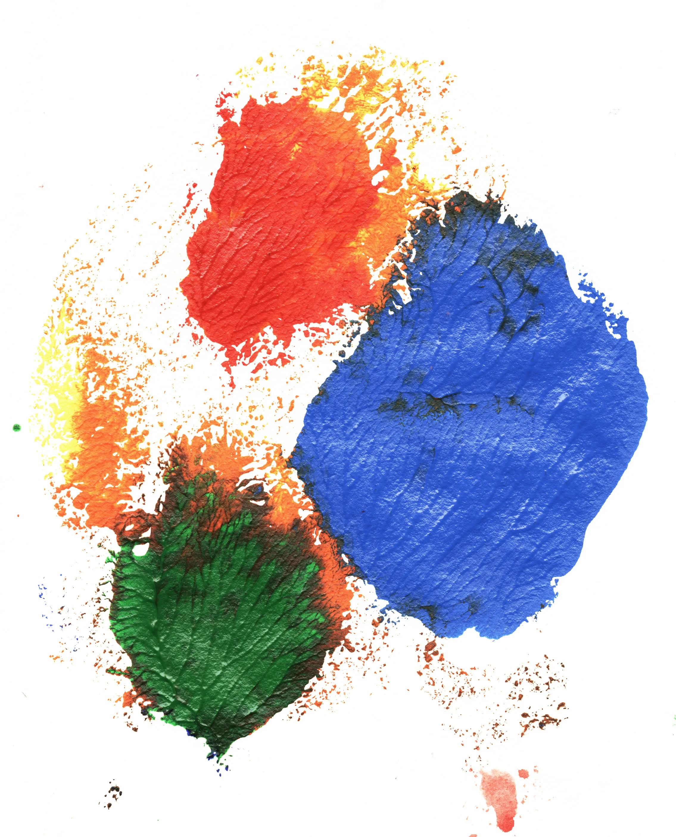
I stepped back from Photoshop and the Mac at this stage. To introduce an element of serendipity and hand-crafting I experimented with smearing some acrylic pigment onto clear acetate. I squirted three primary colours, red, blue and yellow, from the paint tubes, and spread it around using my fingers. I thought each colour could loosely represent each of the three characters in the narrative, and would mix and meld together accordingly.
I chose the most satisfying example of the paint splodges, which took a couple of days to dry, as the paint was plastered so thick, (almost three dimensional), scanned it into Photoshop, and pasted it within my silhouettes. The finished effect seemed, to me anyway, to suggest a sense of magical realism, a quality that had been requested to be considered by the editor in the original brief.
Chosen splodge
As the title and author type also needed to suggest a sense of freedom and optimism, I chose the font Hatmaker, which has a sense of informal anarchy about it, and manipulated the sizes of each of the letterforms to fit within and around the bird and boy silhouettes.
To complete the design I placed all the elements on a neutral textured background. This has both the effect of further integrating all the elements, (plus the Jodi Picoult quote), and also avoiding the dreaded black ruling line around white jackets, which is often added when the book is advertised on-line.
Final cover
I hope that the final result represents an aspect of the narration of the text, and its message of the infinite possibilities that exist in the world, and how we are all connected. But, also, I hope it works on a purely aesthetic level, just a pleasing arrangement of graphic elements.
Editor, artworker and lifelong bibliophile.


