Good Wives and Warriors on designing The Exact Opposite of Everything

Becky Bolton and Louise Chappell have been working collaboratively as Good Wives and Warriors since 2007. Here they talk us through their process for creating The Exact Opposite of Okay.
We were approached by Egmont publishing, through our illustration agents (Central Illustration) to pitch an idea for this cover. They liked the previous illustration we'd done for the cover of another YA novel called Everything, Everything by Nicola Yoon. We were also doing another three YA book covers at the same time so we really felt like we were getting our teenage heads back!
We started by reading the book, which we always try to do before starting a cover design. It's important to get a real feel of the voice, tone and style of the book before we start drawing. It's definitely easier to illustrate a book cover if you enjoy the book, but that doesn't always happen!
This was actually a pretty easy cover for us as the art director had such a clear idea of what they wanted and the book had a clear target audience. It is aimed at a YA/higher end teen market and is billed as a funny, laugh out loud rude book about sex and slut shaming. They wanted the cover to be loud, bold, bright and humorous, more edgy than pretty.
The brief was to create an illustration that burst out from large type and the art director made a list of all the elements that they wanted included. These were to be drawn in quite a teenage/doodle way and included peanut buttercups, phallic vegetable emoji's, a sausage dog, milkshakes, jukebox, a long tongue, an embarrassed emoji face, an alpaca tattoo, a sloth as Hamlet, a unicorn spearing cherry tomatoes on its horn, a duck-billed platypus, burgers and fries, yoghurt etc... a LONG list of specific elements!

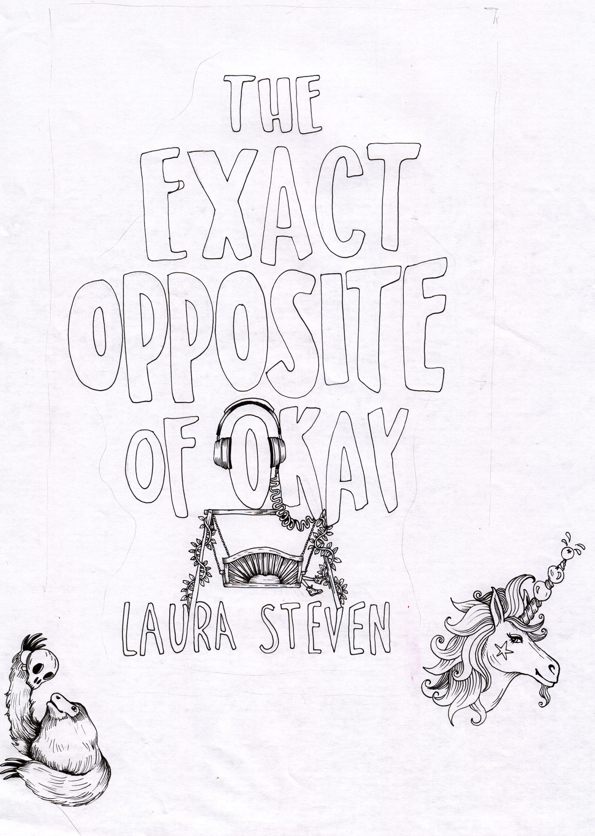
We drew every required element in black fine-liner, scanned them to our computer and collaged them together in Photoshop. We also did a couple of versions of hand drawn text for them to choose from. They wanted this to be bold and hand written to keep with the style of the book as it's in the first person, written by a teenage girl.


All our work starts life as a drawing done by hand. A computer is a super useful tool, particularly in book cover illustration but we really love our hand drawings to be fundamental in our illustration. We can bring so much more energy and life to our illustrations using drawing and line.


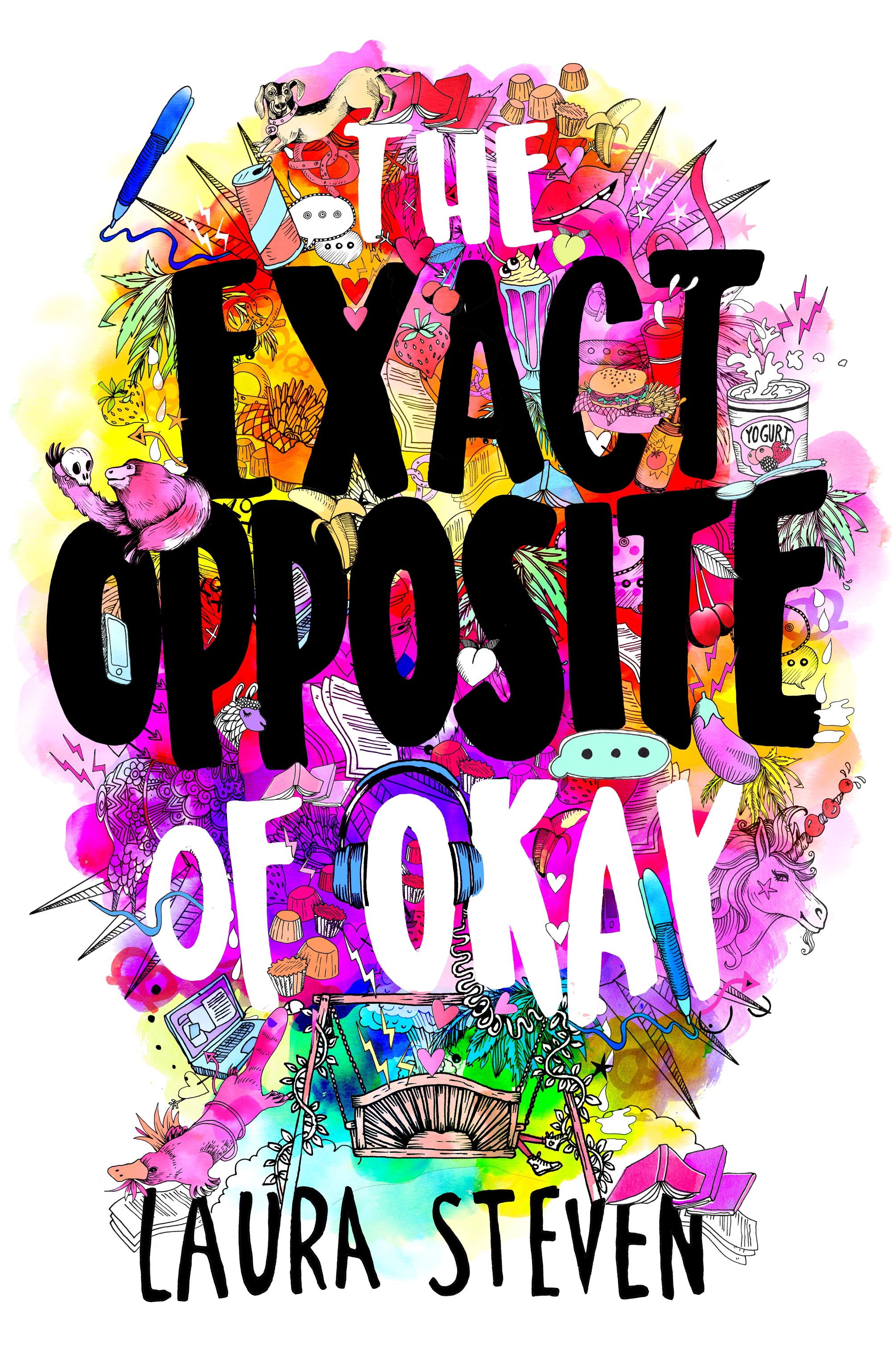


We did the first "sketch" in black and white and we were competing against other illustrators to get the job, which is pretty common. They must have liked ours as we got the job! After this, there were perhaps 3 rounds of changes and feedback until they were happy with composition and text. We mainly had to add more elements and change the layout slightly. We started to layer colour and texture in Photoshop and did various colour treatments. They chose the loudest, super bright colour option.


Join us in celebrating the enormous talent that goes into making books. Consider a small donation to our Patreon fund. Your support helps us provide you with an in-depth look at some of the book publishing industry's most creative people.
www.patreon.com/spinemagazine
Editor, artworker and lifelong bibliophile.