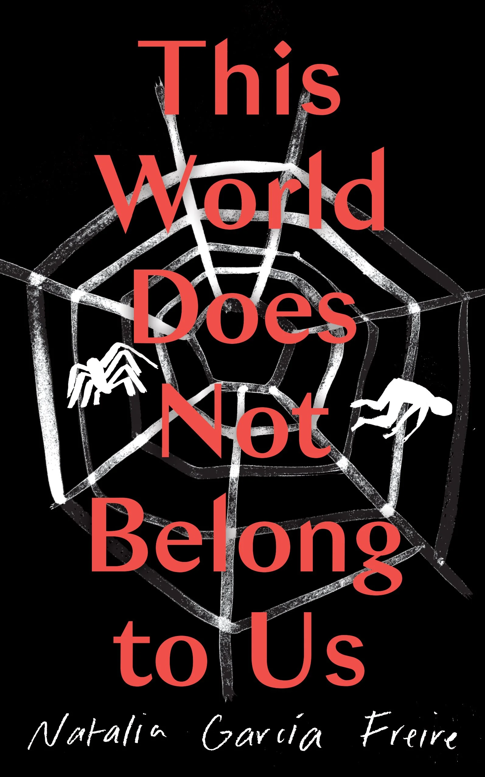
Hayley Warnham on Designing This World Does Not Belong to Us

Hayley Warnham is the senior designer at Oneworld Publications and here she takes us through her process for designing the wonderfully creepy cover for This World Does Not Belong to Us.
This World Does Not Belong to Us is a short, atmospheric novel set in rural Ecuador from Natalia García Freire, translated by Victor Meadowcroft.
To summarise the story, narrator Lucas returns to the house where he grew up, intending to take it back from the two men who are now living there. The narrative moves between Lucas’ recollection of his childhood and the arrival of these two strangers; and the present day, when he is returning as an adult in the hope of taking revenge. Lucas is fascinated by insects. He surrounds himself with bugs and seems to feel an irresistible, hypnotic pull to the dark, slightly dangerous, almost mythical world they inhabit – this immediately triggered some inspiration.
The tone of the book is quite chilling and sinister, so I knew I could go somewhere quite dark with the cover. Lucas’s fascination with insects was a great starting point, but we wanted to be careful not to put the reader off with anything too creepy, as bugs are not the most alluring visual. It was noted that the narrator’s favourite creature is an enormous black spider that he names Señorita Nancy, so the idea of spider webs and feeling trapped felt like a good place to start.
My initial visuals focused on this idea, using quite a dark colour palette but it became apparent that maybe the combination of creepy imagery and a dark colour scheme might come across too ‘horror’ which this book certainly is not. This led into a more playful use of insect imagery, but there was concern this could look too much like a ‘natural history’ book rather than fiction. The style of old insect engravings may have been the cause of this. We also looked at something much more stripped back with a brighter colour palette, but the simplicity just didn’t work in this case and it felt like it didn’t do the story any justice.
For the next round, there was a lot more emphasis on the spider web, and having elements from the book tangled up in it. Maybe overly complex for this book cover, but it also allowed for some experimentation with hand lettering which we ultimately felt didn’t quite work.
What often happens whilst designing, is you find elements in early visuals that work in some way but need refining, a typeface or image for example. One of the early black visuals with the dangling spiders had potential, but felt much too creepy at this point in the black and white palette. From that it felt like a good idea to try some lighter colour variations which could balance out the creepiness of the spider image, so for the next round we pushed this idea with a new colour scheme and experimented with fonts. In particular it seemed fun to have some of the lettering dangling alongside the spider.
This seemed to spark a positive reaction from the team, hitting the right level of creepiness without being too off-putting. From there we were just torn between having a single spider, or many smaller ones and it was eventually decided that the single one did the job as to not terrify the arachnophobes out there.
Final cover
Editor, artworker and lifelong bibliophile.


