James T. Egan, Designing for the Swordcross Knights Novels

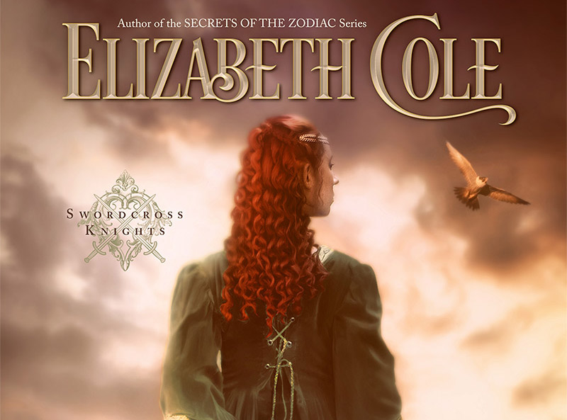
James T. Egan is a book cover designer residing on the Oregon coast. His work includes designs for romance writer Elizabeth Cole. Here he discusses using extensive photo retouching skills to create the images for titles Honor & Roses and Choose the Sky, part of the Swordcross Knights series.
Before starting to work on these series covers, the author and I went back and forth about general ideas for the photo shoots: poses, props, lighting, etc., but the author handled the photo shoots [along with photographer JR Blackwell] and sent me her favorite photos of each model. For each cover, I picked the strongest photo and went to work prepping the figure in Photoshop. I adjusted the lighting and changed the color of the models' gowns and the color of their hair. I’ve done a handful of covers for Elizabeth Cole, and it’s become a staple to add flowers to the cover, sometimes subtly, sometimes not so subtle. For Choose the Sky, we decided the dagger was a little severe for a romance novel, so I gave her lilies to hold instead. For Honor & Roses, I tucked a rose into her hair. It seemed a no-brainer, given the title and the color of her dress. I also added a wrought-iron gate, as the model looked like she might be leaning on something.
Then came the tricky part. Based on the medieval settings and the seasons of the stories, I put together customized backgrounds. I worked with stock imagery, but I combined several different photos to ensure a landscape that’s unique to the book. For Honor & Roses, I ended up combining five different photos for the background, and for Choose the Sky I used four. Once the backgrounds were pieced together, I did a quick mockup of the text to make sure all the elements would work together. On Choose the Sky, plugging in the text made me realize I needed to change the location of the castle. From there, I spent more time adjusting the lighting on the models to look more natural with the backgrounds and took steps to make sure they blended in with their surroundings. In Choose the Sky, you can see I popped a few flowers into the foreground in the lower left to better blend the images.
For these covers, I used a typeface called Desire, which has an extensive selection of alternate characters. Since these are medieval romances, I picked the more old-style letters and avoided going crazy with the swashes. Then I added a metal effect to the type and added in some color details to tie in to the model. When everything was in place, I did a few final color adjustments, layered on a few subtle textures, and they were ready to send to the author.


