Jamie Stafford-Hill on Designing First, Become Ashes
Jamie Stafford-Hill is an Associate Art Director at Tom Doherty Associates, designing covers, jackets, and the occasional interior for Tor Books, Forge Books, Nightfire, and Tordotcom Publishing. Here he takes us through his process for designing First, Become Ashes.
After designing the cover for K. M. Szpara’s first book, Docile, Irene Gallo, publisher of Tordotcom, asked me to work on his second novel. First, Become Ashes is a contemporary fantasy novel but they wanted to stay far away from anything evoking classic quest or genre fantasy, going for more of a crossover upmarket literary look. On Docile I’d had good luck working from the clear and useful ideas suggested by the author and editor and felt good about the simple brief: something type-driven, using imagery of fire and/or meadowlarks, possibly evoking a phoenix. Irene also mentioned the “bright and unusual” color used on Docile, suggesting the possibility of establishing a sort of strong color brand for the author.
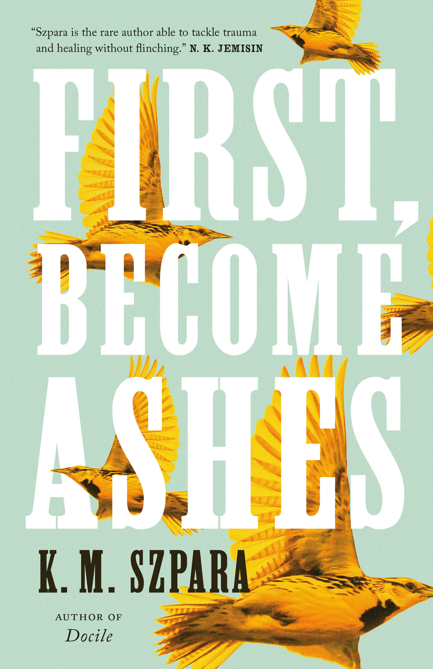
Right away I could see the title breaking on three lines in really big type — it fits nicely into a big block without any words ending up too big or too small or with a size balance that doesn’t match the meaning of the title. After doing a few quick type layouts and sketches I moved on to imagery, where one particular photograph of a meadowlark in flight caught my attention. I liked how it worked as a kind of pseudoflock, flying in all different directions. I hoped this captured some of the chaotic journey that protagonist Lark undertakes after he’s, basically, launched unexpectedly into the world outside of the cult he grew up in. It’s also a nice nod toward the multiple POVs and mixed timeline, though I didn’t know that at the time. The flock of birds in turn played nicely with some real big type (including one of my favorites, Clarendon Extra Condensed), allowing interaction between text and image while remaining legible.
[footnote: comps include a tagline that was cut at some point]


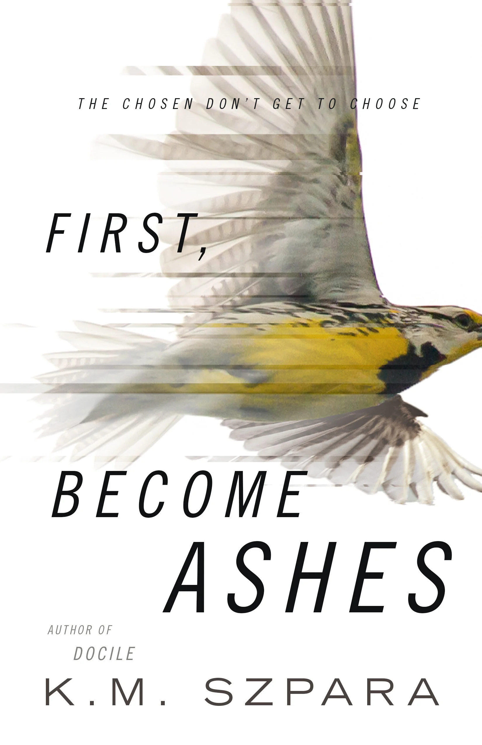
I really liked these, the blue one especially, but took a step back and made myself explore some other directions (well, just slightly different directions since I was apparently really into this bird), focusing on the singular meadowlark and trying out some different type. From this round, I liked the hand-lettered title a lot but wasn’t too happy with attempts to directly work in the phoenix/fire aspect. Instead I explored whether some distortion effects could show both escape/flight and psychic breakdown inside the aforementioned cult but I’m not sure how successful that was.


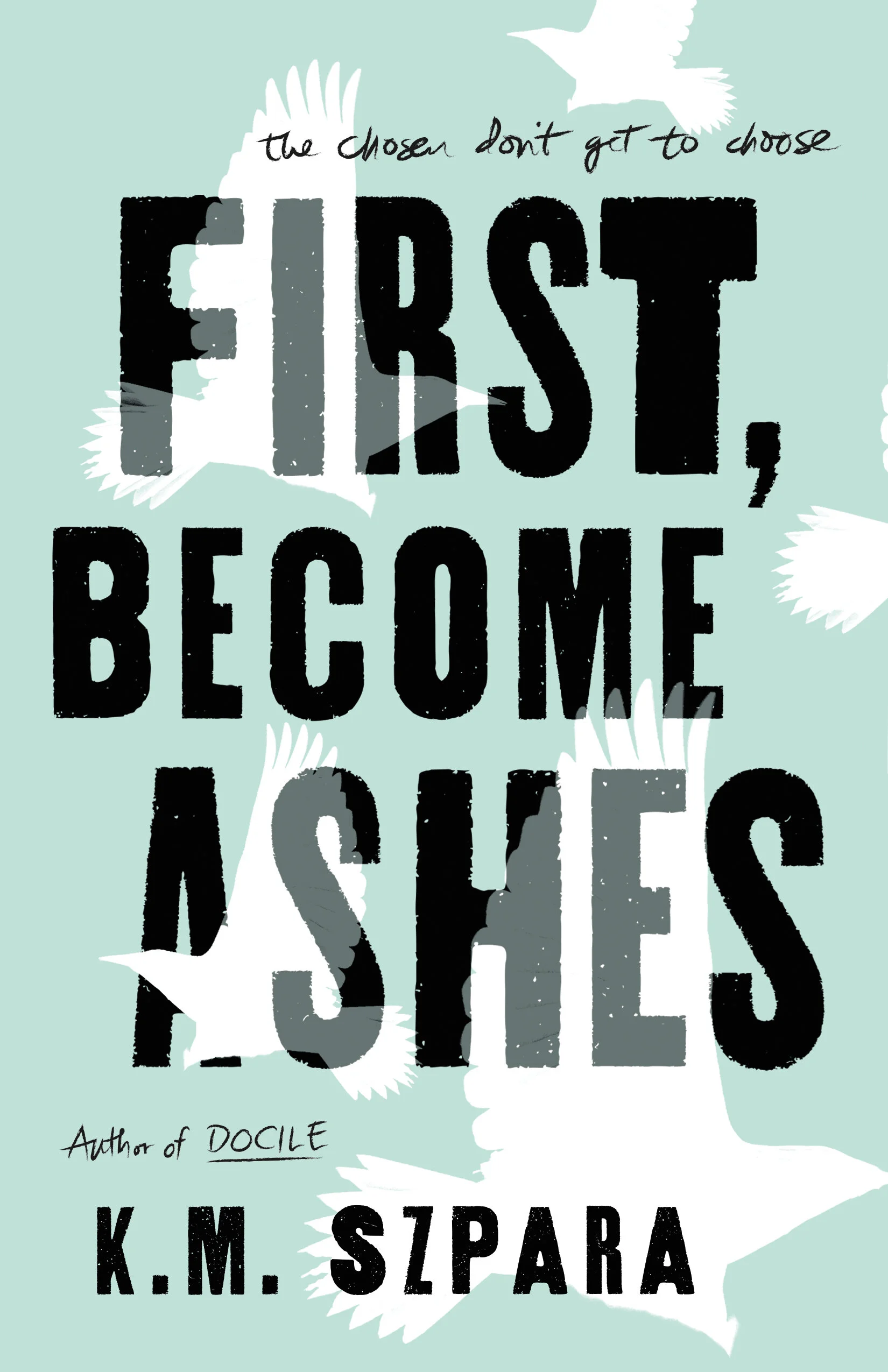
In all I showed almost twenty comps, mostly variations on the multiple birds with big type, and iterations on the hand-lettered design in different layouts. Tordotcom Publishing has a fairly streamlined cover process that doesn’t typically involve a lot of meetings or other departments, so deciding on the best candidates was primarily a discussion between the publisher (a former art director), the editor, and secondarily, myself. We eliminated most of the later designs pretty early on. The rest were tacked up on the wall to kind of “live with” for a few days (a process we’ve all missed for the last year of WFH) and we eventually settled on a few of the green background + bird flock comps as finalists. At this point the poster-style design was the favorite and after a few layout tweaks the version with black type and white birds was chosen to show the author. He didn’t love it. But he didn’t hate it, and did like one of the alternates we sent — big white type and vibrant yellow birds. While the bold black title and white, just-begging-for-spot-gloss birds would have been a great cover, in the end it was important that the birds are recognizable as meadowlarks, and there’s something about the white text on pale green that’s strangely eye-catching.


The final jacket uses a spot gritty matte application over gloss lamination so there’s a nice contrast between the smooth embossed type and the rest of the jacket. We’re all pretty happy with how it turned out.
Final cover
Editor, artworker and lifelong bibliophile.