Jo Thomson, Bringing to Light the Cover for The Vanishing Hours

Jo Thomson is a London based Graphic Designer, currently working as Head of Design for Doubleday. Here she details her process for creating the cover for The Vanishing Hours.
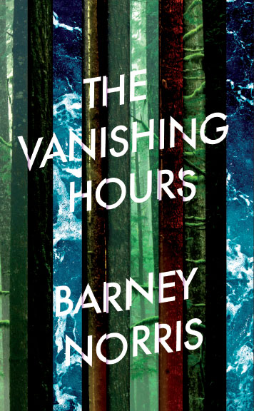
I came to work on this brief after a we’d had a few rounds of visuals from a freelancer that weren’t quite working for the cover meeting. They were great designs, in keeping with the cover style that had been established with his two earlier novels, but the meeting felt we needed to step away from this look for the third novel. I had voiced some ideas in the meeting and so, with the deadline looming, my Art Director asked me to try some new options. Naturally, my ideas evaporated as soon as I sat down to work on the cover and I mentally kicked myself for having been so chatty in the meeting. I talked the brief through with Alice (the editor working on the novel and all round lovely human) and this helped give me a bit more of a steer, although I was still a bit stumped. An accident involving a scalpel and the tip of my finger resulted in some much needed reading time in the glamorous location of Ealing Hospital A+E waiting room! I whizzed through the novel in the couple hours that I was waiting there and returned to the art dept inspired with some ideas and a comedy bandage. The jacket we have is actually the very first design I worked up – although by no means the only one. I had worked up some other visuals that were a bit more sombre in tone, as well as a few photographic options with trees and doors. The novel is all about shifting planes of reality and I had wanted to try and give a sense of depth and levels through layers.
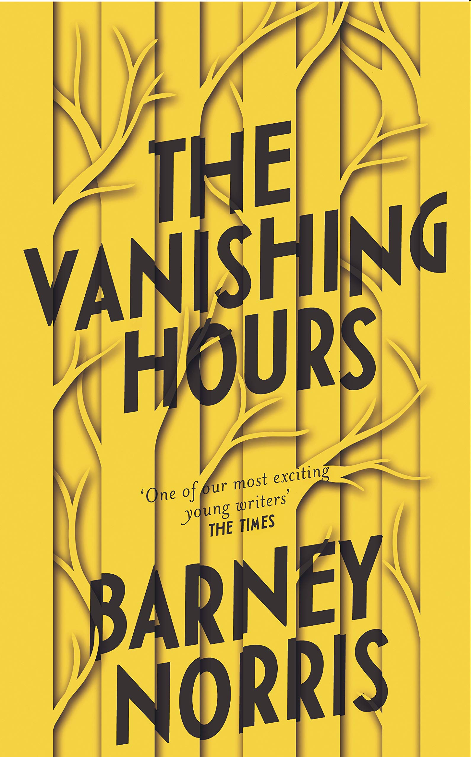
Woods and trees feature as part of this theme in the novel, and so after playing around with type and shadows (and layers, oh god so many layers…) I ended up with this design. I chose to use a bright yellow to give the cover more of a poppy, surreal vibe and to give the shadows a bit more emphasis. I really wanted the yellow cover to be chosen and was chuffed when the covers meeting picked it – it’s not often that happens!
I decided to deboss some of the trees on the cover to add tactility and more depth to the image, with bright sea green endpapers to pop against the yellow and black.
I really enjoyed working on this cover and was thrilled with the finished result.
Final cover
Editor, artworker and lifelong bibliophile.


