Jo Walker, Creating the Cover for Laline Paull's The Ice

Designer Jo Walker has an impressive portfolio of book covers. Among her amazing works are jackets for the novels of Laline Paull, published by 4th Estate. Here, in her own words, Walker details the rationale behind the design for the most recent of these books, The Ice.
Before starting work on The Ice, there was a lot of discussion about how the jacket should look, as it was the second novel by Laline Paull who had written The Bees which was a huge success. The initial thought was to create a jacket that felt similar in style to The Bees but different enough so people wouldn’t think they were buying a sequel, which it isn’t.
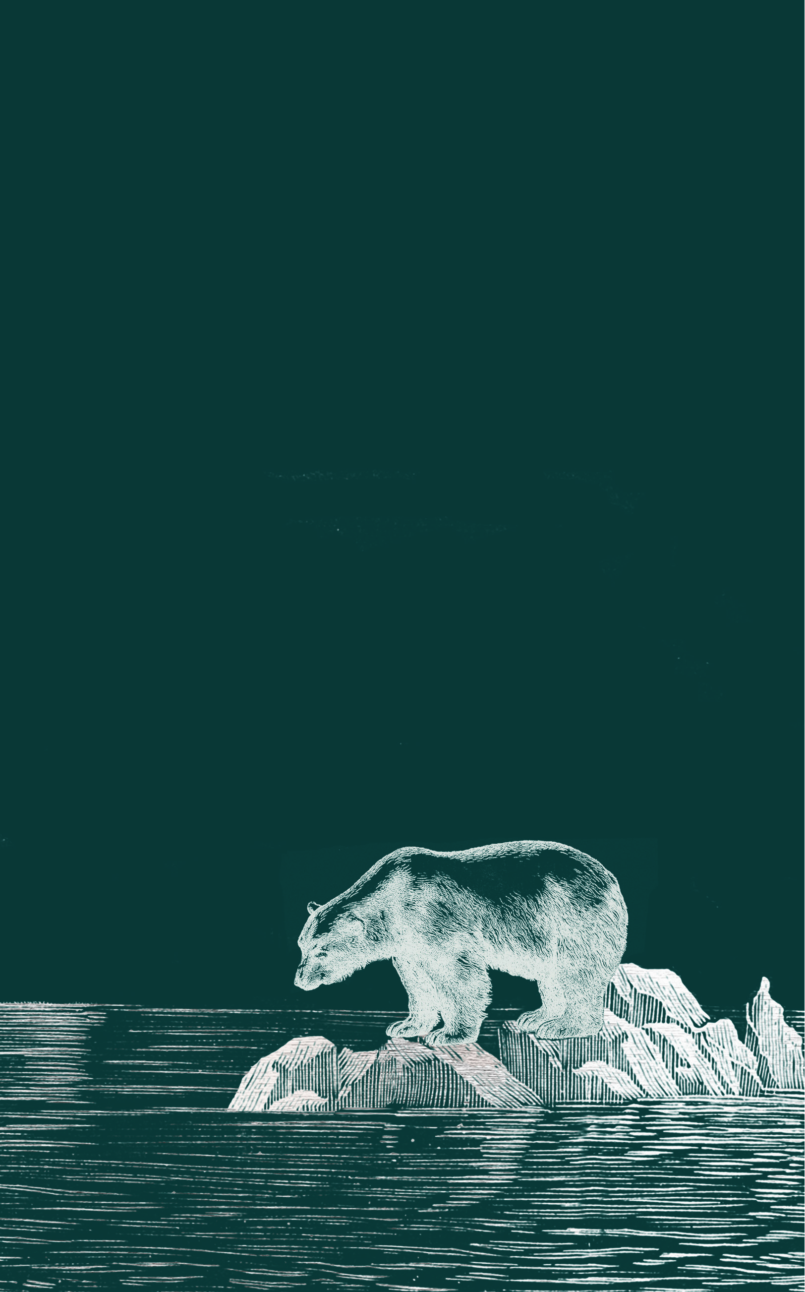
The Ice is set in the near future and begins with an expedition of a tourist cruise ship trying to get a rare sighting of a polar bear, which are now all but extinct. For The Bees, I wanted the jacket to reveal that although it was about one single bee, she was also part of a huge hive and that’s what the die cut was used for. For my initial idea for The Ice, I wanted to show a polar bear that appeared to be on a huge glacier in the arctic but when you peel back the cover, the ice had melted and it was just on a tiny piece of ice in a vast ocean. This initial idea was rejected by the author and agent and I’m so glad it was! It was completely wrong for the book, far too close to The Bees jacket and paved the way for what we have now.
Laline passed on some incredible photos of the Arctic from her husband Adrian Peacock who is a photographer. The colours and shapes of the ice were really inspiring and the photos were full of atmosphere. Laline really helped by sending ideas she'd had too, she is a very visual person so is the ideal author to work with on a book jacket.
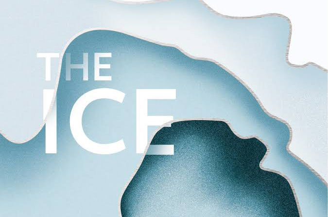
I started to concentrate more on the idea of melting ice, so created abstract shapes and added texture to give some depth to the design. I wanted to use the shapes to draw you into the jacket where the illustration ‘melts away' into what’s printed on the board. Laline, the editor Helen Garnon Williams and I discussed ideas of what the central illustration should be and we decided a solitary man in an ice cave would be perfect. I wanted the kind of reveal that The Bees had, so that when you open the jacket there’s more to see than you think so I went on to commission Chris Wormell to do an engraving of a huge ice cave with a solitary figure in the middle. I tried using The Bees font but this is such a different book, it didn’t feel right. In the end, I chose something quite simple as I wanted to have the title disappearing into the ice and didn’t want it to be overcomplicated.
Laline was very pleased with the jacket which was such a relief as she’s an absolute joy to work with - someone you definitely want to create the perfect jacket for! I was really happy with the end result, Chris did a great job and we commissioned him to do chapter headers too so the insides married up with the front and felt like a complete package. We used the same finishes as for The Bees which was to use every finish under the sun - I like to pretend it’s all about the design but I’m not going to lie and say I don't get excited when someone tells me I can have loads of finishes! I used soft touch, silver foil, die cut and silver blocking on the inside. The book deserves to do just as well as The Bees if not better and I’m hoping this jacket will help.
Editor, artworker and lifelong bibliophile.


