June Park on Designing Katherine Dunn's Toad

June Park is a graphic designer based in New York. Here she takes us through her process for designing a stunning cover for Katherine Dunn’s novel, Toad.
Katherine Dunn published her best-selling, National Book Award finalist novel Geek Love in 1989, which quickly catapulted her into a cult classic status. Before Geek Love, she wrote a novel that was rejected by her publisher, that then sat in an archive for nearly half a century until Editor Naomi Huffman dug it up and brought it to light. Toad, published posthumously by MCD Books, is a dark and edgy portrait of a young woman who over the course of the novel retreats from society into a self-imposed exile. Dunn’s writing is discomfiting, absurd, grotesque, yet lyrical and captivating. As the editor puts it, Dunn’s work “delights in making the reader squirm”, so we thought that’s exactly what we’ll do with the cover.
Geek Love, published by Knopf, was designed by Chip Kidd, who has designed some of the most iconic jackets of our time. It is ultra simple yet eye-catching with the use of custom type and color, and the editor wanted the same for Toad: simple but memorable.
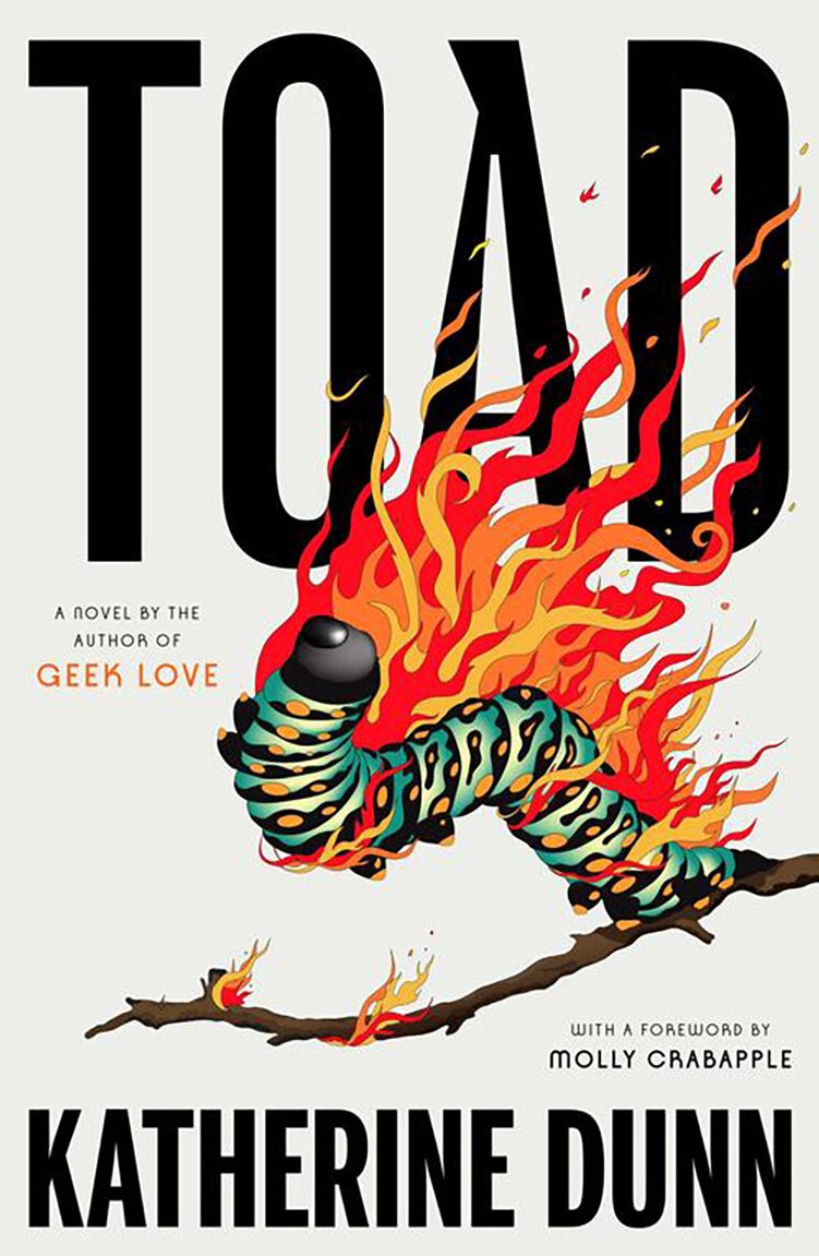
There were many intriguing visual motifs in the book, such as ‘a pickle jar full of goldfish’ and ‘a hoary garden toad’ that fit the bill, but ‘a swarm of caterpillars set ablaze’ really stuck out to me. A caterpillar, let alone a swarm of them, is something we don’t see a lot on book covers for some reason, and I thought “that’s just perfect for us.” I know there’s a camp of people that find creepy-crawlers perfectly adorable and another that find them most gut-churning; as the latter myself, I decided to work with an illustrator who could do them justice. I put together some sketch comps and illustrator options to pitch to the in-house group.
Fortunately, everyone involved loved the idea of the burning caterpillar. We decided to go with a single caterpillar instead of a swarm to make sure the cover art was repulsive but not too repulsive. It also allowed something simple but still visually striking, which was my preferred direction as well.
With the chosen layout above, I reached out to illustrator Lydia Ortiz. I had been following her work, and thought her graphic yet fluid style was a perfect fit for this book. I really enjoyed the collaboration, and I think she did an amazing job balancing the grotesque and the charming. The flame still blows my mind.
Final cover
We also worked on two spot illustrations to go on the rest of the jacket. I think they are so adorable and unhinged.
Full cover
Toad was one of those rare projects where everything at every stage fell into place just right. For that, I’m eternally grateful to everyone involved—from the editor to our in-house teams at FSG/MCD to Katherine’s family/the agent, to the illustrator, and of course, Katherine Dunn, whose work continues to inspire people. And a huge thanks to Vyki and Spine Magazine for inviting me to share the behind the scenes. I loved this book, loved working on it, and hope you’ll enjoy it too.
Editor, artworker and lifelong bibliophile.