Katie Everson on Designing Boy 87
Katie Everson is a freelance designer with over ten years’ experience and the only person to have designed both the Carnegie and Greenaway Medal winners in the same year. Among others, she’s designed books by John Green, Neil Gaiman, Sarah Crossan, Anthony Horowitz, Mal Peet, Michael Morpurgo, Michael Rosen, Katherine Rundell, Jandy Nelson, Sarah. J. Maas, Alexander McCall Smith and Louis Sachar, and worked with many illustrators including Chris Riddell and David Tazzyman. She also writes and her YA novel, Drop, is published by Walker Books. Here Katie talks us through her process for designing Boy 87.
A gripping, uplifting tale of one boy’s struggle for survival, Boy 87 echoes the stories of young people all over the world today.
Shif is an ordinary boy who likes chess, maths, and racing his best friend home from school.
But one day soldiers with guns come to his door, and he knows he’s no longer safe. He must leave his mother and younger sister, to embark on a dangerous journey. Separated from the people he loves, Shif will encounter new nations and strange voices, cruelty and kindness, imprisonment and escape, on a hazardous voyage by land and sea.
Reading an early manuscript, I was immediately moved. I knew Boy 87 was a cover I wanted to work on. It’s a middle grade novel about a boy who travels from his home in Eritrea to the Mediterranean, to catch a boat to Europe. He’s running away from conscription into the army, but despite the weighty subject matter, the story is told with a feather-light touch. It’s exciting, tender, heart-warming, and above all, hopeful.
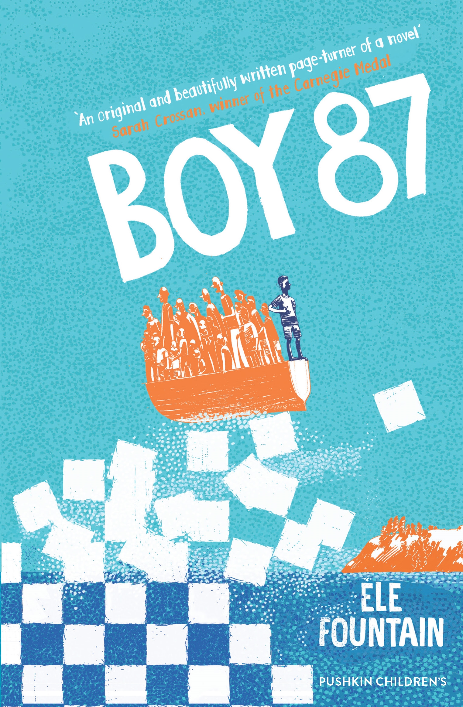
Shif's father had given him a chess set. I liked the chess theme, with its iconic shapes, and the notion of Shif as a pawn in a much bigger power game.


Striking motifs, yes, but also ambiguous. I wanted the reader to sense a real, human connection.
The idea of Shif’s boat teetering atop a breaking chessboard wave slammed me in the face – the raw feel of the shapes, the perilous angle of the boat – and I couldn’t scribble it down fast enough.
This first rough shows the initial concept in its simplest form: bold, but also quite stark and cold. The addition of a setting began to bring it to life with the suggestion of journey, danger, a future and the hint of land in the distance.


The basic idea approved, I moved on to the styling. Middle grade usually encompasses about ages 8-12 years, although Boy 87 has much wider appeal. However, with a young core readership it made sense to look at a softer style with a brighter, more varied colour palette.


I had seen Kate Milner’s work online and was especially drawn to her picture book, My Name is Not Refugee, for which she won the 2016 Student Illustrator of the Year prize at the V&A Museum’s Illustration Awards. I knew she would be the perfect choice to illustrate the cover.
Kate’s first rough is shown here on the left with the orange type. We played with the colours and settled on a vibrant cyan sky, orange boat, and clean, white type.


Having toned down the concept’s hard edges and brought Shif to the fore, we took a familiar news image and flipped it on its head. So the tension of the boat cresting the tumbling chessboard gives way to hope, with land on the horizon. Shif is heading for a brighter future.
Editor, artworker and lifelong bibliophile.