Linda Huang on Creating the Paperback Edition of Someone Who Will Love You in All Your Damaged Glory

Linda Huang is graphic designer based in New York. She is currently an Associate Art Director at Vintage & Anchor Books, an imprint at Penguin Random House. Here she takes us through designing the paperback edition of Someone Who Will Love You in All Your Damaged Glory.
When I learned that Knopf was going to be publishing a book of short stories by the creator of the Netflix show Bojack Horseman, I asked my colleague Tyler Comrie — who was designing the hardcover — for the manuscript so I could read it for pleasure. If these stories had any ounce of the dark, absurd humour in Bojack, I knew I would love them.
Tyler’s clever design features a figurine of George Washington, who is briefly mentioned in one of the stories. Usually, when we redesign a jacket for paperback, there is a strategic reason driving the decision. But in this case, the editor was simply open to a different interpretation if a designer felt so inclined (I did).
There are usually two approaches when designing for a book of short stories: represent an element from a single story or depict the tone of the entire collection. I decided to go in the latter direction, finding a visual metaphor for the entire book that would also relate to the title.
I first thought of flowers as the most obvious, basic symbol for love, and, after looking at 17th century Dutch flower paintings, was reminded of the incredible work by the London-based artist Gordon Cheung.
In his series New Order, Gordon takes paintings from the Dutch Golden era and modifies them with a digital algorithm, creating stunningly sensual and harrowing iterations. Flowers effortlessly disintegrate and bleed into each other.
The digital quality of this image didn’t feel quite right for the book, however, but it did plant a visual seed: the idea of flowers bleeding or crying. I thought it would be interesting to execute this concept literally, by wetting the type on an image of flowers. The printing logistics didn’t quite work out, though.
I then stumbled upon these ethereal flower prints by Nick Knight, clearly inspired by Dutch still lifes. Knight manipulates the printing process with different techniques, blurring the boundaries between photography and painting. I knew I had to use an image of his.

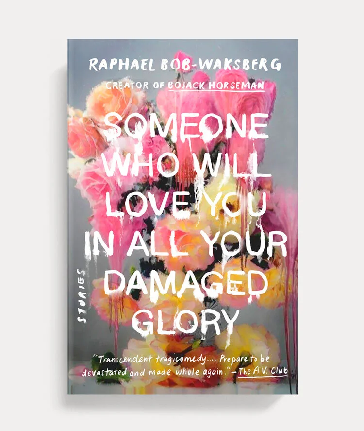

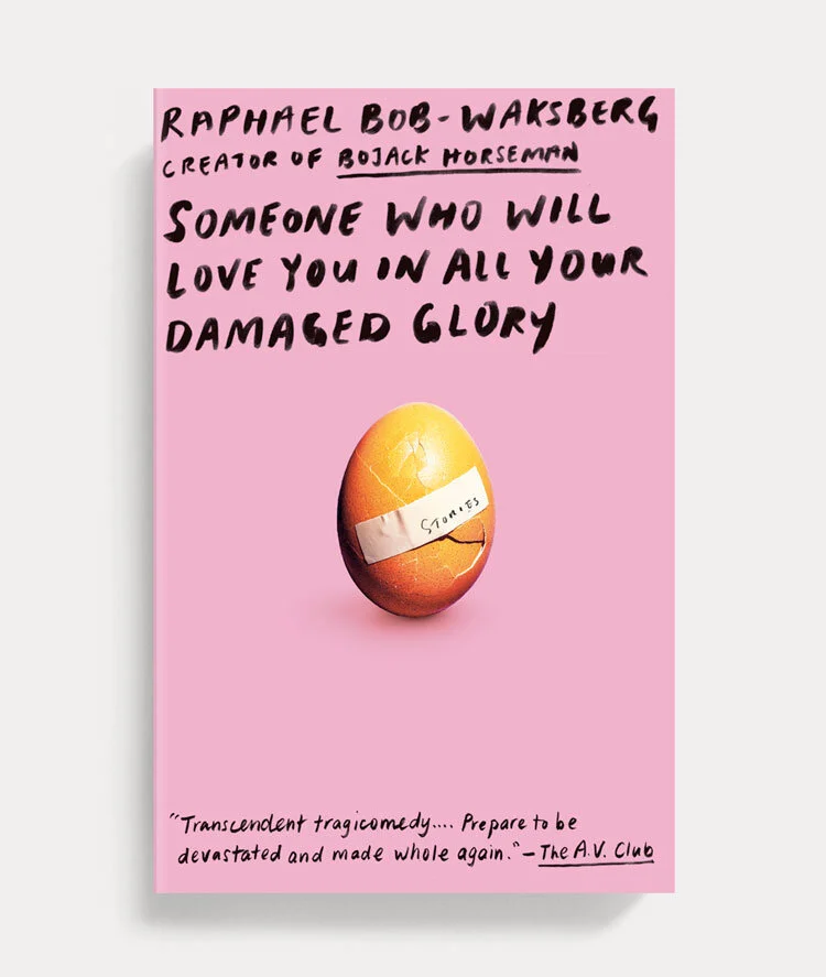
I tried integrating the type into the art as well as separating it using a panel. It worked formally, but I wanted to try another direction that wasn’t as overtly maudlin. Something more humorous and wry and more in keeping with the tone of the stories. I also felt the need to sketch some all-type covers to emphasize the lengthy title.


A rabbit hole of research led me to the work of Maurizio Di Iorio, specifically, a crisp photo of a cracked egg over which a bandage is plastered. It perfectly captures the emotional vulnerability in the stories.


When we presented these options at the cover meeting, we had recently undergone a change in leadership. The new publisher admitted that she was not the target audience for this book, so, in a show of remarkable humility, asked those in the room in the proper demographic (i.e. those under the age of 40 and/or fans of Bojack Horseman) to make the call. Asking us to pick the right cover was highly unusual, immensely appreciated, and demonstrated her strength as a publisher.

We sent the author our favourite directions: the hand lettered title bleeding on flowers and the egg on the pink background (chosen for its nod to the hardcover). He loved both, but ultimately picked the egg for its humour.
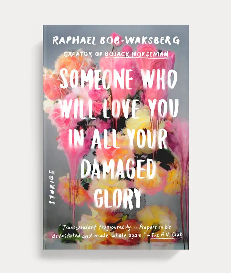
Final cover
Editor, artworker and lifelong bibliophile.