Terri Sirma on Designing Howard Means's Splash!
Terri Sirma is a designer and illustrator based in Queens, New York. She currently works at Hachette Books (an imprint of Hachette Book Group) designing book covers. Here she talks us through her process for designing Splash!
At the beginning of the project, the author and the editor had a clear idea of how they wanted the cover to look. They envisioned a single drop of water rising out of a body of still water that filled the cover — they described it as something universal and timeless that would be so captivating, it would be hard to look away from. The target audience for Splash! is not only swimmers, but sports historians, history and micro-history readers, sports fans generally, and athletes of all stripes. Although the cover was initially assigned to another designer, I was ultimately handed the brief and I was very excited to take it on.
The first cover I presented was a direct interpretation of the author and editor’s idea. After looking at various versions of water drops, I chose a crisp image of a single drop of water rising from a large, clear body of water, and since the title is one short word, I was able to make it pretty large and set it in a bold sans-serif across the entire cover. I chose to make the type all white against the blue background so it would really stand out. The second direction still incorporated the idea of a drop of water, but instead of just a single drop, I placed several droplets as if they had been splashed onto a surface. On both covers, the title interacts with the drop(s) of water which gives the cover more depth and adds a bit of movement.


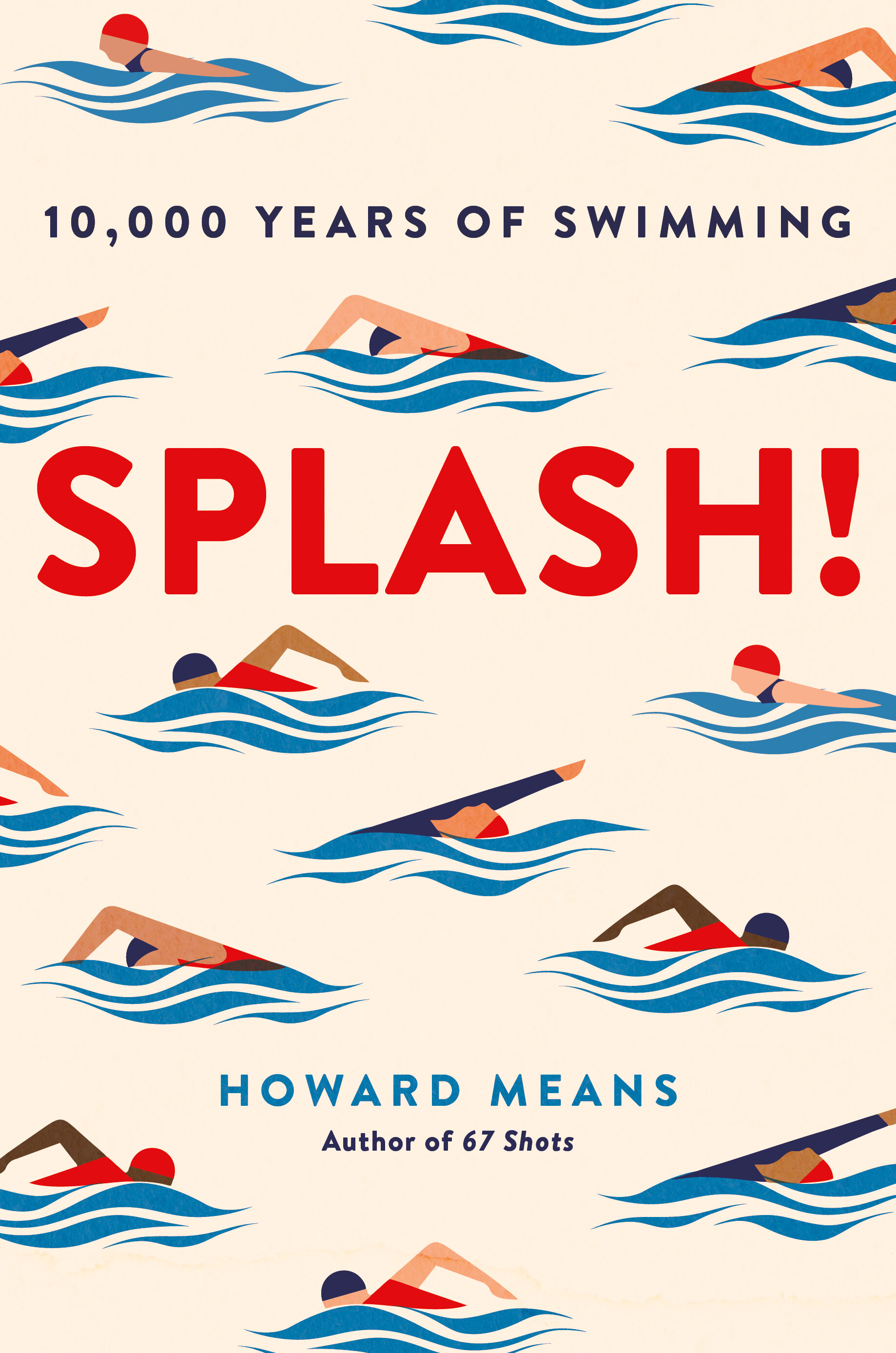
Although the first comps embodied the initial vision of the book cover, the team thought it needed a human element to make it more appealing and reach a wider audience. For the next round, I tried two approaches; the first incorporated photos of a person jumping/diving into water, and the second was an illustrative route to make it more fun and inclusive. I Initially had one large illustration of a swimmer moving across the title but after discussions with the Art Director, Amanda Kain, she suggested making the illustration smaller and creating a wallpaper design with various versions of the illustration—we both really liked the idea. We presented these directions and the team was immediately drawn to the cover with multiple illustrations. After a few tweaks to color and fine-tuning of all the elements, we had a final cover!


In finalizing the cover, we diversified the swimmers through skin tone and played with the type colors to help make the title pop. I think the bright colors and illustrations make the cover modern and fun while the uncoated stock finish gives it an historic, raw feel.
Final cover
Editor, artworker and lifelong bibliophile.