Lynn Buckley Goes Vintage for The Siren
Lynn Buckley is an Associate Art Director at Penguin Books. She has also worked at Farrar Straus and Giroux, and Random House, and freelanced for many other publishers. She has awards from The TDC, Print, and the AIGA. Here she talks us through her process for designing the gorgeously vibrant cover for The Siren.
This was a lot of fun to work on with Albert Tang, the art director. The initial direction was straightforward: "Should feel like a good cousin to The Lion’s Den (my design for the author's previous title) But not a sequel." The direction from the cover brief was "Pretty much a woman in siren pose. Backdrop – some fancy island. (Where I want to be)" Ha--me too.
The book itself is fun, escapist and suspenseful. A blockbuster movie, staring a famously unstable actress, is filming on a fancy resort on a Caribbean island. A hurricane is brewing, and everyone is struggling to keep the film and the film crew from going off the deep end.
I started with reading the book and looking at vintage vacation posters.


I wanted to include these elements in the design: Caribbean Island, wealthy looking woman/movie starlet, and something to indicate "Hollywood movie". It also needed some element of tension to let readers know that all is not well. The story revolves around three women, so I threw that into the mix.


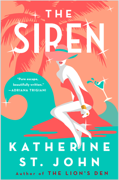
A note on the illustrations: Most of the images, especially the figures, are adapted stock illustrations from Getty or shutterstock, which I then combined together with elements I drew, or other stock elements. (I am able to draw certain things easily, but I'm not quite able to draw a detailed vector figure or yacht yet!) I usually start with sketches (unfortunately I have not saved those), then search for the correct character illustration. From there, I build around the character(s). For example, the first comp here uses a woman from shutterstock, by CaptainMCity. I then drew her in the water, with waves, multiplied a stock palm tree, and tipped the glass over.
When the illustration is central to the design, we credit the illustrator even though it is technically "royalty-free" because the illustration is so important.
I sometimes wish we could hire illustrators for these projects. In this case, that would likely be too expensive--it would mean a designer fee as well as illustrator fee, since this was a freelance project for me. Some clients have also become used to seeing finished-looking art as comps nowadays, they don't respond as well to sketches. And, I have come to really enjoy being able to work in this way--taking pieces of royalty free images, and arranging them in a new way with new colors is great fun. And something unexpected usually happens in this process that makes the design sing.
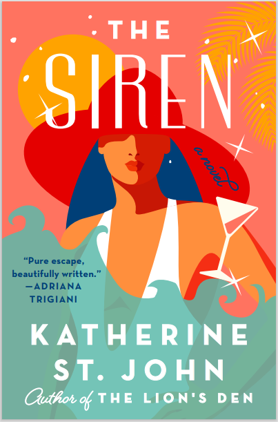
Albert liked the first round, but wanted one design with a woman on a rock in the traditional "siren" pose. (which I was asked to do in first place! I got caught up in making sure all the other elements were accounted for.)
I explored different ways to introduce an element of tension and humor using the waves and spilling cocktails.


The team wanted different colors (brighter and less retro) and different cocktails (they felt a martini also looked retro).


The author and their agent liked the design, but wanted a darker element with more tension. I tried Albert's suggestion of a boat sinking, as well as some sharks and lightning.


They liked the boat sinking, but wanted it more yacht-like. I tried a bunch of different yacht-like boats---A traditional "yacht" doesn't translate all that well as a boat when very small and sinking...


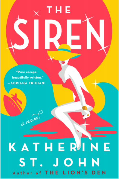
And the final cover!
Final cover
Illustration of the woman is adapted from a shutterstock image, by "Clash_Gene"
Editor, artworker and lifelong bibliophile.