Matthew Revert on Designing How to Set Yourself on Fire

Matthew Revert is a designer based in Melbourne, Australia who has gained prominence in the independent press and record label world for his creative designs. He has designed a range of different formats, including books, cassettes and LPs, for various clients ranging from independent publishers to industry heavyweights such as Eraserhead Press, Thick and Vaney, Bizarro Pulp Press, Ampersand Press and Broken River Books. Here he talks us through his process for designing How to Set Yourself on Fire.
Head editor, Michelle Dotter from Dzanc and I enjoy an easy working relationship. It’s always a pleasure working with her, so when I was given the opportunity to design the cover for How to Set Yourself on Fire by Julia Dixon Evans, I jumped at the chance. The book sounded fantastic and offered a lot of design opportunities. I don't tend to take titles too literally when approaching a book's design as it is often far too obvious, but when I first approached it I couldn't resist the evocative image of a burning book. As you'll see, an element of this idea survived to the final draft, but early on, I was far more overt.
I'm still very fond of this first design, as was Michelle, there was a part of me that wondered if maybe I had nailed it on the first go. The burn effect in this first iteration is very obviously achieved digitally. I wanted the sense that the exterior and interior of the book were working in tandem to create a pleasant happenstance with the bottom of the cover burnt away, revealing the author name beneath. When Michelle sent the design to the author, Julia and I have to admit I was quietly confident. My confidence was misplaced, but when I consider the final product, I am very grateful it was.
The feedback for this cover was positive but Julia was very keen that the design included several of the farewell phrases used in letters throughout the book. Taking that feedback I integrated it into the next iteration.
I enjoyed the typographic interplay of this version, but the design no longer had the same visual impact. It was at this point that everything changed dramatically and careened toward the final handmade cover.
Several days after submitting the previous design, I woke up to an email from Michelle with a couple of photographs attached. She had taken it upon herself to write the farewell phrases onto strips of paper and photograph the strips strewn amongst themselves. The photographed nature attributed an amazing three dimensionality to the image, which I adored. I became desperate to work with the concept, initially trying to work directly with the photographs Michelle sent. The issue I encountered related to the compositional rigidity I was now subject to and finding a way to incorporate the title and author name into such rigidity was not easy.

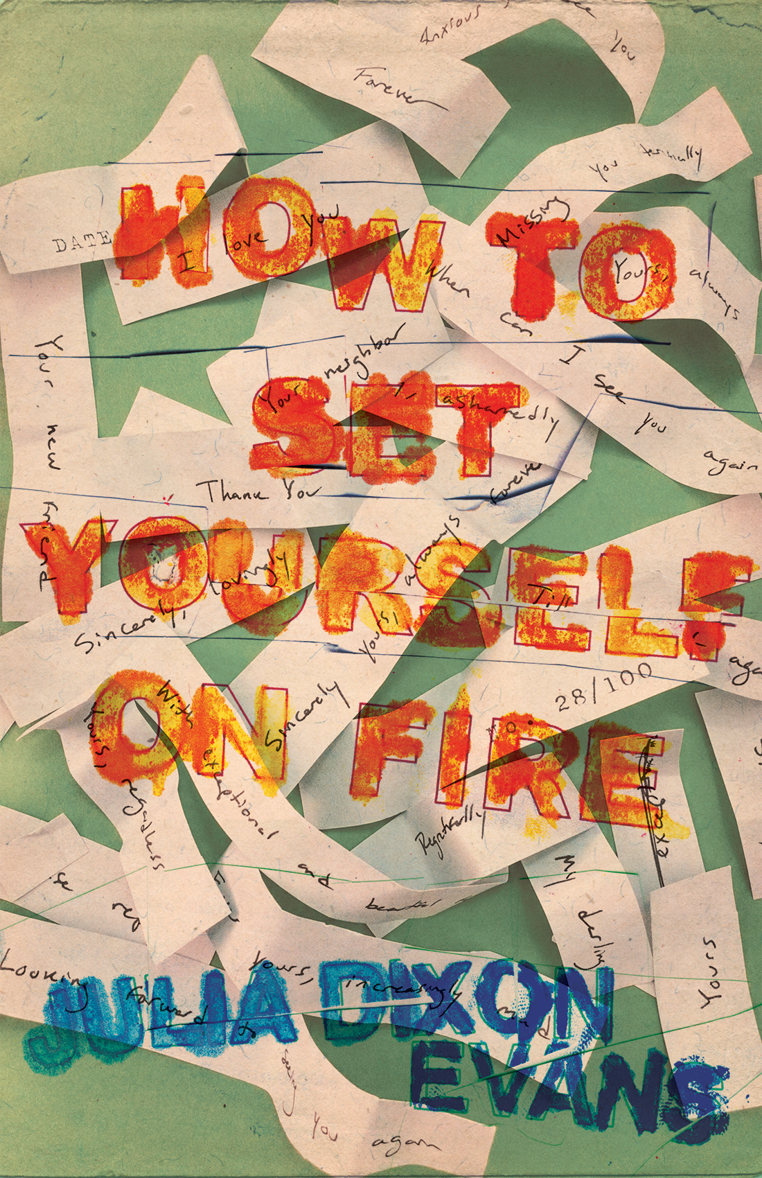

After playing with Michelle's photos, it was soon obvious that the only way this concept could work was for me to make it myself from the ground up. It was integral that I write out the farewell phrases myself using strips of paper similar to Michelle's photographs. I found a nice old book with a beautiful cloth-bound blank cover to use as a canvas and with the wonderful invention of Blu Tac I secured these strips to said canvas, so I could easily remove and rearrange them as needed.
Other than a few tweaks of hue, contrast and various sharpening, the final cover is simply a photo of my handmade composition. There are no special tricks employed and I relied upon good old-fashioned patience to make it work. I tried different compositions until I found one that sat comfortably while still maintaining a sense of space. Most importantly to me though, by taking a photograph of the handmade cover, I was able to maintain the gorgeous three-dimensionality of Michelle's original photos. I singed the strips of paper used for the title and author name to offer visual differentiation from the strips surrounding them, sent the cover to Michelle and it was approved very quickly.
Having invested so much time on the cover, it became essential the entire wrap follow suit. My initial plan was to handwrite every aspect of the cover's text, but there was so much information to convey on the back cover it became difficult to find a harmonious composition.
While I would have loved to find a way for the handwriting to work, it was obvious there was too much information to convey for such a technique to be effective. I opted for a middle ground and used a word processor to write the back copy and then printed it out before tearing each paragraph and burning the edges. In keeping with the theme of the book's title, I burned myself several times while doing this, but I kind of had to really, didn't I?
Final cover
Editor, artworker and lifelong bibliophile.