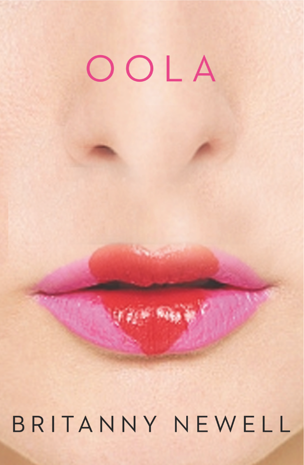
Micaela Alcaino, Creating the Cover for Oola

Micaela Alcaino is a London based designer with many fascinating book covers to her credit. Among them is the cover for Brittany Newell’s Oola. Here she details for Spine what went into creating this piece.
Initially this book was opened up to the entire art department as it was an opportunity to have fun creatively with a book like this. It was a chance to engage a younger audience in a classy literary book, something that was new and fresh. Oola resonated with a sense of mystery but with a colourful flair in Brittany Newell’s writing. To be honest I’m an intuitive designer, so I just get a sense of what the book is trying to say and what it’s trying to make you feel. For me I don’t tend to go through a particular process per say, but rather coax out what I’m feeling from the words on the page and start from there. Oola, to me, was summery, colourful, edgy and sexy but with an undertone of something dark and obsessive, think Lolita meets Animals.
I took into consideration that this would be a paperback original, so that demanded a cover that had to stand out on the shelves. This led me to wanting to produce a cover that was provocative yet very simple, almost absent enough to be ambiguous and sparked curiousity, but alluring in its seduction. After a long hunt for the right images I started to produce some covers. I also toyed with typefaces that were fresh and almost playful, things you would see in the magazines or social media. I seemed to have had a slight obsession recently with the typeface ‘Stag’ as I had used it on a previous design and I really liked that it was thin, something almost apologetic, but playful in its serifs. But I also played with my own hand rendered typeface for the title. I'm also a fan of strange cropping, so a lot of the images I used, I cropped obscurely to create some negative space as well as trying the opposite and creating a sense of claustrophobia.
Ultimately the cover I enjoyed creating the most was the one that was chosen. It was light, fun, spacious and enticing. (A design I don’t believe you associate regularly as a book cover). But it was agreed that the lips were a bit too provocative so we decided to find something that was a little less red and obnoxious.
As a book cover designer all I want is for someone to enjoy and appreciate a well crafted cover that speaks the words of what the author has written. If that can be created then my job is done and I’m happy!
Editor, artworker and lifelong bibliophile.


