Designer Michael J. Windsor, Setting His Sights on The Plotters

Michael J. Windsor works for Random House as a book jacket designer and is a freelance graphic artist. He is also a painter, focusing mostly on large abstract works and small illustrative oil paintings. Here he talks us through his design process for The Plotters by Un-Su Kim.
The concepts for this amazing, funny, and rather existential novel took me in quite a few directions. My initial approach centered around a running theme in the book which is centered on the mythical hero Achilles, to whom the protagonist, Reseng, holds in high regard and as someone he relates to. The idea most associated with Achilles is obviously the Achilles heel…his weak spot, and of course or hero Reseng has one... don’t we all… but more on that later.
I wanted the image used here to have a very classic feel but with a modern twist. The foot and arrow are etchings, while the type, target and blood are all very graphic…the screaming orange background meant to evoke the glow of the gritty nighttime streets of Seoul. The world the author has created in a modern city with a character who loves classic literature is what I tried to convey here. But alas, it was not meant to be. I think the blood was a bit off putting to those making the decisions, but I still really like this version.
My second and third concepts were pretty much the same. I think I tried a more is more approach and a less is more approach with the old books. Taking the idea of using books from Reseng's love of literature and his growing up in the care of a man named Old Rooster, that has a very extensive personal library…and is his handler. I guess I should have mentioned that Reseng is an Assassin for hire (pretty big plot point I forgot to touch on above!) Which is where the pistol comes in. I quite like these as well, but I feel that the less is more version is stronger. The books as bullets in the clip rather than the whole gun is just a cooler approach. These also feel gritty and worn giving the overall feel a bit of an edge. I also really like the typography on these…the serif and sans-serif combo have a really nice feel and mix old and new really well…I’m a sucker for that kind of combo.
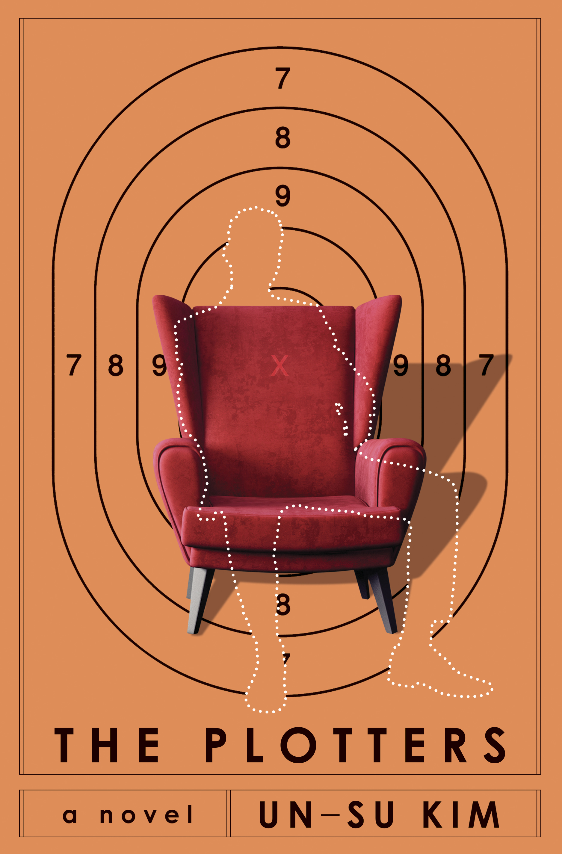
The final version and the one that ended up on the book plays up the existential aspects of the novel. I do believe this to be the most intriguing of the bunch and the most fitting for the story. The target symbolizing the Hit Man's mark rather than a literal shooting target. Notice the red “X” or center of the target aligns with the heart of the outlined man. The empty chair…Now why is there an empty chair on the jacket of a book about an Assassin? I’m not sure how to summarize this, but I can assure you it applies heavily to the book. This can also be said about the outline of the man… There is a chair, but who is sitting in it? Let’s just say Reseng is chasing an idea, a figment, a ghost, so to speak. The screaming orange comes back on this one, although the reason for it in my mind this time around is to evoke the idea of hunting or a hunters vest to be more precise. Which brings me back to weak spots. This is the last jacket I did in a succession of five books that all featured neon on them is some way. I just got carried away with it for a bit, but can you blame me?
Final cover
Editor, artworker and lifelong bibliophile.

