Michael Morris with a Look at Different Directions for The Travelers

Michael Morris is a designer based in New York. He currently works for Crown Publishing Group. Here he details his process for designing a striking cover for The Travelers.
The cover for The Travelers by Regina Porter came about when I was trying to do something completely different and, once I stopped trying so hard, it finally started to come together. Basically every cover designer will tell you the road to a cover is almost never the same, which makes it interesting but also stressful of course.
This novel is a family saga of two families, one white and one black, interconnected over many years and places. It’s a story made of many different stories, none necessarily more important than the other. This meant there was no shortage of symbols to represent each part, but which ones could represent the wide scope of the entire book was the challenge. Initially in conceptualizing with editorial, we wanted something bold, modern, but with a touch of a southern classic feel. Even though it takes place all over, a large selection of the stories take place in the south, in particular one scene that shapes the events of much going forward. This particular scene takes place on a tragic night when a young black couple is pulled over by the cops in Georgia in 1966. Along that stretch of road are weeping willow trees, we felt that given the strong family narrative it would make sense to use willows as a sort of family tree.


These were my initial attempts. They liked the dark background with the willow branches but the initial cover we sent along to the author actually ended up being the opinion with goldfish (#1). As a young man, one character is at the LA apartment of a mother’s friend who has fish tank so clustered full of goldfish he could barely tell what they are. This had struck me because of all the inter-working narratives and the obvious and subtle impacts characters had on one another.
I had dates dispersed throughout the fish since the novel is structured by year but editorial thought it was too overwhelming with the fish so we simplified it.
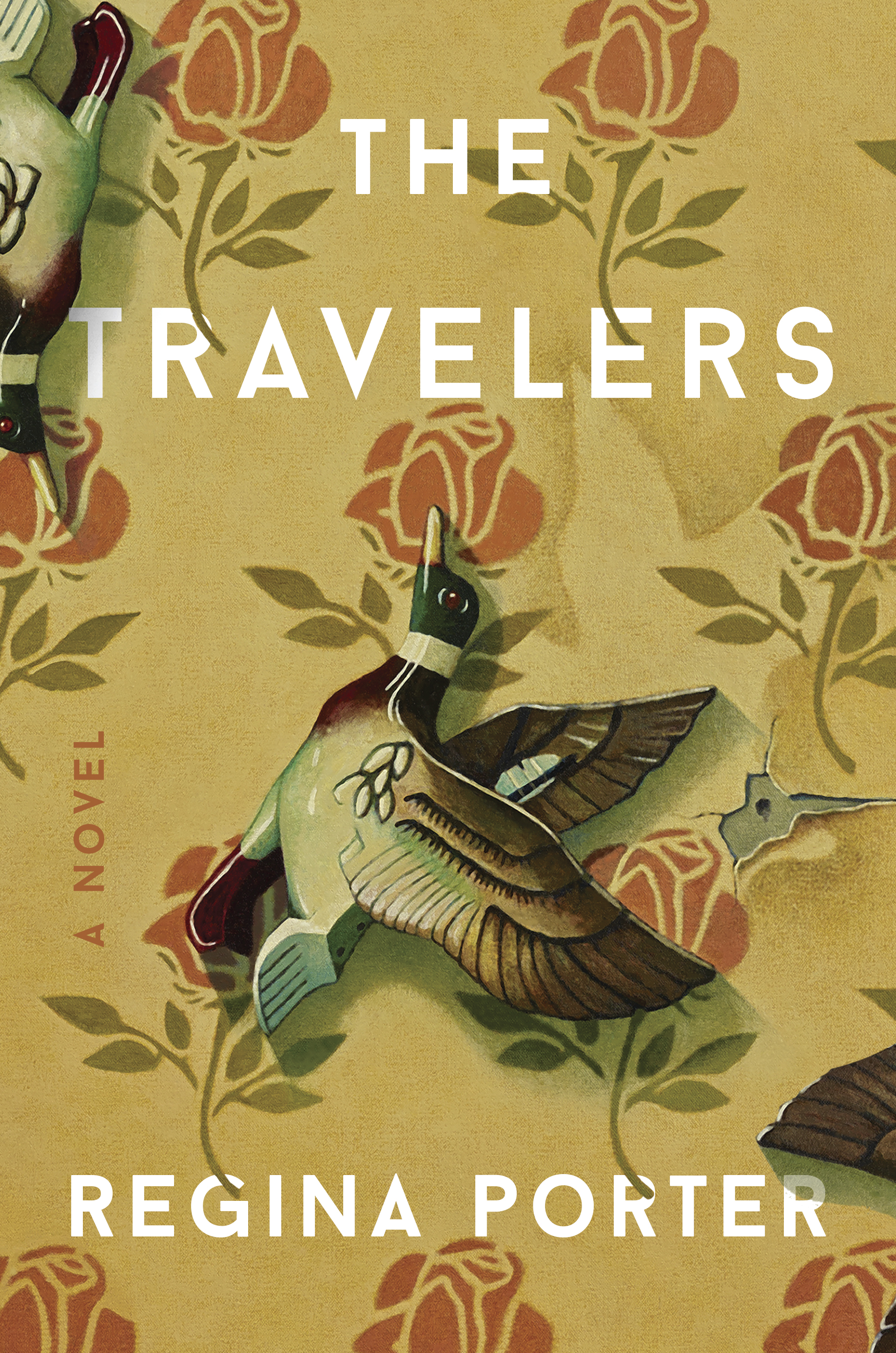
The response wasn’t bad, the author thought it was pretty but she was concerned that it just didn’t feel right. She liked the idea of the goldfish but thought it was too small of a detail of the book to represent it entirely. But, we had a second favorite (#2)! So we sent the idea with the willow branches falling down over the type. Again Regina liked it but it still wasn’t feeling totally right to her, she thought the tree made sense but that the cover was too dark. She wanted something with brighter colors and maybe more abstract.
Ok, so back to the drawing board. We decided to run with the idea of the tree and ways to convey it abstractly with more color. My art director, Chris Brand, encouraged me to try some other directions if anything came to mind since we weren’t married to the tree.


My initial idea was using tree rings interacting, then I thought just the leaves of the willow, but I also decided I needed to explore some new directions like Chris suggested. The first thing that stuck out was a scene at the very end at a crayon factory, parts of both families are coming together who now intertwined through marriage. I liked the idea of the mixing of different colors, this one I did think was unique and the editor did as well, but we all liked the final cover more. My next attempt was just focused on the title, the idea of traveling which is interrupted in various different ways throughout. I liked this; the motion, various horizons but something about it a felt static to me as well, I realized later it was the type. That led me to a bit of a breakthrough down the path to the final cover. I’d decided to give the tree rings one more go before I showed anyone the next round.
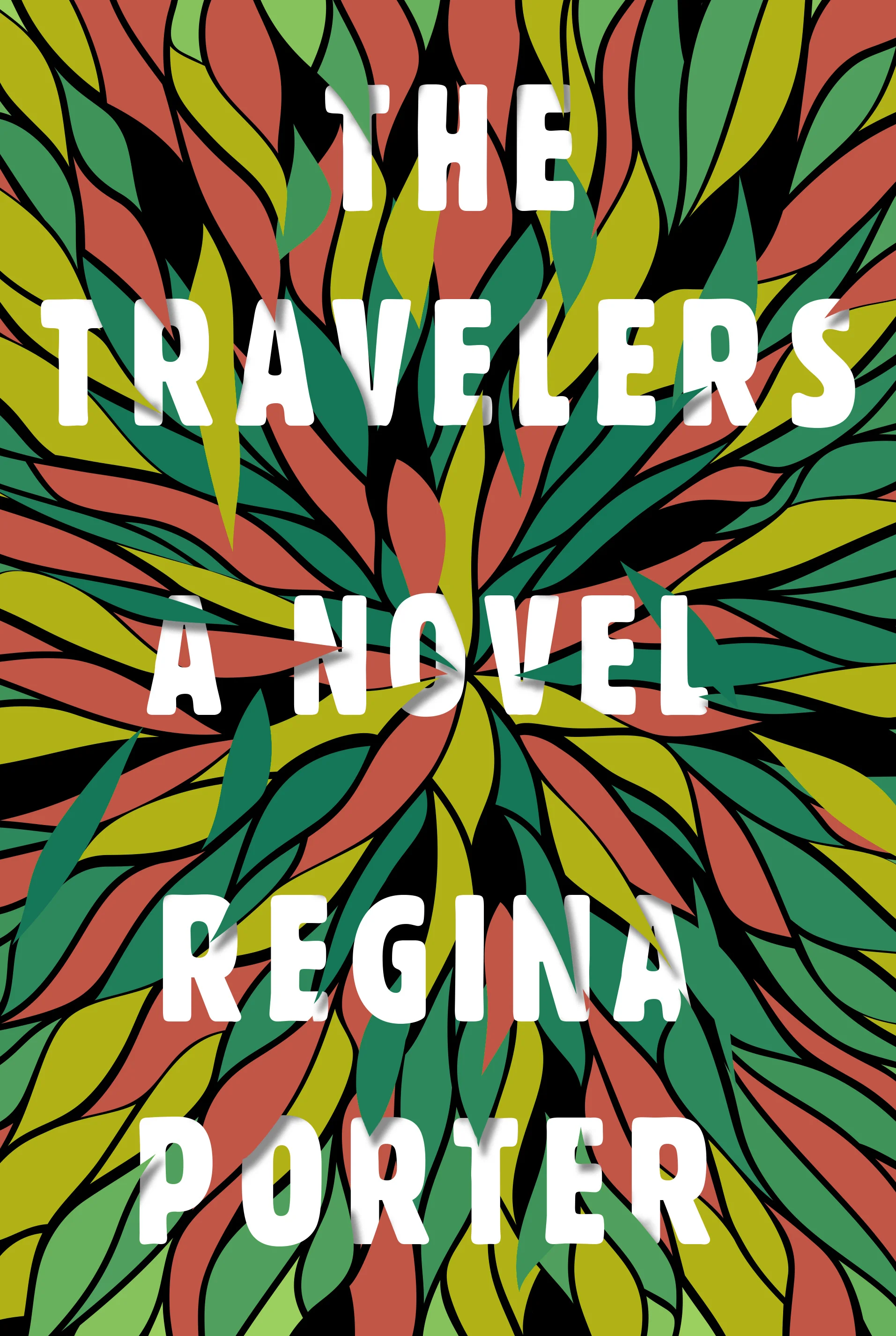
I had these abstract colorful tree rings that felt right but when I set the type it was still too static so I started playing with the type in different scales. I really liked that. And then I remembered the horizon idea and I started to get a picture in my head. I took the type and started playing with random horizon lines of color. It started to come together. Some horizons joined with others; changed colors; some sculpted along with the type; some became water; and some I added bursts at certain points to show the conflicts along the their travels in different stories. It had an organic quality and life to it that I realized the rest had been missing. It was my clear favorite, and thankfully it ended up being everyone else's including Regina!
Final cover
I also got to do a full wrap around of the illustration for the jacket which admittedly took forever but was something I’d wanted to do for a long time.
Editor, artworker and lifelong bibliophile.