Michel Vrana on Designing The Death Scene Artist

Michel Vrana is a graphic designer who ran his own boutique studio for ten years before deciding to go freelance in 2009 to concentrate on his passion: creating book covers. Here he talks us through his process for designing The Death Scene Artist.
Andrew Wilmot’s The Death Scene Artist (Woksak & Wynn) is a literary horror novel that recounts a romance between the dying M_____, a bit player film and television extra, and the world’s greatest living ‘redshirt’, who has died on screen nearly 800 times. There’s a lot of symbolism that came to mind right away in reading the book. Movies, death, performance, scripts, masks, red…
This was one of those projects that came together slowly, then quickly. A couple of weeks of intermittent brainstorming, reading, and letting ideas stew while I worked on an unrelated typesetting project. Then a flurry of activity within a couple of days. While I was reading the manuscript, I had put together a (very) rough sketch. Here’s a translation of my chicken scratch on that sketch: film tape, film strips, red x over type, film reels, photographic collage, iconic, various deaths stick figures.
The image of the skull continued to resound with me when I sat down to start fleshing out designs. Even as a rough, the idea of film reels as ‘coins’ over the eyes of a corpse felt like it would work. For the first couple of comps, I overlaid monochromatic magenta skulls on a solid colour background, and added the film reels over the eyes. The title set in a typewriter font to allude to a script (on a slip of paper perhaps even torn from said script!). And the rest of the type in unassuming Caslon.
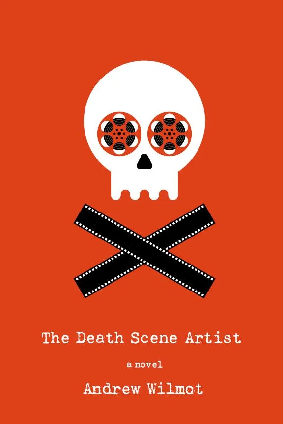
A second set of ideas centering around the skull idea took a more illustrated bent. In addition to the skull and film reels, there are two film strips beneath the skull to make a skull and crossbones. And for at least one of the comps, I used red as the background to get that ‘red shirt’ idea on the cover.
Finally, further exploring the illustration vein I tried the idea of a chalk outline made out of film, spooling from a reel. While I liked this idea, the detail of the sprocket holes kind of got lost. That brought me to exploring something with a close up of a film reel, but it didn’t inspire further exploration and didn’t make it into the mix. An idea from my sketches about a red x over simple type didn’t make it very far either.
So with three ideas I was confident about, I sent the designs in!
Usually once a design is in the publisher’s hands, there’s the suspense of waiting for feedback: What did the author think? Are there any revisions? Does marketing feel like seeing a few different colour options for the background. One of the great things about working with smaller presses is the nimble decision making, but even that couldn’t prepare me for the joy of seeing the author post a chosen cover on his Facebook page within only minutes of my having pressed ‘send’. The magenta skull on the yellow background was the winner — the favourite of editor, publisher, and author.
Furthering that joy, Andrew is the first author who’s asked for a high res file so he could print out a double sized copy to frame for his home!
Final cover
Editor, artworker and lifelong bibliophile.


