Myunghee Kwon on Designing Blue Hunger

Myunghee Kwon is a New York based designer currently working at Bloomsbury Publishing. Here she take us through her process for designing Blue Hunger.
As a designer, the process of creating a book cover can be challenging, especially when it comes to translating the essence of the story into a visual representation. However, for Blue Hunger, the process was an exceptional one. In fact, the book was so visually compelling that ideas for the cover design started forming in my mind as I read through the manuscript.
My usual process for designing a cover involves taking notes while reading through the manuscript, highlighting words or phrases that stimulate a visualization of the story. However, with Blue Hunger, I was able to simultaneously take notes and create sketches of cover ideas.
Blue Hunger is a novel that boasts vivid colors and glossy synthetic elements, as well as exploring erotic rituals that the main character and her partner, Xu, participate in. However, the book also delves into themes of grief and mourning following the death of the main character's twin brother. To capture the essence of the story, I aimed to present three different cover ideas in the first round of sketches. These included a colorful and plastic design that hinted at grief, a design featuring bite marks, and a sexual yet abstracted design.
The initial design incorporated striking colors, plastic elements, and themes of grief, drawing inspiration from the novel's vivid imagery. The gradient palette featured hues such as fuchsia, which was inspired by the mention of "fuchsia signs for non-Chinese spots," and electric green, which referenced Xu's friend's hair color. The glossy, blue acrylic heart, which contains a black hole, represents the protagonist's love for Xu, as well as her mourning for her brother's passing. I added liquid chrome typography to capture the Y2K aesthetic that Xu and her friends would appreciate if the book was published in their world.
The two main characters' erotic rituals played a significant role in the story, so I chose to base the cover designs around them.
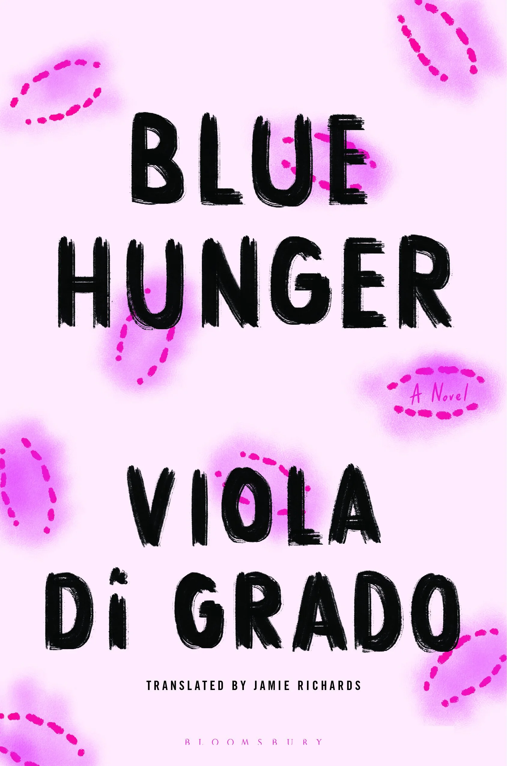
For the second design, I wanted to show the bite marks that the main characters actively inflict on each other during sexual encounters. I aimed for a design that was both warm and gritty, using pink to draw the bite marks and adding rough-edged, handwritten blue typography. This cover design reflects the intense and passionate nature of the characters' relationship, while also conveying a sense of rawness and vulnerability.
Finally, I aimed to create a cover that captured the sexual aspect of "Blue Hunger." To achieve this, I created an abstract graphic illustration of a biting nipple, drawing inspiration from the main characters' erotic rituals of biting and consuming each other. I selected colors to make the image less abstract.
While the first and third designs were both strong contenders in the initial round, ultimately, we decided to go with the second design. Based on feedback, I presented several variations of the design with different color palettes and straight (roman) typography.

Designing the cover for Blue Hunger was an incredibly enjoyable experience for me. It was rare and exciting to be able to visualize the design as I read through the book, allowing me to create a cover that truly captures the essence of the novel.
I am thrilled with the final design and hope that everyone will enjoy the visually stunning novel!
Final cover
Editor, artworker and lifelong bibliophile.