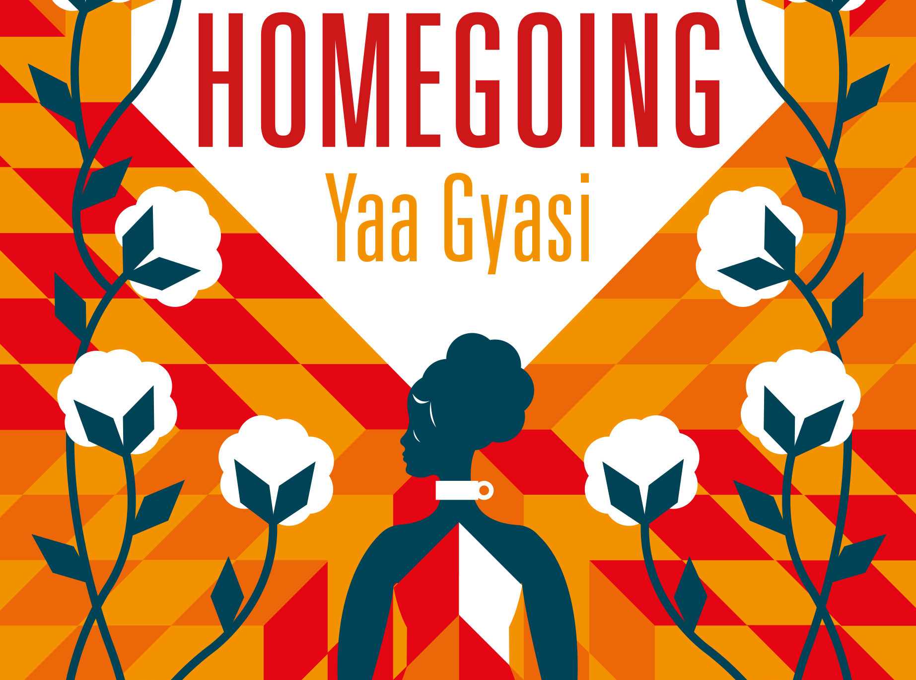
Nathan Burton on Designing Homegoing

Nathan Burton is a London-based freelance designer and illustrator. He created the cover for Homegoing, published by Viking. Spine contacted him about the cover. Here is his process for designing it, in his own words.
This is a great book that follows the fates of two sisters and the subsequent generations, starting in the Gold Coast of Africa, then to the cotton picking plantations of Mississippi and later the dive bars of Harlem.
Choosing where to start with the design of a novel that has lots of characters and a long time frame is always going to be a challenge but I was drawn to the cotton plantation and started looking at early American folk art for inspiration. I purloined the diamond pattern from a quilt image I found which led to the illustrations of the cotton plants (with diamond leaves to match the pattern) and the woman who’s dress merges with the pattern.
My aim was to create something that was beautiful with a hint of menace (the iron neck ring) but also graphic and bold. Originally I had more of a muted colour palette with blues and pink but the publisher suggested warming it up with the reds and oranges which helps get across a feeling of searing heat of the mid-day sun.
In design terms the title is a bit awkward being a long single word so it made sense to use a condensed typeface and keep it simple.
Editor, artworker and lifelong bibliophile.


