Nick Stearn on Designing Covers for Nomad & Exile

Nick Stearn is an art director based in London. Among his works are the covers for James Swallow's Nomad and Exile. We contacted Stearn about the designs. Here is his process for developing them, in his own words.
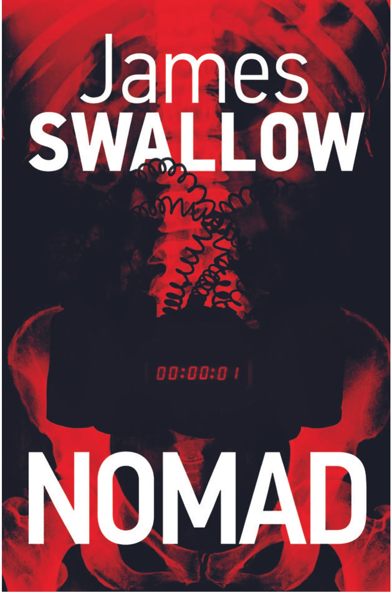
Nomad - a novel of intrigue, under-cover agents, and the fight against terrorism. From the glittering embassies and super-yachts of Europe to the arid deserts of the Middle East.
We looked at many competing titles and decided what was needed was a strong, simple, graphic that encouraged you to pick the book up to find out more. To establish an author brand that is simple and bold, conveying the essence of the book through a simple graphic language.
Tech played an important part in the novel and after discounting images of bombs etc we decided on a simple circuit board graphic. For sense of danger we added the universal colour shortcut, red. For a sense of region, the word ‘stop’ in arabic siting just above the ‘MAD’ of Nomad, with a grunge texture for a feeling of gritty, dark, fast pace. I wanted to keep the font sans serif so not to over power the arabic and range right to give an additional clue to the region where arabic is read right to left.
We did play with various words in arabic from Harib, Bomb, and Death, but settled on Stop as the strongest option in terms of meaning and the simple aesthetic.
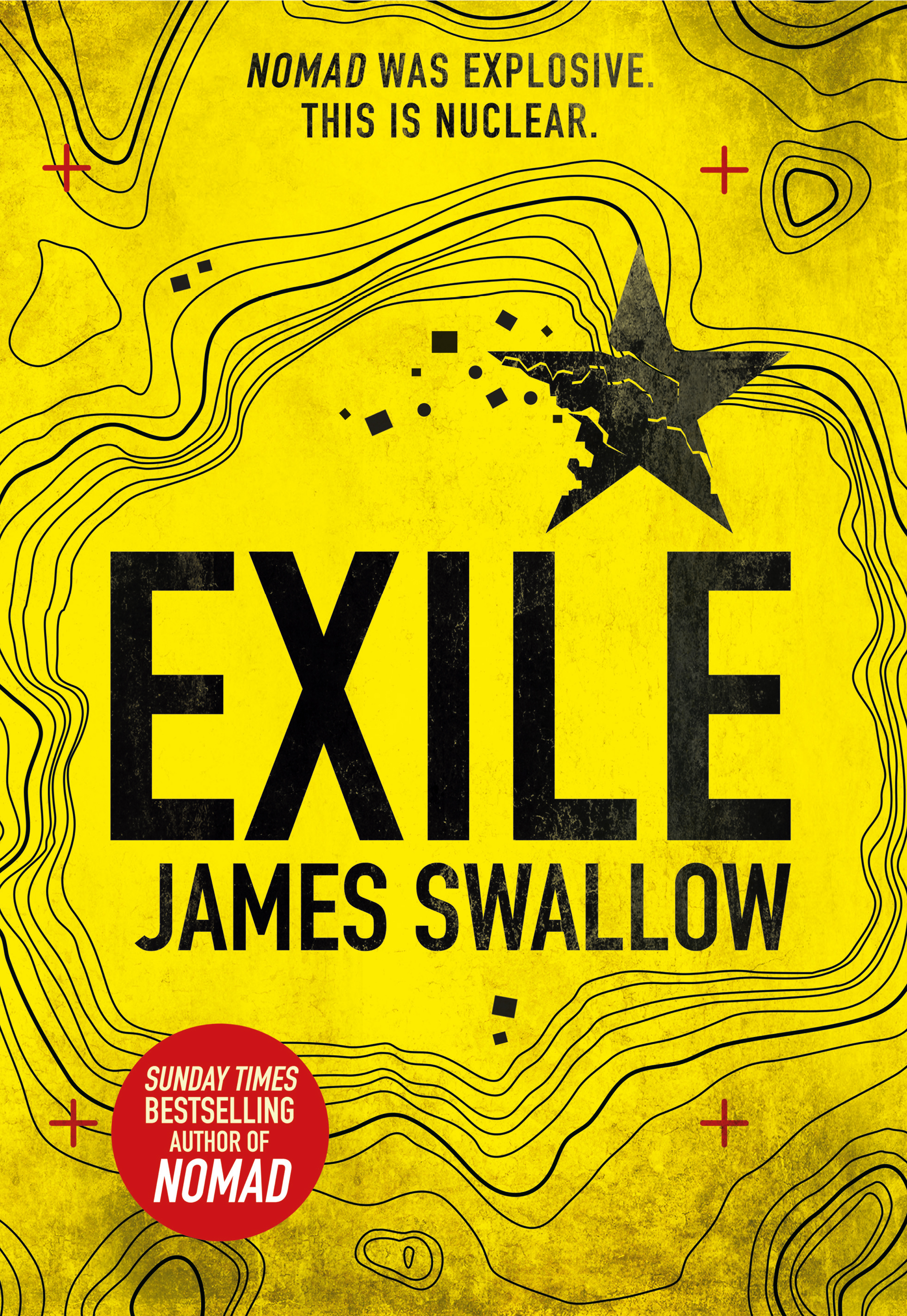
Exile – a novel based on the idea of a nuclear dirty bomb in the hands of terrorist in and around Somalia, with added Russian and the West involvement.
Because of the success of Nomad we wanted a similar package. Strong, simple, bold.
At first I followed the idea of a blueprint on how to build a dirty bomb but once we placed it next to Nomad is just appeared too complicated. Too intricate. I explored the idea of reusing the circuit board and adding the Somali star from their flag on a blue background, but again it was moving away from the initial strength of book one. We eventually decided on a topographical map showing the relief of a desert on a yellow background. The yellow symbolizing not only desert but nuclear/hazard.
We experimented with Russian script above the title in a similar way to the Arabic above Nomad, but because many of the characters in Russian are roman it created confusion when you read the copy. So we brought back the five pointed star of Somalia from an earlier rough. To give a sense of drama we broke up a section of the star creating what could be a terrorist encampment in the desert. After adding a splash of red with the addition of cross-hairs that subtlety implies image capture from a satellite, we added a grunge texture for the dramatic, earthy, fast-paced action.
Hopefully we’ve achieved a bold eye-catching cover but you’ll be the judge of that.
Editor, artworker and lifelong bibliophile.


