Nicolette Seeback on Designing the Luminous Cover for Trust Exercise

Nicolette Seeback is a Senior Designer at Henry Holt & Company, an imprint of Macmillan Publishers. Here she takes us through her process for designing Trust Exercise.
Designing the cover for Trust Exercise was a unique experience for me because I didn’t have the chance to read the manuscript before I started working on it. This was because the project wasn’t initially assigned to me, but I had been attending jacket meetings where many beautiful designs were being presented, none of which were being approved. I had been listening to the feedback on the other designs, while also learning some clues about the book itself during this time. When I was asked to contribute some designs to show in the next round, I thought about all that I had heard, and my first instinct was to experiment with intimate figure drawings. I had heard that sex and consent were themes in the book but I hadn’t yet seen any covers exploring the body, so I set out to fill that gap. I used crayons, thick markers and various other pens to create line drawings on paper that I scanned and vectorized. I treated each of these designs very similarly by placing large type in the center and weaving the illustrations through the letters. These comps were liked by some but ultimately killed because they weren’t quite right for the book.


The UK cover was approved and sent to us, and we were asked to try something similar by emphasizing the X in “exercise” and using paper. I had started reading the manuscript at this point so I knew a bit more about the book. One idea I had was to create an X out of paper stacks and photograph them. This created an interesting effect but I also wanted to try a version where the X could cross something out. I decided to print photos of young girls and photograph them cropped in a way that the X would cover them in the right way to make it seem like someone is trying to eliminate the girl. These were not approved, and during this meeting the idea of using chairs was proposed.


I knew that using a chair on the cover would relate to the title, because the students in the book participate in many exercises during drama class, one of which is a trust exercise. This is when two students sit close together and face each other. They take turns repeating a word or phrase and depending on the way it’s spoken, the meaning can change. Often the exchange turns more into a conversation, and a wealth of meaning arises just by the repetition of a few words. I imagined the chairs as fold-out chairs since they’re constantly moving them around the room for various exercises. I drew two of them at interesting angles, facing towards each other. Given the time constraint I was happy to find a font called Pinto that was drawn very similarly to the chairs. I designed a few covers that featured two chairs but it didn’t seem interesting enough, and also felt too literal.


Compelled to add more, I decided to draw chairs from many angles and create a pattern. In my first design that had a lot of chairs, they’re in a rainbow of colors and many angles, some even upside down, which made the them look like they were falling from the sky.


I thought this may be going too far so I pulled back a bit and designing a version with all of the chairs right-side up, closer together, and in the same color. This felt more true to the book because it reflected the chaos of the classroom. Although not a literal two-chair trust exercise, I realized that as a pattern it still related to the title because of repetition. The same chair seen from various angles is similar to words being delivered in various ways so to earn new meanings. So the chairs became a metaphor for the words in a trust exercise. This version was sent to the author and approved. We picked very bright Pantone inks for the chairs and background and a warm beige for the type. It wasn’t until I finished the book and reflected on it that I came to realized how the trust exercise, and therefore the chairs on the cover, actually are a metaphor for the different characters. Now, to me, each chair represents a person, with their own unique memory and perspective of an experience. To a viewer looking at the cover before reading the book, it may just seem like a chaotic room, which is fitting. But while reading, the cover takes on a new meaning which caught even me by surprise.
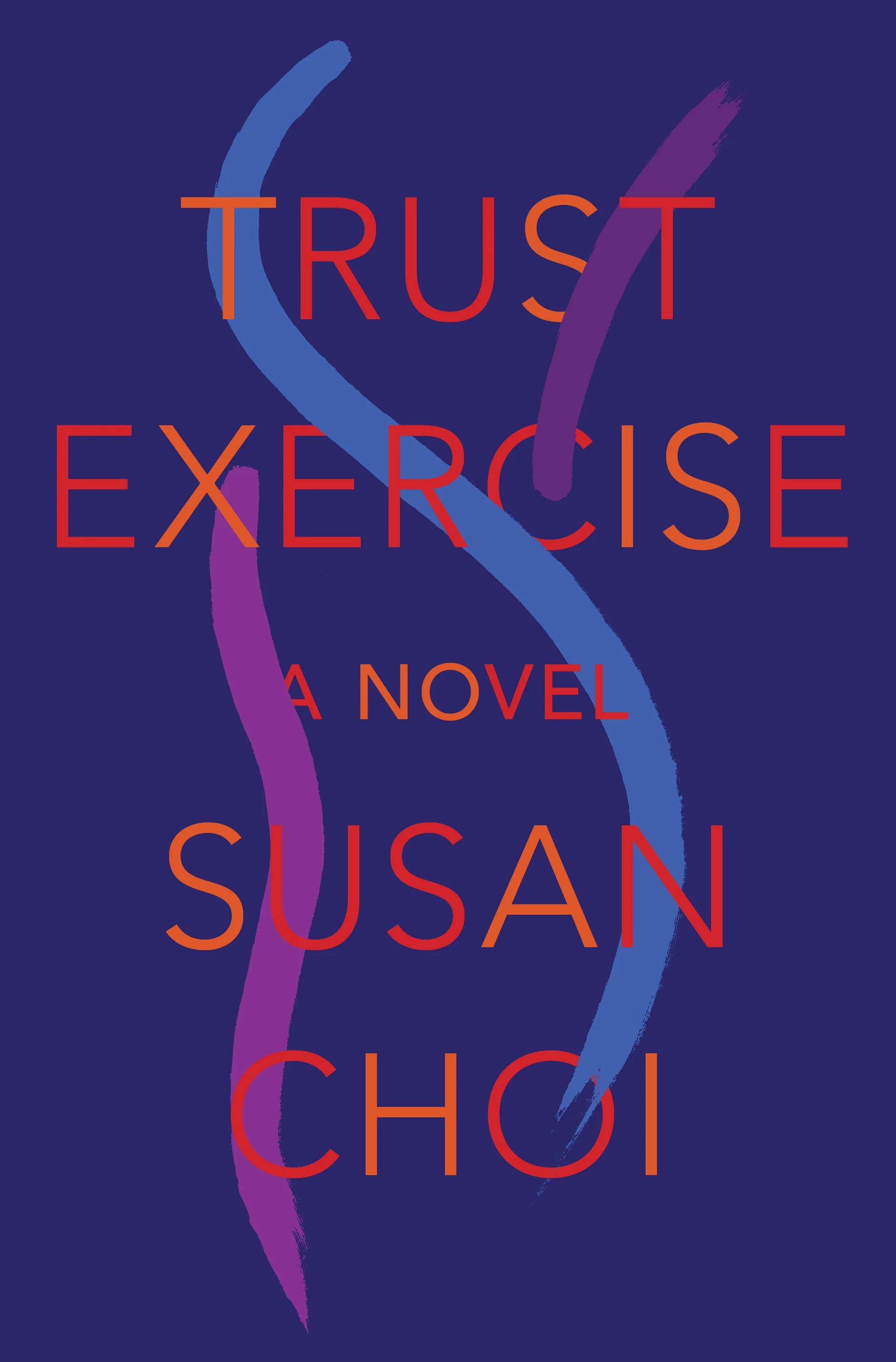
Final cover
Editor, artworker and lifelong bibliophile.