Owen Corrigan and Jeffrey Alan Love Collaborate on A Lush and Seething Hell

Owen Corrigan is a Senior Designer at HarperCollins. He lives in Brooklyn. Here he gives us a peek into his process for creating the cover for A Lush and Seething Hell.
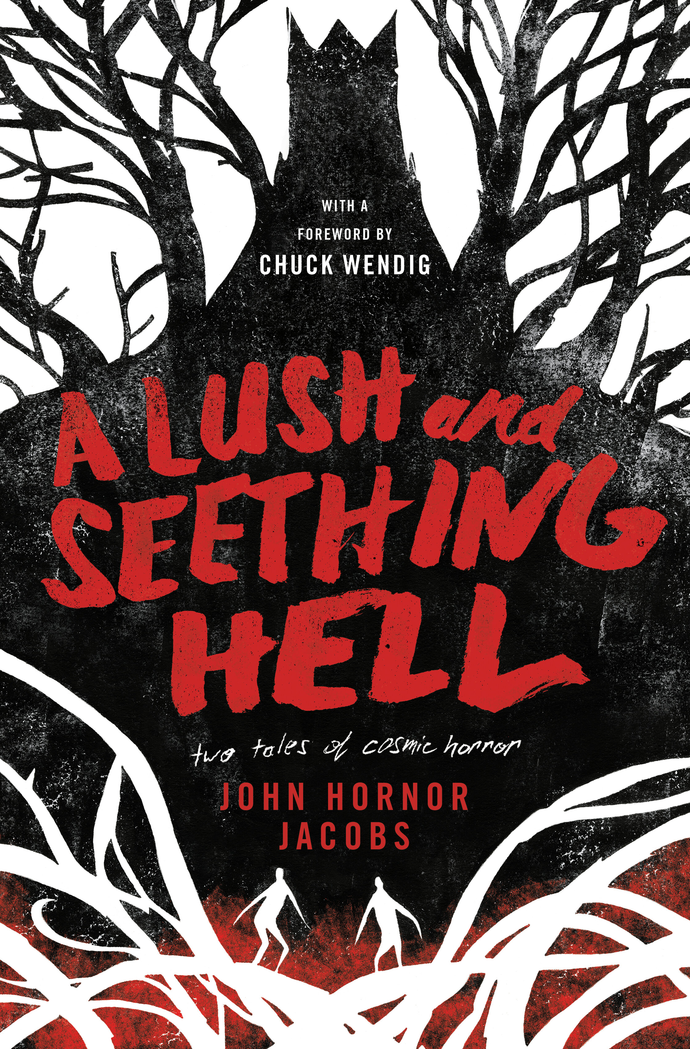
A Lush and Seething Hell is a collection of two horror novellas and a short story by John Horner Jacobs. It’s poetic, moody, and, appropriately, lush. The book’s editor, David Pomerico, was looking for something graphic and striking. He and the author already had Jeffrey Alan Love in mind as an illustrator. Love’s style, also appropriately, is poetic, moody, and lush. I admire Jeffrey Alan Love’s work and am a big fan of his textural, minimal palette and use of negative space.
Love was available and happy to work on the project. I sent over the manuscript and minimal direction, asking him to read it over and try to capture the intense atmosphere of Jacobs’ writing. In seemingly no time at all, I was sent back a wealth of beautiful thumbnails and concepts. They were all visually arresting and deceptively simple—black and white, with occasional pops of red. The three below were my favorites.
I took the sketches to the editor and we decided to go with the third direction. We liked the towering, monolithic structure over the two anonymous, petroglyph-like figures and the symmetry of the tree branches over top the abstract and twisting roots. The guitar in the other sketches is a reference to one of the novellas and it felt right to keep the cover broader, rather than specific to just half of the book.
Love worked on a more refined sketch and I tried a handful of approaches for type. I thought lettering the title or subtitle would work well with the quality of the illustration, but my initial attempts (below) were too restrained and quiet.


I turned to two of my favorite tools: a Pentel brush pen and marker paper. This brush pen has a pliable plastic handle that allows you to flood the brush tip with ink, helpful for modulating the quality of your strokes. The marker paper is translucent which is great for two reasons—I can sketch on the actual illustration to get an idea of how it will work in the space and I can redraw and trace over my lettering easily (retaining pieces that work and changing bits that don’t). I printed Love’s sketch out at 250% so I could sketch large and I worked over the lettering in this way, ending with the sketch below. I worked quickly and aggressively with the brush—I wanted the lettering to show “seething”. I let the baseline undulate and the strokes decay and fall apart as the words continued. For lettering on a project like this, I find striking the right feeling is more important than stylistically, technically, or classically correct letterforms (this, admittedly, is also a convenient way to defend against imperfections).
After scanning the type sketch, I did a little more work on it, tweaking spacing and adding some texture. At this point the article “A” was added to the title. I paired the title lettering with my subtitle handwriting from an earlier comp and chose Trade Gothic for the rest of the type (condensed, all caps, and tracked out felt rightly ominous).
I’m extremely happy with the final book cover, seen below. Jeffrey Alan Love’s gorgeous illustration and the evocative title do most of the heavy lifting here, it was a great project to be involved with.

Editor, artworker and lifelong bibliophile.