Owen Gildersleeve on Designing Burntcoat
Owen Gildersleeve is an award-winning artist based in London, specialising in handcrafted illustration, set design and art direction. Here he takes us through his process for creating the vibrant cover for Burntcoat.
When I was approached by HarperCollins to design the cover for Sarah Hall’s stunning new novel Burntcoat I was immediately struck by how timely the story was, with the book focusing on an artist and her lover in lockdown at her immense studio ‘Burntcoat’ whilst the world around her burns and disintegrates, due to a deadly new virus which is wreaking havoc around the world.
But unlike our experience of the Covid pandemic, Hall’s virus spreads wildly, causing society to collapse and corrode, with fights at foodbanks and burgled shops, followed by an authoritarian government response with military patrolling the streets and curfews introduced for all.
There’s a real sense of kinetic energy about the story and so for the cover I was tasked with creating something that captured that sense of looming drama.
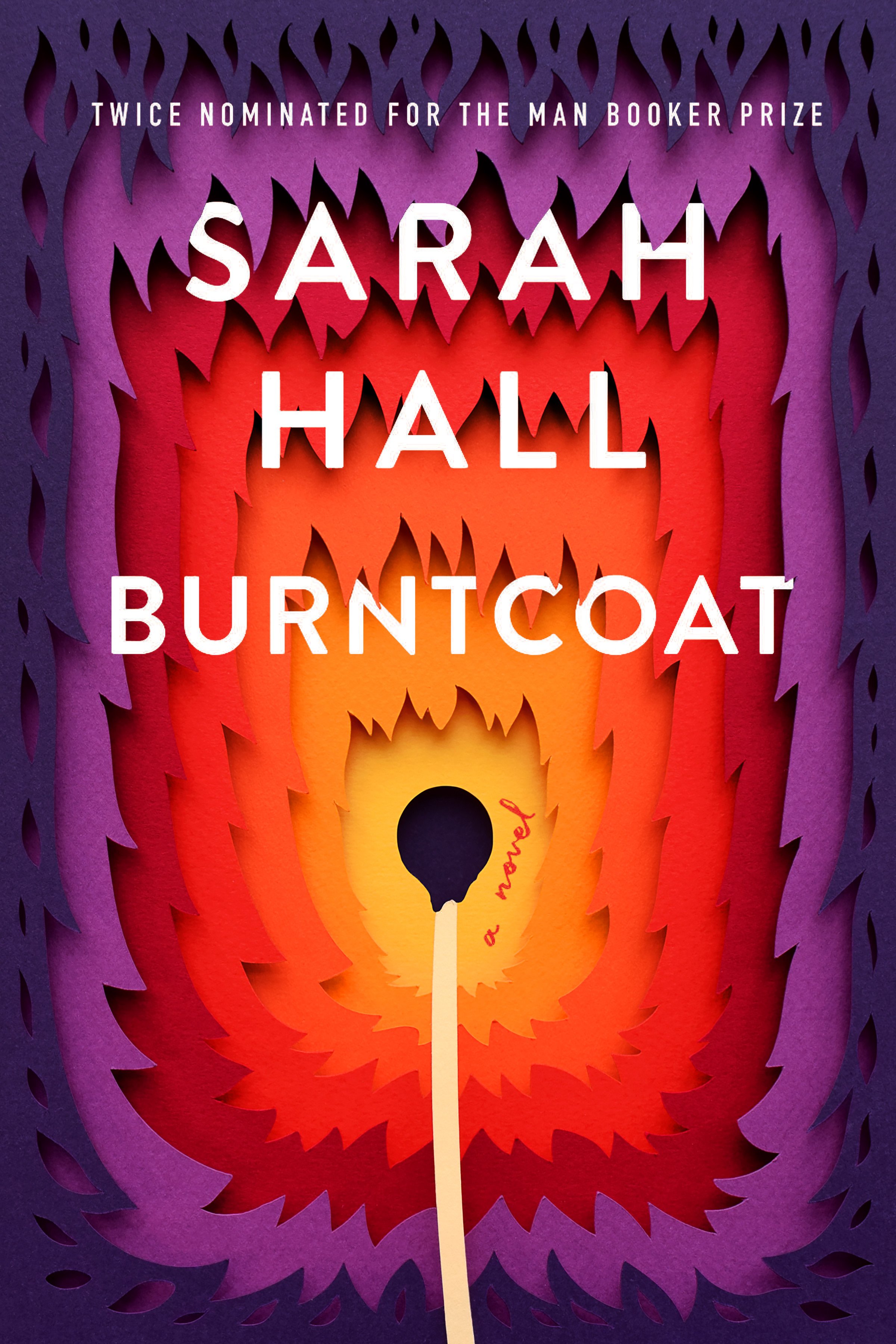
My artwork was inspired by the book’s narrative of fire, flames and burning wood, radiating with a gradient of energetic graphic flames. I decided on a warm gradient of tones for the design, to portray both the flame metaphor, as well as the warmth within the studio and the sexual narrative woven through the story.
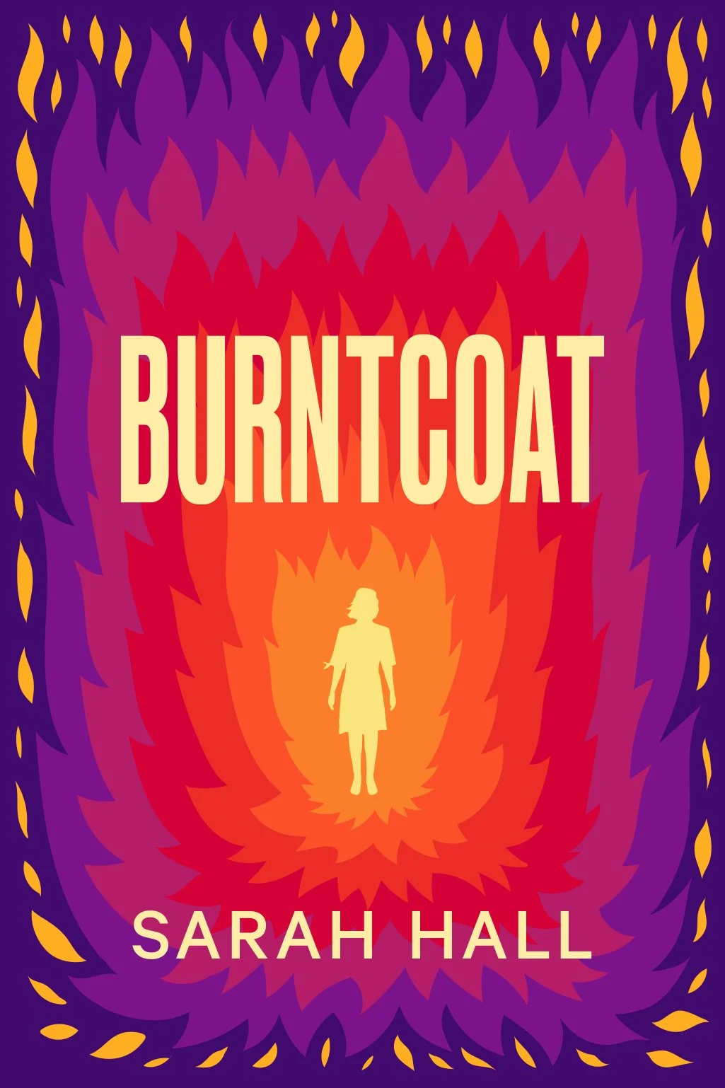
In my initial pencil sketches I had focused on a female silhouette at the centre, representing the theme of resilience.


But during discussions with Sarah and the Art Director Mumtaz Mustafa we realised that the silhouetted form was possibly too literal and that something more suggestive could allow for a more open read. That's when I switched the silhouette to a simple match form, which we all agreed perfectly solved this issue, as well as adding to the bold and graphic nature of the cover.
Once my Illustrator mockups were approved each layer of the design was cutout of individual sheets of coloured paper, using a variety of stocks to add a nice range of textures. This adds a nice tactile finish to the cover which I felt would fit well with the flame design. Once cut out, the final artwork was then assemble using pieces of foamboard to add depth, bringing the design up off the page, adding to the drama of the cover.


Once the artwork was complete I photographed the layered piece in my studio using natural light, which gives nice soft shadows helping to add to the depth of the artwork and captures allows the paper grains to shine through. I then cleaned up the final images in Adobe Photoshop and did a bit of retouching – pushing some of the colours to fit the palette I was after – to finally be supplied to the publishers. Mumtaz then added her magic touch with the type layout, which I think marries up perfectly with the design.
Final cover
There are times when you work on a project that you know you are part of something special and it has been wonderful to see the much deserved praise for Sarah Hall’s novel, including this lovely quote by Sarah Perry, author of The Essex Serpent which sums it up quite perfectly:
“An extraordinary work that will stand as a blazing testament to the age that bore it.”
A big thank you to Mumtaz Mustafa at HarperCollins for reaching out to me about this project and to my wonderful US agents Levine/Leavitt for all their support.
Editor, artworker and lifelong bibliophile.