Pete Adlington on Creating the Paperback Cover for The Wall

Pete Adlington is a Senior Designer at Faber & Faber. Here he explains how he created the stunning paperback cover for The Wall by John Lanchester.
The Wall is set in the near future, where rising sea levels have wiped out huge swathes of the world and to protect itself from both water and ‘the others’ who try to gain entry via the sea, Britain has erected a 30ft concrete wall around itself which is guarded by conscripted young members of the populace. You do your 2 years on The Wall, pray that no ‘others’ come and then you go about your life as normal. If The Others come and manage to get over on your watch, you’re put out to sea in their place. The novel follows Kavanagh, a young man who is just starting his time on The Wall.
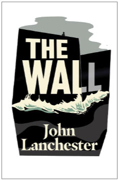
I joined Faber just as the hardback with a beautiful, understated jacket design by Alex Kirby came out. It captured the bleak isolation of life on The Wall perfectly and showed how much work two foils can do when used right. This design worked just right in hardback but for the paperback they wanted an illustrated look that would soften it and give it more narrative.
The descriptions of the loneliness that Kavanagh endures as he spends cold days and nights alone at his post put me in mind of a favourite painting of mine as a child called The Monk by the Sea by Caspar David Friedrich. It has a tiny figure set on a headland facing an almost pitch-black ocean that bleeds into dark clouds on the horizon.
The Monk by the Sea
I thought that a lone figure facing an unseen threat would work for The Wall and so I did some roughs to visualise that idea.


They liked the last one in the cover meeting and wanted to see it with more colour and energy. I ended up doing a lot of iterations and rebuilding the illustration many times, looking for the most interesting way of containing a landscape within an abstract shape. I think this worked better than having a full bleed image as it gives the book a more challenging personality which suits the dystopian storyline. On a more cynical level it also helps it stand out more on a shelf.

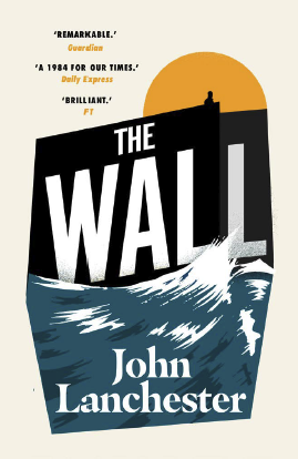


They still preferred the composition of the first but liked the bright mint colour scheme so I transferred a few of the details that I thought worked from the others into that one to end up with the final cover. Dropping the cloud let the aggressive angles of the wall stand out against the white backdrop for more drama and colouring the moon draws the eye to the lone figure. I made the sea angrier and finally, as a secondary and partially hidden detail, I added the suggestion of figures in the waves. They’re hopefully subtle enough that it doesn’t affect the sense of isolation while bringing a bit of discovery to the reader. I love covers that hold a bit back in that way.
The final jacket is made up of completely unremarkable elements but hopefully it brings them together into an arresting, accessible package.
Final cover
Editor, artworker and lifelong bibliophile.