Ray Shappell, A Totally Awkward Love Story

By Vyki Hendy
Ray Shappell is a Senior Designer for Random House in New York City. Among is many designs is the cover for A Totally Awkward Love Story. Here is his process for designing the piece, in his own words.
A Totally Awkward Love Story was the most fun I’ve had designing a book cover to date. It started while reading the manuscript, about a boy and a girl who fall in love while trying to lose their virginity. I laughed out loud so many times at how hilarious awkward and raunchy the story was. It is a sweet romantic comedy at it’s core, but since it is very mature, it would compete in a more sophisticated/older part of the Young Adult market, with a larger chance for cross-over appeal. I love comedy, so it was my goal to create a design that was equally hilarious to the story that my thirty-something year old friends would want to read.
Throughout the novel, there is a reoccurring reference to finding your lobster because Hannah has heard that Lobsters mate for life, and she wants to find her “one”. The original UK title is also Lobsters, so naturally, the very first visual that popped into my head was of a lobster claw trying to undo a bra strap. I laughed a lot while photoshopping these covers and realized that I wanted something along those lines—something unexpected and quirky. Although I did explore some more traditional photographs depicting this concept as well.
I also created some covers with male briefs, since the story is told in alternating point-of-views from Sam and Hannah. Besides a photographic approach, I embraced this graphic illustration of undergarments too.
I pulled together a few photographic figurative options showing both of the main characters, or at the least a hint of both characters. These were the more commercial and safer, more expected comps, but still had some quirk to them.
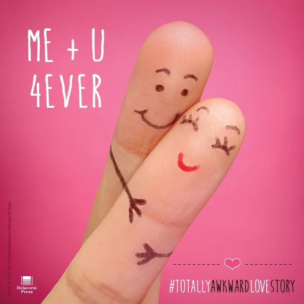
I then found these two hilarious images of fingers and knew that I was into something good. The photo of a finger couple with faces drawn on them in a warm embrace was SO sweet and charming, but yet totally bizarre. When combined with the title A Totally Awkward Love Story, it started to tell an interesting story.
We shared both of these finger comps as our favorites, with overwhelming support and LOTS of laughter along the way. Unfortunately, the illustrated version was deemed too risqué for our market, and plus the "finger couple" showcased more of the romance, which was a huge selling point, so we chose that cover. We shared this revised cover with a bolder title typeface to the authors and our sales and marketing teams as a concept to recreate with our own custom photo shoot, so that we could control the background color, depth of field focus, and quality. With these final approvals (and more giggles), we were ready to recreate this cover!!
ORIGINAL APPROVED COMP (Stock photo with dummy text for placement.)
We organized the photo shoot with still life photographer Christine Blackburne / MergeLeftReps and the hand model Jay Wen. Apparently, most hand models won’t let you draw on their hands, but Jay was amazing and let us create adorable couples out of her perfect fingers. It was an extremely fun shoot and by the end, we were all confident that we had created an amazing cover that was much better than the original stock photo.
I explored some alternate type lockups on the final photograph, but in the end, it was decided to stick with the simplest design that I had from the first round. I updated the typeface to have more of a quirky personality. The title and the photo are so amazing that they both deserve to exist in their own space without competing with the other.
And here is the final cover!
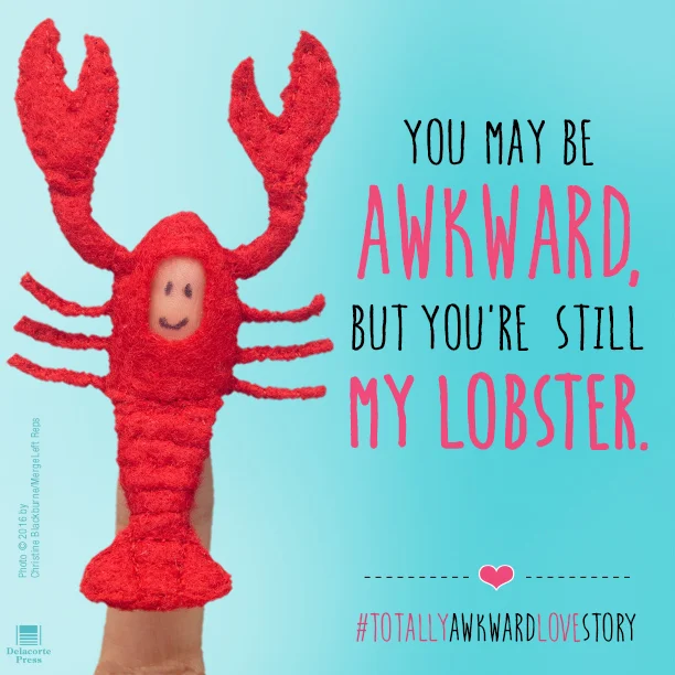
We also photographed alternate scenarios with our “finger people” to use on the flaps and back of the jacket, along with some images for our marketing campaign. And yes, we did have a tiny finger lobster suit created!
Marketing campaign: Social images + a fun finger puppet dress up kit, with perforated clothing that you could dress up your fingers.
Lastly, I was able to use my second favorite design on the case cover, underneath of the jacket. The front has an illustrated pointed finger gesture on the right side, and the back of the case has the hole gesture on the left side. If you flip your book around quickly, or sit 2 copies next to each other, then you can create finger and hole gesture. HAVE FUN!
Editor, artworker and lifelong bibliophile.


