Shapes with Personality: Shayla Bond Talks SPINE 7’s Cover Design

Editors Note: SPINE 7 is in the final stages of editing and will be available for purchase in the coming weeks. Check back for more details. You can see previous print editions of SPINE here.
Cover Design: Shayla Bond
Simplicity is key. Sure. But so is substance. A clean, minimal graphic only works if it means something. Enter Shayla Bond, the cover designer for SPINE 7. If you think this issue’s cover is cool, you should meet its creator. Bond (even her surname radiates badassery) is a self-taught visual artist and fashion illustrator with a university background in textiles and artisanal methods. For her, the jaunty shapes on SPINE 7’s cover are not only delightfully simple; they are deliberate, meant to mean.
Although she works freelance as a fashion illustrator and textile artist, Bond is new to cover design. Though one might never guess it, this very issue is Bond’s cover design debut. “Designing a cover for a magazine about Book Cover Designers felt very meta to me and initially intimidating. With some much-needed encouragement from SPINE Editor Eric Wilder, I found a direction.”
As a designer, Bond combines her background in textiles into her two-dimensional designs, lending them the illusion of texture. “I still feel that my background in Fashion definitely compliments my overall personal style because of my love of textiles. I learned artisanal methods in University such as weaving and natural dying, embroidery and hand stitching. When I create, there's definitely an emphasis on colour and texture, very much as there would be in a textile. I think I'm focused on the 'feel’ over concept too much sometimes, but it's more intuitive for me.”
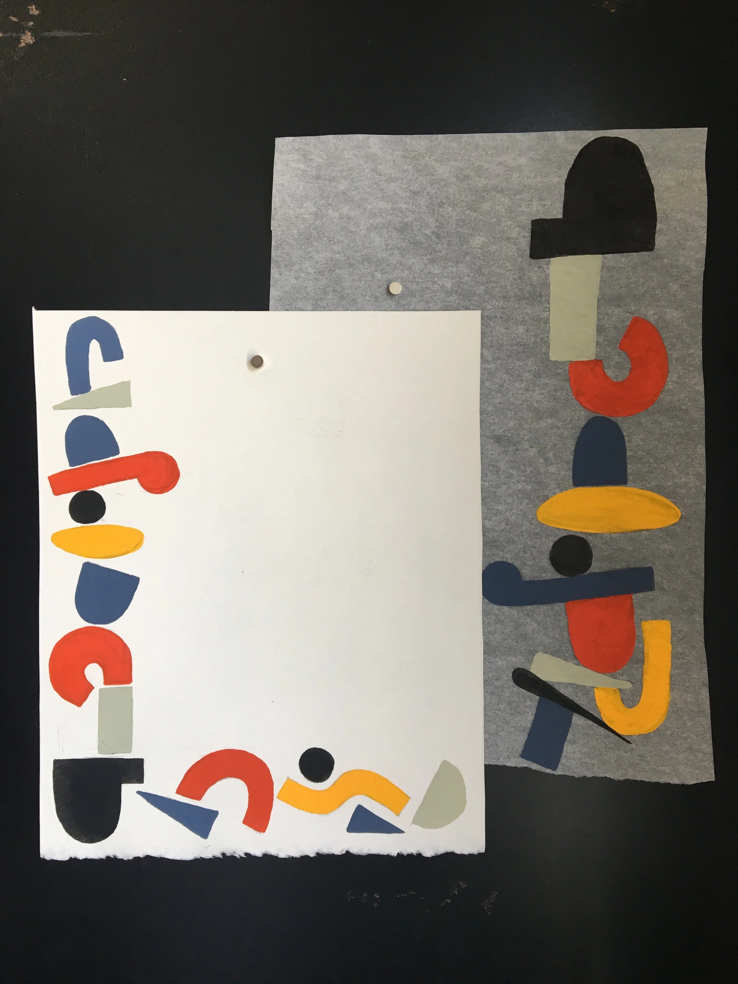
For her inaugural cover design, Bond created a simple image that becomes more kinetic and involved the longer one considers it. From the outset, she wanted to incorporate the literary into the visual: “Over the past few months I had been experimenting with abstract shapes and the process of painting in an exact manner with gouache. It had become a meditative process and reduced anxiety for me. Not dissimilar to reading a book. I thought that the two processes complimented each other and found my starting point.”
Bond claims that her work for SPINE 7 enriched her concept of design. “Not having much design theory under my belt, I found it hard to stray from the literal. My first cover concepts focused on the shapes balancing on each other in a spinal fashion. Eventually, painting the shapes over and over again in varying positions helped me think outside the box, and the idea developed naturally.” Eventually, the meditative nature of precise shape-painting led Bond to a more concrete vision for the cover. “I really wanted the shapes to dance on the paper in relation to each other. I chose a colorway of morange, mustard yellow and muted blue from the get go. It felt very mid-century to me and lent itself to the quirkiness and oddity of the shapes I was using, which also resembled letters on their own.”
Bond created several cover designs with the gouache method before settling on a final rendering, which was painted traditionally, then photographed for the cover. “In order to pick a final design, we iterated over 3 rounds of concepts. I ended up with 7 pools of shapes, each with their own personality. I like to call this design The Dancing Man. Initially my goal was to juxtapose the shapes within a cluster. I found the clusters as a whole created what looks to me like a playful man running, an ode to the ebbs and flows of a story narrative.”
Minimalism and mid-century revival are huge right now, but Bond makes them new for SPINE 7. Her process for this cover was meditative, like reading. It was also long and deliberate, like writing. The shapes are abstract nods to letters themselves, and they have movement, much like the narratives we crave. And the design stands out at first glance. Although she certainly relies on simplicity, Bond makes the calculated seem effortless and the symbolic seem playful.
We threw out the adage, “Don’t judge a book by its cover” when we started this magazine. When done right, covers convey meaning and conjure all sorts of explicit and implicit associations. They need to be simple, but not simple simple. Good covers, like the books and magazines they protect, mean something more.
Join us in celebrating the enormous talent that goes into book cover design. Consider a small donation to our Patreon fund. Your support helps us provide you with an in-depth look at some of the book publishing industry's most creative people.
www.patreon.com/spinemagazine
Mary Ryan Karnes is a freelance writer and a Master's candidate in fiction at the University of Southern Mississippi.


