Lauren Harms on Designing the Cover for Startup

Lauren Harms is a book cover designer living in New York City. Having been highlighted before for her work on Invincible Summer and Where the Peacocks Sing, we catch up with her once again to talk about the process of her cover for Startup - the new must read by Doree Shafrir.
Can you walk us through the design of this cover from start to finish.
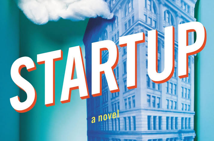
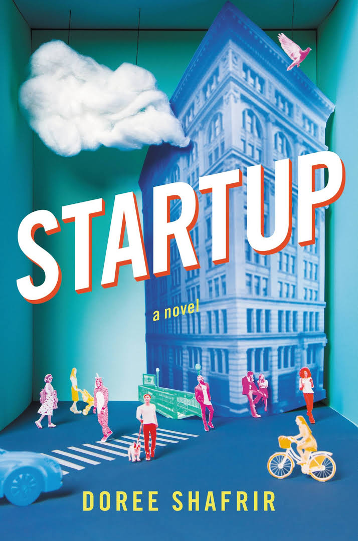
Startup is a super fun read – a witty take on NYC tech culture from the point of view of a startup founder, a tech journalist, and a 30-something Brooklyn mom/social media "engagement ninja". While doing image research I came across fine art dioramas and was immediately drawn to them. The idea of a microcosm aligned perfectly with the tech bubble setting. And who doesn't love The Sims? My creative director thought the fine art dioramas were too detailed, and rightly so. I didn't want to give up on the idea, so I started thinking about how the same concept could be simplified visually. I researched some model building items, like mini subway entrances, but the ratio math quickly got complicated. I’d also been planning to paint the objects, so they were monochromatic and less detailed. So I figured, why not skip a few steps and do everything in paper? I pulled a box out of the recycling bin and started printing out miniature objects and people. I shot a really rough version with my phone and took it into a meeting. After the concept was approved and the author weighed in, we made slight tweaks to the cast of characters and added things like the car bumper and birds. It kind of turned into real life Photoshop, adding objects and tweaking colors. Once all the pieces were in place, we shot it professionally and worked in the type.
Can you tell us how you feel the first impression of this jacket relates to the overall mood of the book?
When I first started working on this, [I] thought a lot about how I was creating an image for a book – a very traditional format – about tech culture – a notoriously untraditional industry. I think the image hints at that irony. Yes, it's made by hand, but the bright colors and minimal elements make it a refreshed take on a diorama.
What was the most enjoyable aspect of designing for this project?
Building it all by hand! It was a lot of fun to bounce between the computer and x-acto. So much fun, that I made a video of the final build.
