Steve Leard Plays With Perspective for The Mountain That Eats Men

Steve Leard is a graphic designer based in Plymouth, specialising in book design, branding, illustration and typography. Here he talks us through his creative approach to designing The Mountain That Eats Men.
The Mountain That Eats Men (Zed Books, 2019) is the haunting story of Cerro Rico, a mining mountain near Potosí, Bolivia.
From the 16th century, the mines of Potosí bankrolled the Spanish empire. During those years immense wealth allowed the city to grow larger than London at the time and the mountain was quickly given the epithet Cerro Rico – the ‘rich mountain’. But today, Potosí’s inhabitants are some of the poorest in South America while the mountain itself has been so greedily plundered that its summit is on the verge of collapsing. So many people have died in the mines that Cerro Rico is now called the ‘mountain that eats men’.
The book is a unique combination of memoir, reportage, travel writing and history. In this captivating, moving tale of harrowing bravery and wistful beauty Ander Izagirre tells the story of the mountain and those who risk their lives in its shadow through the eyes of Alicia – a 14-year-old girl working in the dark, dangerous mines to support her family.
Zed wanted the mountain to feature prominently on the cover, but were open-minded on the style and approach, just as long as it communicated the idea of the mountain.
During research into the area, I found some great photos of the mountain today and the miners, so I tried some options with these images to see if they’d work.


As good as the photos were, they weren’t the right feel for the book, so I started looking at different illustrative styles instead. I found a line drawing of the mountain that I liked, but felt it made the book look too traditional. I created an illustration with a bold blue sky that was liked at Zed, but again for me it’s not the right fit or special enough for the book. We felt a more abstract and ethereal approach would be more appropriate for the book.


I’ve seen a lot of covers using contour lines before, and I thought this could be a good chance to do something nice with silver foil, to link back to the subject matter. Zed also asked if I could try an option using a figure, so I tried to combine the sense of a figure within the contours of a mountain.


These initial two seemed a bit generic to me, so I wanted to push the idea of contours further. Whilst looking at the mountain on Google maps to get the correct contour lines, the rough shape loosely reminded me of the profile of a persons head, with a nose and chin leaping out at me. Whilst its not immediately obvious, I thought it could represent the idea of a figure and the many people who have died in the mountain.
I took the contour lines to see if presenting them in a different way to how I tried before would be more effective. Whilst the shape reminded me of a profile, I worried that it wasn’t obviously enough to someone not looking for it. But despite this I thought using the correct contour lines was necessary, and if someone else saw the profile too then that would be a bonus.


These initial efforts seemed a bit quiet, so instead I tried a completely different approach and moved away from linear marks. Instead I tried using layered card to build up the contours, alternating colours that evoke the Bolivian national colours.

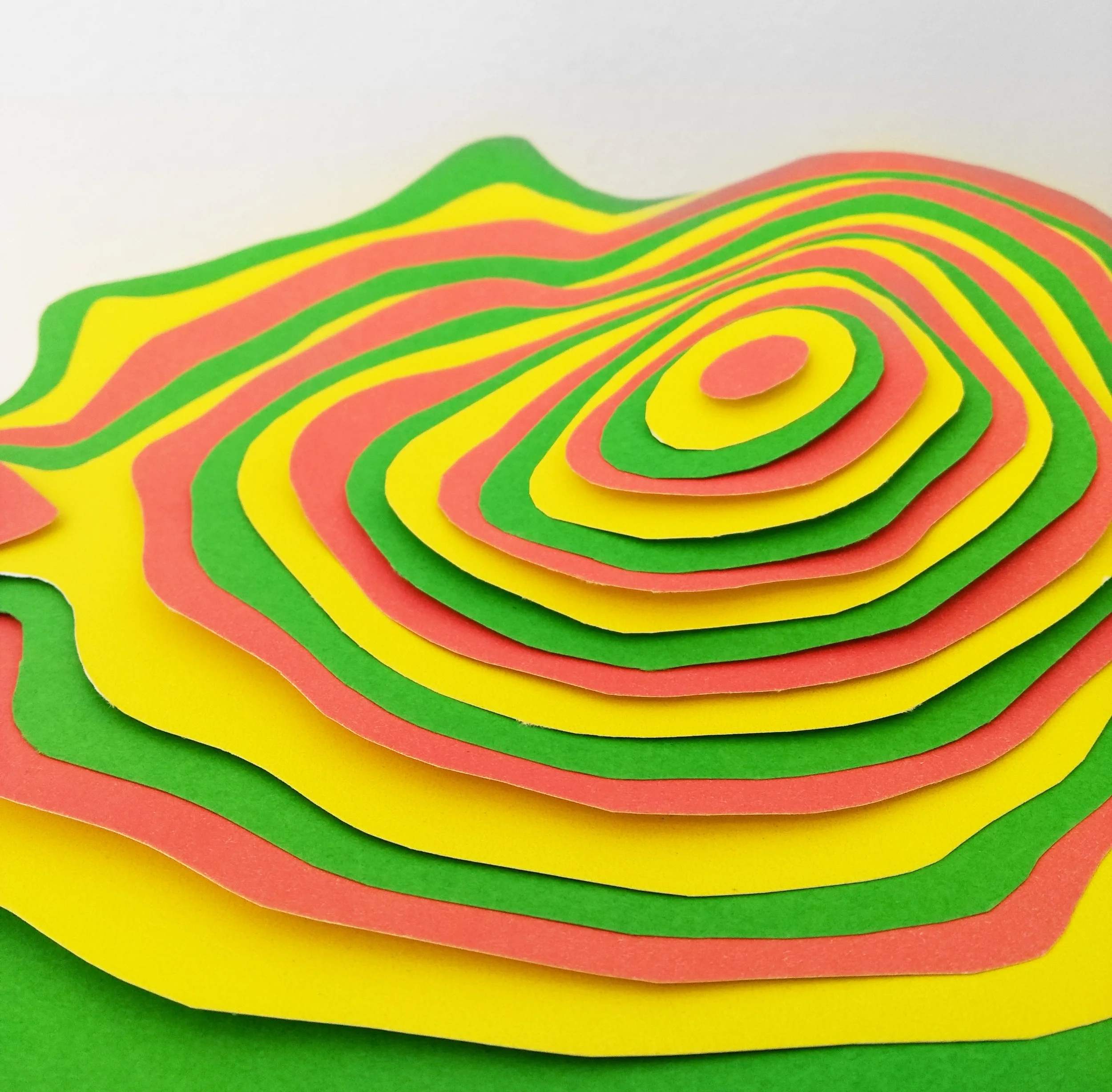
After constructing these layers, I photographed them from above and placed type over the top to create these contrasting options from the previous approaches I’d done.


I really liked this direction, but ultimately this approach wasn’t used. I did however like the idea of the layered card to create the impression of a mountain. I went back to a photograph of the mountain to trace the outline of Cerro Rico.


I used the outline of the mountain and repeated the shape one on top of the other.
The basic design was very flat, so I now brought back the method of layered card to give it texture and depth.
I cut out each layer and photographed them stacked one on top of each other from above.
Whilst l liked the concept, this attempt wasn’t achieving the result wanted. So I enlisted the help of Paul Davis, a photographer in Plymouth to help me really make the cover more sharp, stronger and have a lot more depth to it. The end result really lifts everything from the original that I did.
Final cover
The design lent itself to flow onto the back cover as well…
I loved working on this brief as it gave me lots of scope to try a variety of approaches. I’m really pleased with the final result and a huge thanks has to go to Kika Sroka-Miller at Zed Books for pushing this direction through.
Editor, artworker and lifelong bibliophile.