Steve Panton, In-Depth on The Big Sleep

Steve Panton is a cover designer and illustrator in London. Among his works are the jackets for Christina Kovac's The Cutaway, Eugenia Cheng's Beyond Infinity, and Katie Kitamura's A Separation. Here Panton shares with Spine an in-depth review of his creation for Raymond Chandler's The Big Sleep, a design for which he was awarded 2nd prize for Penguin Design Award Adult Competition 2013.
My The Big Sleep book cover was created as part of a University project back in 2013. The brief was set by Penguin for their Design Award Adult Competition. As the brief formed part of a larger project I was able to set myself two weeks to create the book cover. The brief described the book as a story about sex, drugs, blackmail and high society within the genres of mystery and crime. Whilst also being a serious and significant mainstream novel. Penguin wanted a new cover for a new generation of readers, with originality as the key factor.
I started by researching previous book covers and vintage film posters for The Big Sleep as well as other Raymond Chandler books. Everything had a very overwhelming sense of vintage crime noir. I then read the novel and analysed the plot, characters, motifs and themes. The fact that this was a classic novel meant I had an abundance of source material in regards to researching. Whilst I was reading I took down notes on anything that stood out either visually or narratively focusing on objects, characters, main events and recurring elements (cigarettes, matches and smoking all regular occurrences). These notes would later help me greatly when creating the final cover.
I then created initial sketches based upon my reading and research, producing super rough sketches which would later lead to thumbnails. After shortlisting my favourite ideas I then decided to focus on the vintage matchbox concept. I loved the physical similarity between a book and a matchbox both in proportions and in general shape with both having a very obvious spine. I believed that as an idea it not only linked to the narrative and the time setting but allowed me to create an intricate and detail rich cover that could depict an abundance of motifs and themes from the book.
Once I had decided on my concept I could start thumbnailing the cover and developing the composition. I started by researching vintage matchboxes and vintage playing cards due to both their visual similarities and the gambling link within the novel. After deciding on my favourite researched designs I then thumbnailed initial compositions based upon these, whilst merging elements together until I was happy with a solid direction.
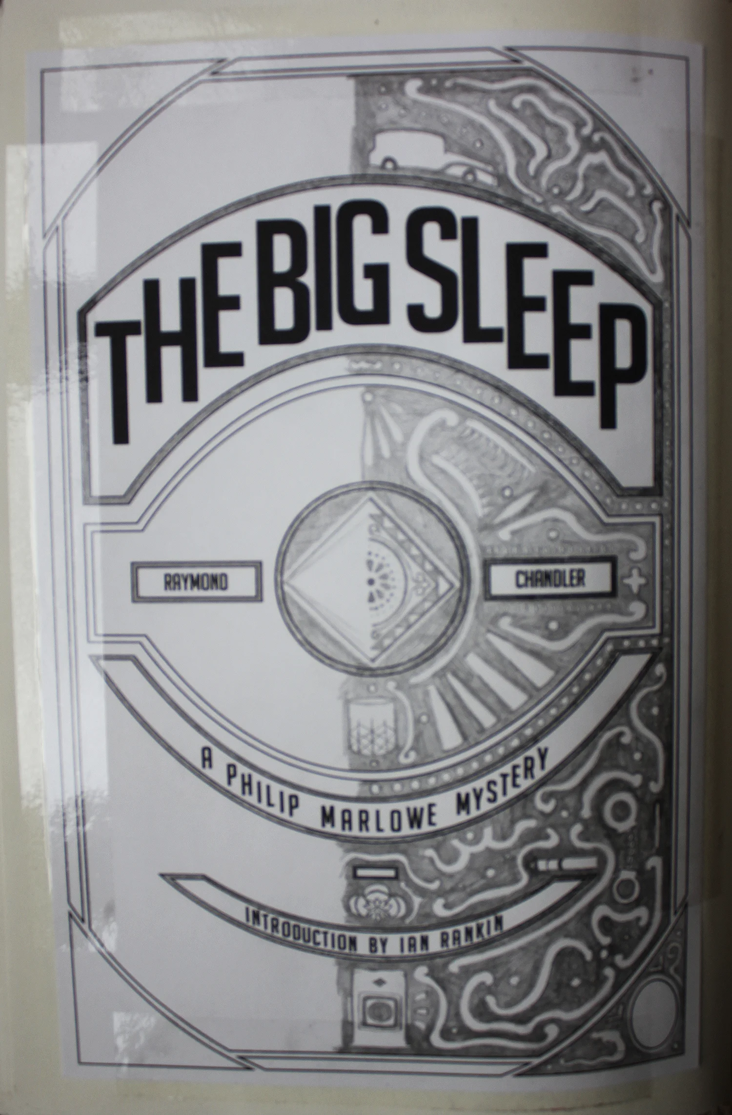
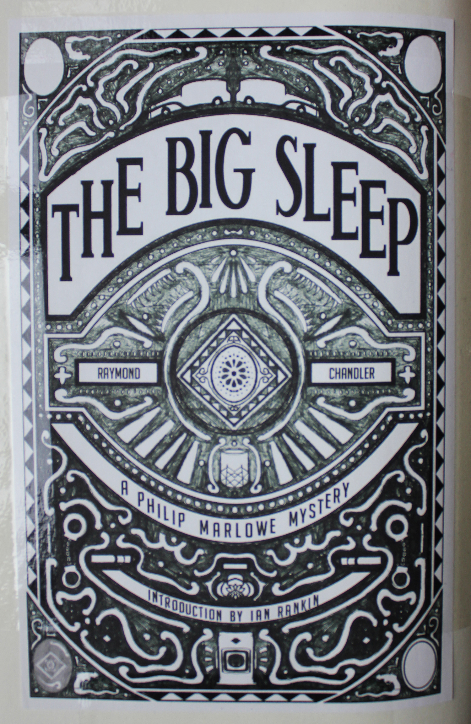
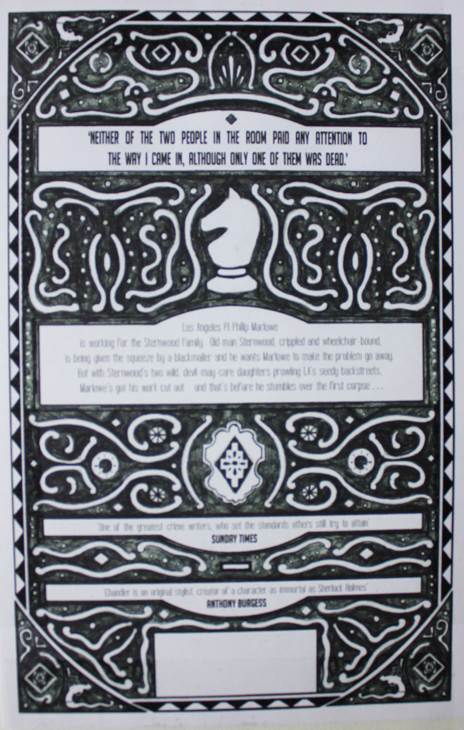
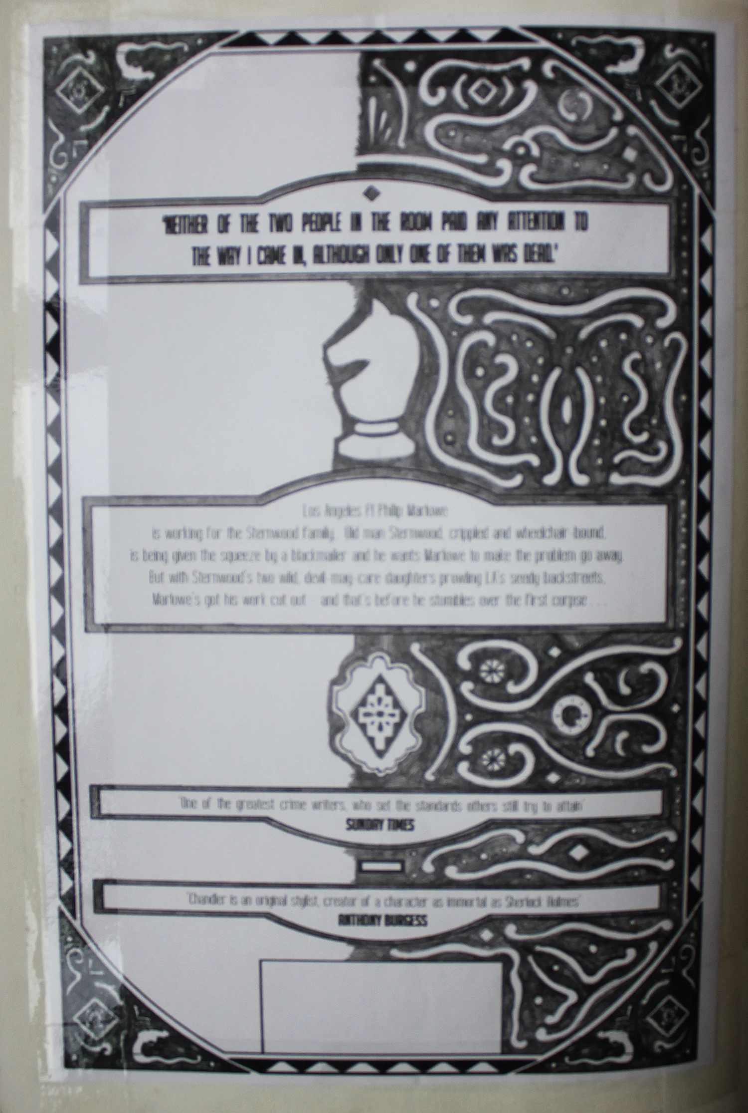
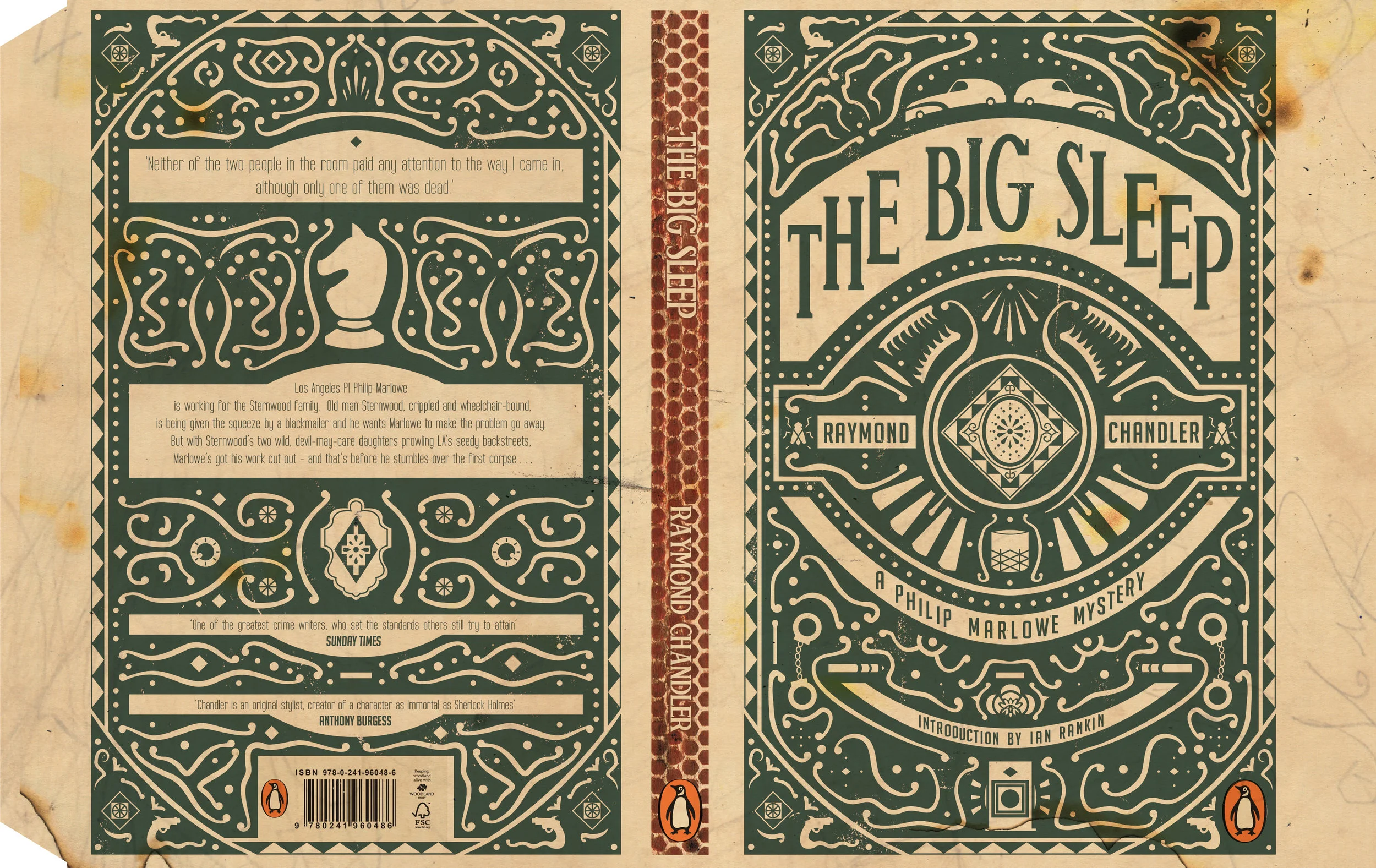
After developing my thumbnails I was able to start working on my initial rough design. I hand drew a rough pattern allowing for type placement and logos. I then roughly laid out the type so that I could start looking at the best possible typefaces. I ended up choosing Big Noodle Lettering for the link to vintage Hollywood films. I then digitally worked up the template so that I could draw over the top. I focussed on drawing only one side using my list of motifs from my reading and research as reference, these notes allowed me to visually represent even some of the more obscure parts of the book, which I thought would be really exciting for the reader to go back and notice as they progressed through the book. I then mirrored the pencil sketch to create the full design, and finally duplicated this same process for the back cover.
Once I had finalised the pencil sketch I started vectorising the design in illustrator so that I could refine the shapes and motifs. After I had finalised the design I began looking at colour options based upon my earlier research and started experimenting with textures in order to make the cover feel more authentic.
At this stage I only just returned to the idea of turning the book into a actual matchbox with the design being a slipcase and the book cover being the inner matches. I decided I did not have time to develop this any further due to my project deadline, but I briefly looked at the mechanics of the special edition box and decided that if I had more time in the future I would return to this idea.
After looking at colours and adding various screen printed and burnt textures I finished what would later become the outer case. However, at this stage this was the ‘complete’ book cover. And I entered this as my design for the Penguin Design Award.
Several weeks later I received an email saying I had been shortlisted and I was given feedback from John Hamilton at Penguin suggesting I look at the balance of the typography and I was given one more week to develop my design and submit the revised cover to Penguin.
I took the opportunity to amend the cover following John Hamilton’s suggestions. I refined the type enlarging the author name and I also improved the motifs slightly.
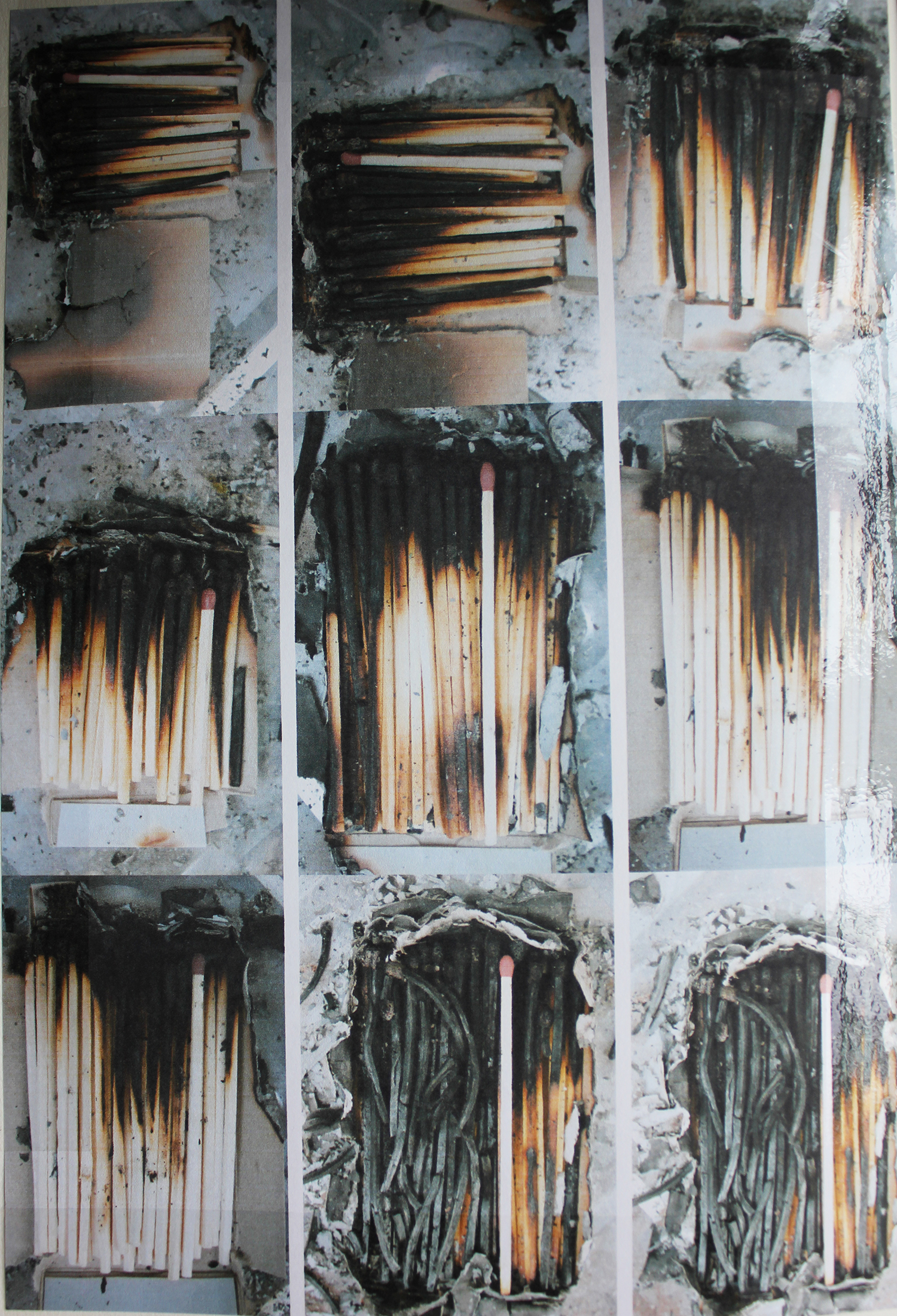
Due to having extra time I returned to my initial idea of turning the book into a matchbox. I started by photographing miniature boxes of matches burning and extinguishing them at various stages. I really liked the photos and thought it would make a very interesting front cover, but in order to match my concept it needed to work as a wrap around cover and I struggled with thinking about the best way to make this work.
After deciding on the best photos I scanned in what remained of the burnt matchboxes so that I could create an accurate depiction of the burnt outer edges and back cover. I used these textures to produce the final inside cover. I wanted to leave one match unburnt amongst the many burnt matches to represent the main character Philip Marlowe and how he is the one good and pure character amongst a city of sinners and corruption. I added a small knight chess piece motif to this remaining match to signify Philip and I experimented with and without adding the title and author text. But settled on leaving the match stick plain, I thought that this was more impactful after having a lot of detail on the outer case to leave the inside cover empty.
The final result is a fully packaged book designed to replicate the aesthetics of a vintage matchbox, hence the single colour, the screen-printed quality and ‘striker’ spine. The design features many various motifs from the text, thus allowing the reader to re-visit the cover through out the course of the book.
The slipcase further cements the matchbox aesthetic, revealing that all the matches within the box have been burnt out bar one which carries the symbol of the knight, representing the principle character Philip Marlowe.
This project allowed me to experiment with what I believe is truly important in the field of book design. Making a complete physical product. I enjoy designing books that not only consider how the cover looks as a piece of art, or how it feels as a desirable product but how it is interacted with and how it can continue to be interacted with by the reader. It is this capability to design for a three-dimensional product that really excites me about book cover design.
Editor, artworker and lifelong bibliophile.


