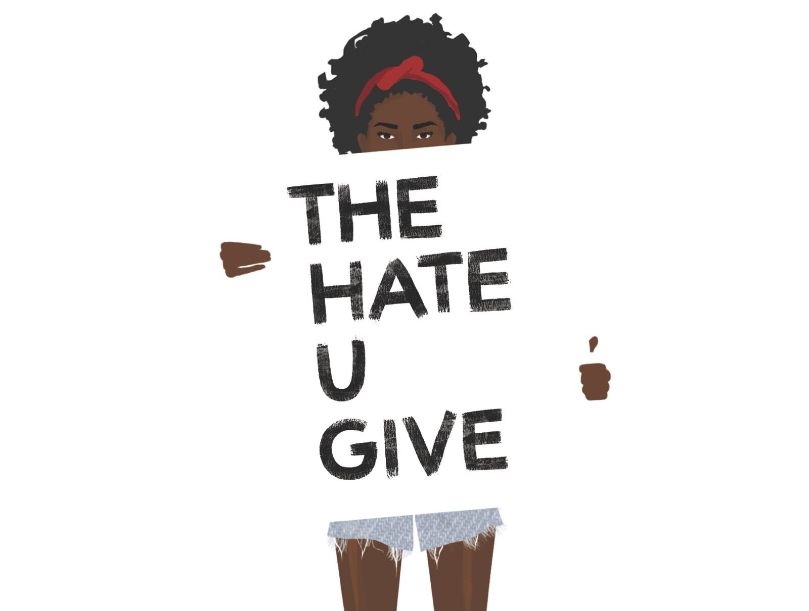
Designing the Cover for The Hate U Give

When HarperCollins cover designer Jenna Stempel-Lobell was asked to design the cover for Angie Thomas’s The Hate U Give, she was sure that the book would prove to be successful. She could not, however, have foreseen just how successful.
“I certainly had my fingers crossed that the book would garner acclaim,” said Stempel-Lobell of the #1 New York Times Bestseller. “The voice is really compelling and it was one of my higher energy books overall from start to finish – especially because the publication date was pushed up!”
After reading the novel, Stempel was excited by “the wealth of imagery” at her disposal. Exploring a host of artists and concepts, she and her team ultimately decided on illustrator Debra Cartwright, the clear favorite.
Cartwright, who has an undergraduate degree in painting and modern art from the University of Virginia and in graphic design from Parsons, usually creates work that focuses on “some pressing social issue.” She has worked in magazines for five years and illustrates by night. Some of those illustrations have gone viral, and one served as the inspiration behind The Hate U Give’s cover.
“The inspiration for the cover design was created as I sat in my 34th floor magazine office on Broadway overlooking the Freddie Gray protest down on the street,” said Cartwright.
“I couldn't leave work to join in at the moment so I illustrated a woman and a little boy with the sign saying ‘Stop Police Terror.’ It went viral on Instagram and unfortunately is still shared when another black person is killed. It’s being used as a protest image for so many, I suppose it seemed fitting for Starr.”
Cartwright said that when Stempel-Lobell informed her Angie Thomas was a big fan of her work, she assumed Thomas had stumbled across the protest illustration.
“It was all very organic,” Cartwright said.
“We commissioned [Cartwright] to create matching black and white illustrations for the front and back covers to show both Starr and her friend Khalil, whose death sparks the whole narrative,” said Stempel.
Thomas approved.
“I am a huge fan of Debra Cartwright’s, so when I found out she was doing the artwork for the cover I was ecstatic,” she said in an interview with HarperCollins. “There is so much I love about it. It’s such a great depiction of Starr, right down to her natural hair and her sneakers. We don’t see black girls on covers nearly as much as we should, and I am honored that we do see a black girl, in all of her beauty, on mine.”
“Starr’s fierce gaze on the cover is amazing,” said Stempel-Lobell. “Plus, the number of adorable girls we’ve seen dressing up as the book cover on social media has been really heartwarming.”
The back cover, though not as immediately noticeable, is just as profound.
“The image of Khalil was created with similar inspiration,” said Cartwright. “[It] was illustrated during a woman's march called the Slut Walk, I equated the perception of women in short skirts labeled as ‘sluts’ to men in hoodies being labeled ‘thugs.’ I sought to highlight what you wear has very little to do with who you are as a person.”
Cartwright felt that The Hate U Give was geared toward her. She is shocked by its success.
“Yes, I immediately raved about the book after reading the manuscript but I’m a big teen fiction buff,” she said. “Social issues, a black woman living in two worlds, with two loving parents? It was so me, I failed to realize the reach. I’m elated.”
Stempel-Lobell, whose own background is in illustration, will be celebrating her three-year anniversary with HarperCollins this May. She said her favorite part of the cover design process is the initial sense of optimism she feels right after finishing a manuscript and before she starts comping.
“What if this is the best thing [I] ever make?” She said she asks herself. “The possibilities! Less exciting is when no one is on board with your comps and you’re worried you’re out of ideas.”
Nowadays,Stempel-Lobell works predominantly on Young Adult Fantasy novels, so special effects and opening title sequences in movies have a big impact on her.
“But more generally, I gravitate towards work with a ton of ornamentation and detail,” she said. “I would sleep with Marian Bantjes’ book I Wonder under my pillow if I thought I could absorb her patience and skills at crafting beautifully intricate work. Since my first impulse is always ‘kitchen sink options,’ coming up with a ton of small elements and then arranging them, I really admire illustrators like Debra Cartwright, who is able to create such compelling pieces that use negative space so well.”
Cartwright says that, in addition to social issues, modern art inspires her, as does “viewing ideal worlds through the lens of someone else.”
Currently, Stempel-Lobell is waiting to receive Thomas’s second manuscript, which she says should be coming in the next few weeks, and Cartwright is working on some large-scale oil paintings that she looks forward to revealing in a show in the near future.
Hiba Tahir is a YA author, a freelance journalist, and an MFA candidate in poetry at the University of Arkansas.
