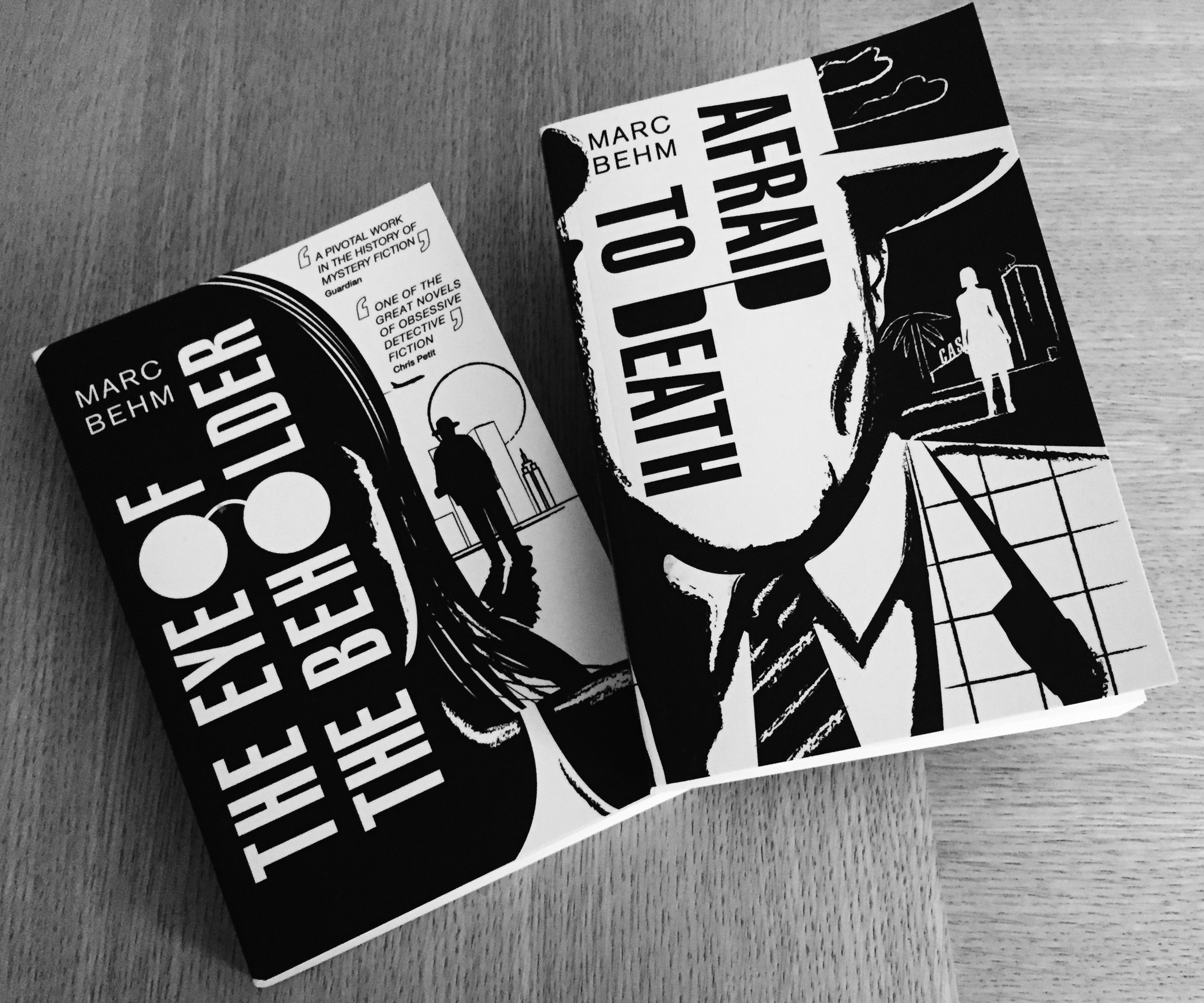
Tom Bevan, Eye Of The Beholder & Afraid to Death

Tom Bevan is a designer and illustrator currently residing in Leyton (UK). Among his works are recent cover creations for Marc Behm's Eye Of The Beholder and Afraid to Death. Here Bevan details his process for creating these pieces, in his own words.
The brief for these two books was fairly open, insofar as the main proviso was that they should look ‘really cool’. Both novels are considered ‘lost’ minor classics, so the desire was to give the covers the élan they deserve, for this, their re-release after 20 or so years.
Another request was that the colour palette be limited to black and white, with one cover being an inversion of the other. Thematically, the two exist as companion novels in some ways, so this made sense conceptually. Restrictions in briefs can actually prove liberating, and thus it felt here.
The novels themselves are to a large degree concerned with obsession, pursuit and observation. In the case of Eye of the Beholder, this is between a slightly crumpled middle aged male private eye, who – at a distance – follows a younger woman he grows to think of his daughter, eventually becoming her anonymous ward. In the case of Afraid to Death, the protagonist is a dissolute gambler, who is trailed relentlessly by a murderess who seems supernatural in her malice.
In terms of look and feel, I wanted to give the covers a slightly psychotic noir vibe, which evoked the unsettling, weird tone of the books themselves. I worked up a few directions, looking at pulp book covers, film posters, comics (especially Frank Miller and Charles Burns) and jazz typography – such as Reed Miles’ work on Blue Note – for initial inspiration and tone.
One of the options I presented was illustrative, and it was this that got picked, and developed into the final covers. I arrived at the layout that would become the final one, mostly through lots of sketching, and playing with type. I knew I wanted something really dramatic, that would capture the strange, impersonal bond the book’s protagonists share, so decided to have the pursued (in each case) squarely in the foreground, with their stalker in silhouette in the middle difference. I wanted the covers to have a ‘widescreen’, cinematic feel, so wrapped the face around the spine and back cover, on which can be glimpsed the seedy liminal worlds Behm’s protagonists inhabit – transitional zones of airports, motels and casinos.
I’d decided early on that the face in the foreground would be blank, for a couple of reasons: mostly because it made a good spot to run the type (which I wanted to be bold and filmic) and because it looked appropriately tense in silhouette!
For the title lockup, I wanted something really cool and snappy, which hinted at the book’s themes, and after much manipulation, managed to work the books protagonist’s eyes into the composition, obscured by glasses. For a font, I opted for a highly condensed sans-serif; mostly as those kind of typefaces (with their limited X width) can lend themselves to manipulation when grouped tightly, and when closely kerned and in the right context, can look appropriately tense and paranoid.
Image: Tom Bevan
Overall I was really pleased with how these turned out. The proof is often in the pudding with printed artefacts, and in the end, it felt like the slightly unorthodox type and image layout delivered, and equally importantly, worked as a pair. It was a really fun project.
Editor, artworker and lifelong bibliophile.


