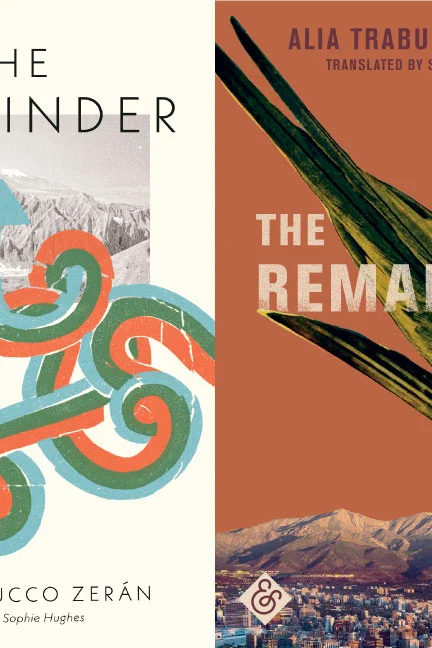
Tree Abraham Takes On a Transcontinental Challenge for The Remainder

Tree Abraham is a book designer, illustrator, writer, & maker of things. Here she takes us through the process of designing both the UK and US version of The Remainder.
Last summer I had the fortuitous experience of being briefed the same book by two publishers. First, the British publisher And Other Stories reached out to me, and then a few rounds into the cover design process, the American publisher Coffee House Press contacted me about designing the US edition. Having studied design in the UK, and now based in the US, I am quite comfortable adapting my style to suit the intended market, but I could not have foreseen the challenges that this unique case would pose.
The briefs were for the book The Remainder by Alia Trabucco Zerán, originally published in Spanish. Saturated in Chilean landscapes and its dictatorial past, the coming-of-age novel follows three friends on a road trip in a hearse to retrieve the corpse of one of their mother’s that has gone missing during its repatriation from abroad. All three are grappling with their own inherited and new traumas in twisty, eccentric ways. The writing oscillates funny, clever, and sad, very much reflecting the complex dynamic between the three characters.
The UK publisher wanted something that felt literary and contemporary, not YA in the slightest, energetic yet sober. The story begins in a city covered in ash, and carries on through the cordillera, so this imagery was suggested as a potential starting off point.
Initial designs explored dissolving the type or landscape into ash. As the story progresses, the sky is described as evolving from being smoky with ash to cloudlessly blue. Feedback from these rounds mainly focused on whether the treatments felt too retro, too quirky, or too much like a travel book.
Upon reviewing the manuscript, I found other poignant imagery to incorporate. In particular, references to birds. The main character recalls a childhood memory of plucking the green feathers off his grandmother’s parrot until it dies. Then later on the road trip, he becomes enraptured in a flock of birds taking flight. He comes to envision himself as a bird:
“I’m flying with my wings outstretched, wings so wide I can’t see the edges of my own body, the edges of my arms which are beating so serenely, so beautifully, and the wind whistles against my body and I sigh a happy sigh as I soar, swerving gently with each puff of this air cocooning me, cos it’s swaddling me, Santiago’s air; the sky falls in on itself to touch me, it crumbles into ash and the ash sings to me, sings me a lullaby, and what I really want is to fly away forever, fly higher and higher until I disappear and I’m nothing but a shadow.”
There is a brokenness and hopefulness to the way the character relates to the birds. I tried a number of variations with flocks of birds in flight, but in the end, the single obscurely cropped parrot added more intrigue and solemnity.
UK final cover
It was during these birded rounds that the American publisher contacted me. And Other Stories had shared all my early designs with them and they had decided they wanted to go in a completely different direction. They thought of me for the brief, unaware that I was the designer whose work they had just reviewed!
We discussed whether I would be able to come up with fresh designs, which I was confident I could if given a distinct enough brief. There is a misconception, which I believed when first starting in publishing, that designers read a book and distill its essence and authentic voice into an allusive and alluring cover design. I still strive for this, but a lot of what a cover portrays is dictated by how a publisher wants to market a book. So in this case, it was important to receive as much clarity as possible from the US publisher on how their aims for the book differed from that of the UK, so that I could reorient my approach.
Coffee House Press had a similar take on the book as And Other Stories—something that could capture both a liveliness and a darkness, without feeling YA. Other helpful adjectives included circuitous, idiosyncratic, wild, searching. They wanted perhaps more color, more texture, more pattern then the UK design.
The first round was a bit of a struggle because even though I was providing fresh designs, they still hinged on similar imagery to the UK, because I was the same designer interpreting the text and its dominant visuals, and the US was opposed to any overlap. One of my favourite killed covers is of the tipped over flowers. The characters down a bottle of Pisco as they drive, one character plucking the petals off a flower in melancholia. I liked the idea of flowers on a grave...flowers in a vase...and how this could be turned forlorn.
I eventually arrived at the final. I drew three separate lines on three pieces of paper, tore them up, scanned them into the computer, and stitched them back together. A process that echoed the journeys of the characters.
Three separate characters together forming one arrow, all on the same sinuous, craggy road along the cordillera toward better days. The arrow satisfied a lot of the requests of the US publisher, to have texture, color, pattern, energy. Looking back, I think the rest of the cover was inspired by Anne Carson’s Autobiography of Red, which I had just finished reading and also follows sullen characters through South American mountains.
US final cover
Ultimately, I am so grateful for the prolongated design process. I got to collaborate with two fantastic publishers and stretch beyond my edges to solutions that I could have never reached in isolation.
Editor, artworker and lifelong bibliophile.