Trend Alert: It's Hip to be Square

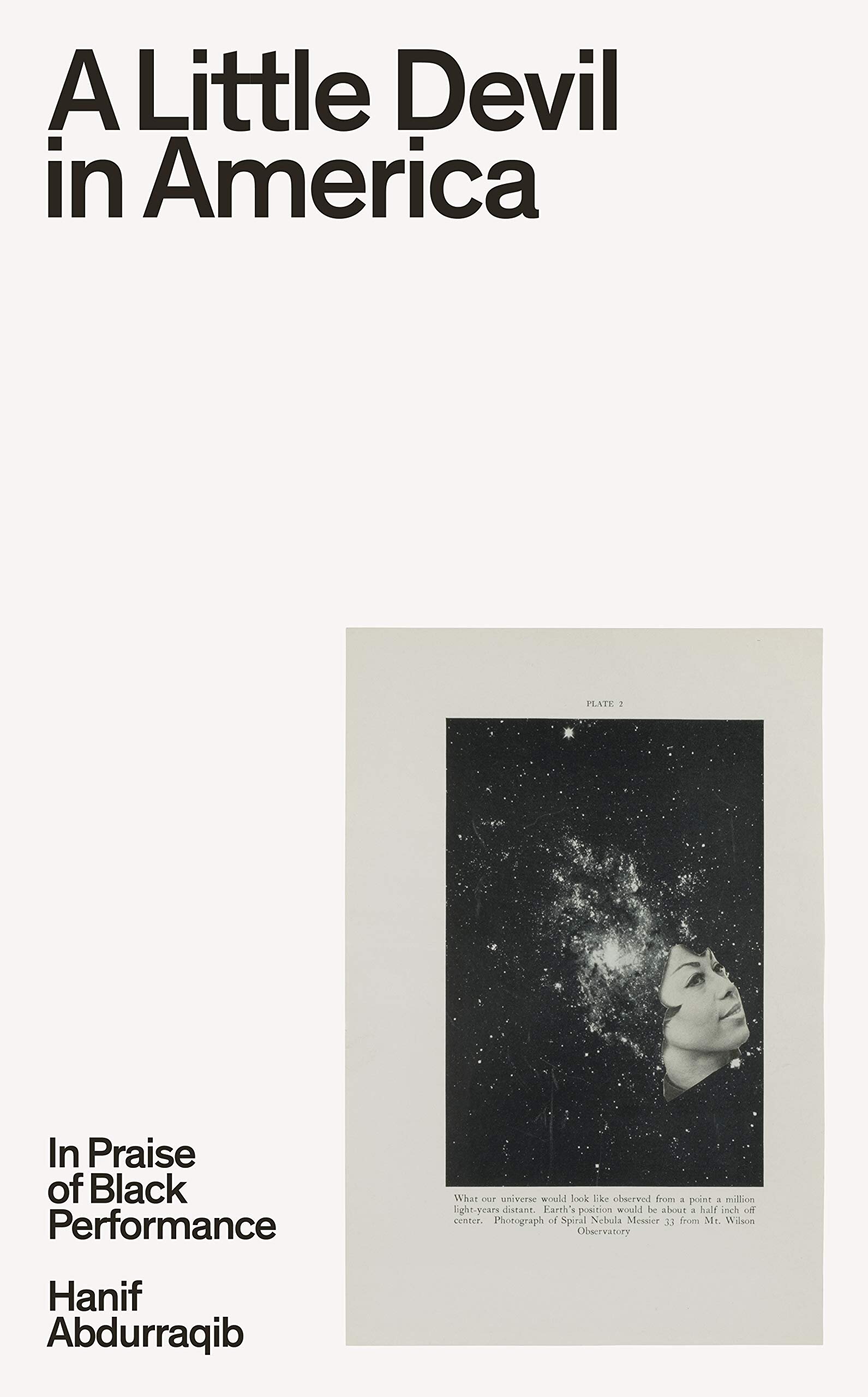
It was the lovely Jessie Gang of HarperCollins who first pointed out this trend to me back in February 2021, and since then I seem to be seeing them everywhere. A square-centric magazine-esque layout usually featuring a photograph (often jauntily set off-center) along with either some cool, modern, lower-case serif or bold upper-case sans serif. Here are some examples of the best I’ve seen so far.
A similar trend I’ve noticed (and am loving) is the bisected cover.
Vyki Hendy
Editor, artworker and lifelong bibliophile.


