University Press Coverage, June 2026
Welcome to our University Press Coverage — known as the Uni-Press Round-Up on the right side of the Pond — a ongoing feature in which we highlight, with commentary, a selection of university and academic cover designs published this month. Please enjoy this celebration of amazing work.
The selections are in alphabetical order by press. Where possible, credits are listed in the captions (often with links to the designers’ other work), and each cover includes a link to the university’s official page for that title.
As with all cover designs we feature, we encourage you to head to your local library, college or university library, or bookstore to view the works in their full splendor.
As ICE has grown to play an outsized role in modern American life, it would be easy to follow the cliché highway when given an assignment like this. Instead, the more subtle approach used here works very well, elevated with details like Franklin’s “look,” a reminder that residency isn’t as permanent as it once was, and, of course, “give us your poor” being proudly trampled by today’s “powerful.”
Paperwork. Nice.
Note: Beacon Press books are “published under the auspices of the Unitarian Universalist Association of Congregations.” The Press is a member of the Association of University Presses, hence its inclusion in this column.
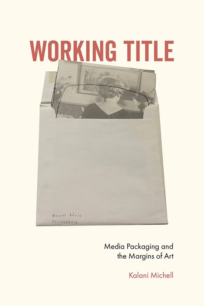
At first glance, Working Title seems like just that: a work in progress. Delve deeper, and the truth is revealed: it works very hard indeed, “[making] legible the artistic practices, communication traces, and intervening decisions that constitute the process of art that is occluded by an exclusive focus on product,” as one of the reviews says.
The cover reflects this ongoing process. Art, “packaged,” yet giving us a glimpse — just a hint — that there’s so very much more on offer.
Less is more, personified.

University of Chicago Press. Book design by Ryan Li; art director, Jill Shimabukuro.
“Capital Untamed reveals how the financial markets became an instrument of political power, frustrated state ambitions, and ultimately escaped attempts at mastery,” the description reads.
It’s referring, of course, to 19th-century France, but the smug greed, the layers between the “haves” and “have-nots,” and the striking separator(s) apply so very aptly to the 21st.
(In book design, as well.)
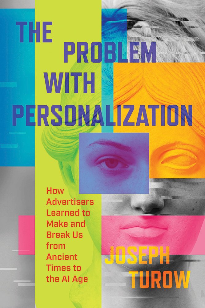
Multilayered items “weaponizing data in unprecedented ways that drive social fragmentation and the disappearance of shared social reality.”
“Ripped from the headlines” seems apt, but in fact, it’s an age-old problem.
A problem represented beautifully on this unsettling cover that’s simultaneously brightly-colored, oh-so human, and yet stone-cold. With some “read-out errors.”
As fulfilling the brief goes, an out-of-the-park home run.

Harvard University Press. Book design by Thomas Colligan; art direction, Gabriele Wilson.
From “outdoor dining and public protest to policing and snow removal, […] sidewalks are vital arenas where rights and regulation are contested”; this title is an examination of how “something as ordinary as a stretch of pavement holds the power to transform a community.”
The question is, then, how does one visualize that? Drama? Cliché? How ’bout a line drawing? Perhaps one that evokes the “games” — Chutes and Ladders, Steps and Falls, Signs and Seals — that are much more part of this reality than anyone realizes?
(Bonus points for the crosswalk in the style of the HUP logo.)

University Press of Kansas.
Roughly 1.7 percent of the human population is born intersex. For three days, the author’s parents called him Baby while they awaited the results of chromosome testing. This is his story, a “direct response” to President Trump’s first-day Executive Order seeking to define gender and sex as strictly binary: male and female. It was, as the author puts it, “the natural progression of the GOP’s ongoing assault on transgender people.”
The cover is the perfect blend of official document, footprints, and monospaced and handwriting-style type, with the chromatic shift the crowning accomplishment.

Sometimes, it’s not about “reexamin[ing] the director's cinematic brilliance, storytelling mastery, creative partnerships, and controversies, offering a fresh perspective on Hitchcock's legacy,” however serious or even … well, Moral.
Sometimes it’s just about “fun.” This cover is fun.
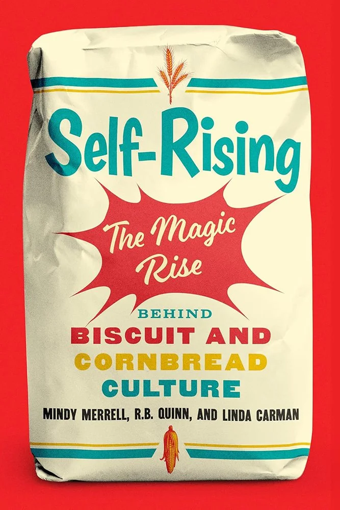
Title-as-flour-bag, with mid-century goodness in type and style.
There’s no shortage of schtick in the University Press world; often titles are aimed at a local audience, and a certain “look” is appropriate. In this case, the designer (and AD) have gone for something that’s more, that’s better. And we’re better for it.

Princeton University Press. Book design by Karl Spurzem; art director, Jess Massabrook.
“Drawing on sources that range from political speeches to Hollywood films, Jones charts the posthumous transformation of Disraeli into a paragon of ‘One Nation’ conservatism,” the description reads.
That’s Benjamin Disraeli, the late-Victorian Conservative Prime Minister, if you’re not familiar — but it doesn’t matter whether you know him or not, because of a masterful choice on the designer’s part: “the artwork is a redrawn caricature from a magazine advertisement for the 1929 Disraeli film, published in the December 1933 issue of Philadelphia Exhibitor magazine,” he writes.
It’s incredibly eye-catching; when paired the title’s holding shape — a monocle, presumably, although given the size describing it as a telescope firmly eyeing the future would work, too — this cover does more than enough to command attention.
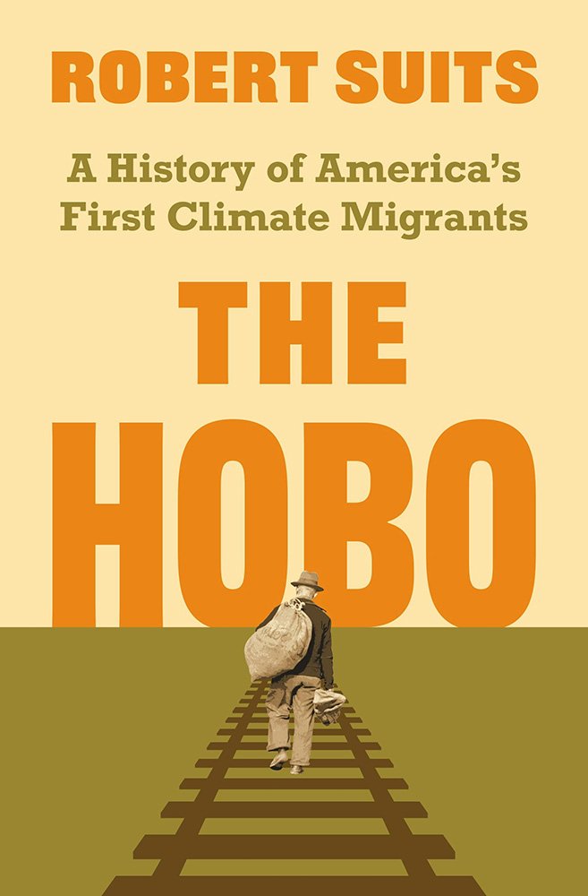
Princeton University Press. Book design by Chris Ferrante; art director, Maria Lindenfeldar. Photograph On U.S. 101 near San Luis Obispo, California. Itinerant worker (detail), 1939. San Luis Obispo, California, United States. Library of Congress Prints and Photographs Division, Washington, D.C.
“This fascinating book reveals the hobo to be a hidden motor of US energy history,” one reviewer writes. Hobos, often the opposite of the older, disheveled stereotype, “provided a human fix for an industrializing nation struggling to master a varied and changeful environment. Steam power hinged on muscle power—on people, who bore system-level shocks with pain and dignity.”
The itinerant’s photo is by Dorothea Lange, by the way. “Not the old ‘Bindle-Stiff’ type,” she said. Yeah: “marching towards a new future,” indeed.
(Great color choices here, too.)

Stanford University Press. Book design by Adam Bohannon; art director, Michele Wetherbee. Image: Two photographs of the Sahagian family's 1906 portrait of unbelonging. Courtesy of the descendants and Ottoman state archives.
I try not to over-quote a title’s description, but this one needs some background:
“In 1896 the Ottoman sultan issued a decree that allowed Armenians—and only Armenians—to emigrate on the condition that they expatriate and never return to their homeland. A key step in this process was sitting for a photograph. The Ottoman state archived the photographs; the Armenian migrants received passports and left for European ports, most of them bound for the United States. Between 1896 and 1908, more than four thousand Armenians sat for such expatriation photographs. […]
“Portraits of Unbelonging follows the stories of the individuals in these photographs over a century—from the bureaucratic files that unmade them as Ottoman subjects, to the ship manifests that tracked their migration routes and the naturalization records that documented their new lives as immigrants, and finally into the family albums and stories of their descendants living today.”
With a simple yet poignant overlay and appropriate text, these photos make — positively compel — a potential reader stop and ask questions. One cannot ask for more of book design.
Stanford University Press. Book design by Ann Weinstock; art director, Michele Wetherbee.
The background document here is fascinating. It’s from the Cairo Ministry of Justice, 1902, and was in fact the Official Bulletin of the Native Tribunals. That it’s in three languages speaks volumes about the era, and it’s an ideal starting point.
It’s complimented by “painted” color blocks and simple type; if the shadow effect was added, it’s done well-enough that I can’t tell.
“Simply, elevated” done just right.
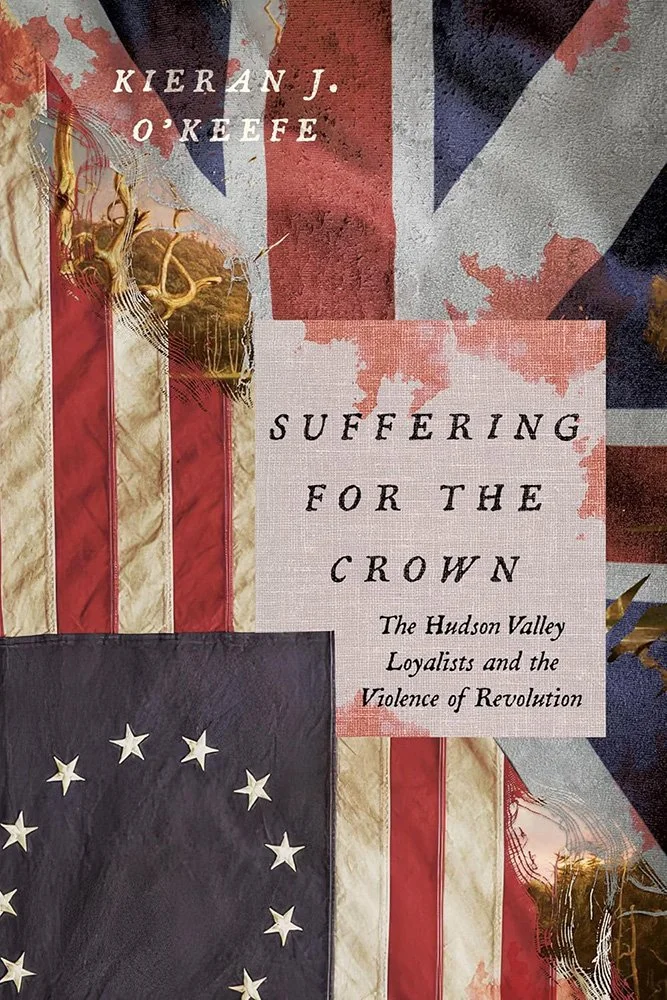
University of Virginia Press.
An examination of the “chaos and carnage” of the American Revolution, featuring flags for both the revolutionists and loyalists — along with blood, old-tyme type, and likely stress of more than just fabric.
Two things stand out: the quality of those items, and the painting just beneath.
The Hudson Valley is an incredibly beautiful place, and is well-represented in art of that century (and every one since). That it’s peeking out through the frayed — tattered — seam between old and new works so very well indeed.
It’s against our only-highlight-titles-published-this-month rule, but I’m going to include one from last month that got overlooked — one which is too good to let go by:

Lebanese refugees marry and open a corner store in Toledo, Ohio. It’s the late 1970s, and you just know it’s all going to go smoothly for the couple and their children.
The cover uses a diorama effect that’s fantastically representative: from the stools to the stop sign, the dark night to the harsh light, the emptiness to the neon, every box is expertly ticked.
Hat tip to Dan at Casual Optimist.
Are you a book cover creative, art director, or publicist? If you want your work, or the work of your press, to be reviewed be sure to get in touch with us.
Please include the cover designer’s name, the art director’s name, any additional details like illustrator or photography credits, and the publication date. (Yet-to-be-published titles are welcome, with embargo dates if applicable.) Images should measure 1200-1500px on the long side, preferably in JPG format and the sRGB color space.
We look forward to featuring your work soon!
A freelance designer and photographer, Giles has been writing about book design for nearly thirty years. During his spare time, he walks, explores architecture, and enjoys music on a great stereo. He lives in Middle Georgia with a dog and cat.